- Experimenting with printing techniques over the top of imagery/text will be expressive and benefit my idea generation.
- Cutting into the pages to reveal page below
- Flaps
- Book within a book
- Text on one page, image on the other
- White space
From previous research, I identified a number of different techniques and materials have been used to produce the publications such as screen printing and digital printing. This has made me realise that the type of paper and overall composition of the publication needs to be based on informed decisions. In order for me to choose what materials and techniques are appropriate, I need to think about what design principles I am going to present.
Further Research
Looked at some publications that I could physically hold and touch in order to gain a better understanding of the processes and materials involved.
Colorplan

The publication is predominantly made out of a thick, textured ,high quality paper which makes it pleasant to hold. Subtle touches such as the raised circles create an effect that can't be replicated on a digital format, as creative review states, 'Even in these digital days, a beautifully produced paper promo can still make even the hardest-hearted designer drool.' It is a bespoke, quality publication:
The publication is made out of a concertina fold, instead of its own individual pages. This creates a flow of visual information that can be spread out or read like a book. The top and bottom 'page' is made out of a thicker card in order to keep the publication flat and professional.
Pages include interactive elements to entice the audience and make the publication enjoyable to read.
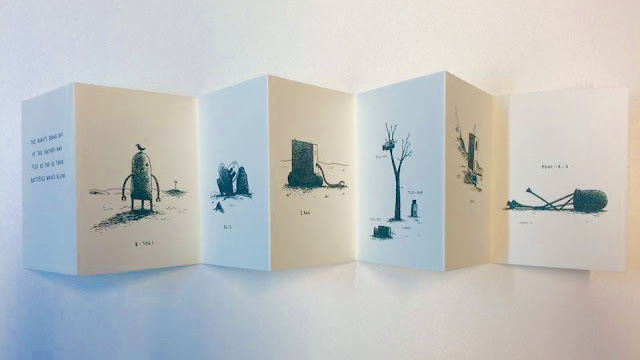
Another example of a concertina publication:
Extremely simple in context as well as the type of publication which creates a pleasant and smart reading experience. The imagery is prominent in order to illustrate the story. I am surprised by how effective the concertina fold is for making publications.
Further Research
Looked at some publications that I could physically hold and touch in order to gain a better understanding of the processes and materials involved.
Colorplan

The publication is predominantly made out of a thick, textured ,high quality paper which makes it pleasant to hold. Subtle touches such as the raised circles create an effect that can't be replicated on a digital format, as creative review states, 'Even in these digital days, a beautifully produced paper promo can still make even the hardest-hearted designer drool.' It is a bespoke, quality publication:
The publication is made out of a concertina fold, instead of its own individual pages. This creates a flow of visual information that can be spread out or read like a book. The top and bottom 'page' is made out of a thicker card in order to keep the publication flat and professional.
Pages include interactive elements to entice the audience and make the publication enjoyable to read.
Another example of a concertina publication:
Extremely simple in context as well as the type of publication which creates a pleasant and smart reading experience. The imagery is prominent in order to illustrate the story. I am surprised by how effective the concertina fold is for making publications.
ABC3D - Marion Bataille
Bataille has changed the way a book can be made to make this a stunning example of craftsmanship. Each page is dedicated to a letter of the alphabet, using paper folding techniques and sliders to create 3D and moving characters. For example:
Clever way to simply change a letter as it makes it's simple and interactive.
As the page is turned, the circles inside the 'S' turn, emphasising the curvaceous shape of the 'S'. The book has pushed the boundaries to what a book can do as the form of it can change perspectives as well as the content. This couldn't be replicated digitally.


No comments:
Post a Comment