When I visited the Corn Exchange, I noticed there was no map to find where the shops are. I took note of what order/position each shop was in, in relation to the entrance.
Initial concept - Take advantage of the whole circular shape:
Completely removed grid line which allowed opportunity to group the type together more and increase the size of type because as you can see above, some of the type isn't legible:
Right side is heavier than the left due to double figures. I didn't rotate the numbers because it wasn't relevant and made the composition disjointed. The pictograms are a lot more prominent due to the numbers taking up less space. I would make a key to go along side this, however it wouldn't be interpretable from a distance.
Initial concept - Take advantage of the whole circular shape:
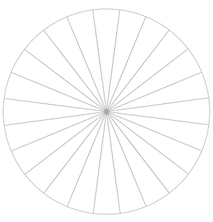
Sketching out how I am going to get the 24 shops onto a circular map. The shape of the corn exchange is predominantly oval, however I think the connotations of a circle are wholesome which will be visually balanced. Tried splitting the circle into 24 sections so that I had an even amount of space for each door. Used Illustrator to get an accurate result:
The shape reminds me of the ceiling of the Corn Exchange as the lines and act as the supports for the roof and it's also a circular shape:
Used the circle as a grid to plan out the order and position of each shop easily:
Some of the shops have more than one door, such as King Koby, Primose and Yellow Sunshine. To represent this, I left a segment out for each door, however I think I need to find a way to fill this space, possibly by enlarging the type. I chose Univers Ultra Condensed because it's a balanced typeface that's legible, however as you can see above, it's not legible on a small scale due to how condensed it is. I decided to put the type on the outside of the circular grid so that the type was evenly spread and gave me a bass to work with. The type on the right hand side needs to be rotated the other way, mirroring the other side as it isn't legible upside down. I had to rotate the type in order to make each shop name legible because I underestimated how many shops are on each level.
Removed outer circle because it felt like it was closing the type out. The lines resemble the ceiling of The Corn Exchnage, however I think they lines draw the eye to the centre of the composition, drawing attention away and distracting the audience from the information.
As a result:
Used sans-serif typeface to state floor level because it contrasts with the narrow Univers and fills the white space. Chose Times because it's bold and traditional which is appropriate for The Corn Exchange because of the history behind the building. I rotated the type on the right hand side so that the type wasn't upside down and easier to read, however Humpit could be problematic.
Altered the size of the type depending on how many doors the shop has. I don't want this to create an advantage for shops with large type, however once the audience recognises it'll make sense. This created contrast between the type on the page and reminded me of Bauhaus graphics:
Being playful with typography is a legacy left by the Bauhaus movement.
Needs pictograms for entrance because it blends in a lot with the type and acts as visual cues:
Cut subtle gap into the circle to suggest the entrance. I may need an arrow and type to make this clear. The entrance will be a key referencing point for people to find their way around. Added in a lift pictogram instead of type so that the audience has visual cues to interpret quickly.
Leeds offers a huge variety of tourist attractions and The Corn Exchange is one of them. The pictograms are internationally recognisable so it's a good wayfinding system for tourists.
Wanted to reflect the age and historical architecture and decor more with typography so adapted the type to be Times Bold:
Due to the uneven stroke width of each character, some of the type is hard to read on smaller scales. I made the circle grey so that it was subtle and didn't push the type away.
I recently had an induction in letterpress and typesetting in which I used another classic sans-serif typeface; Clarendon. This was my main inspiration for using it because it is bold and impactful so may be easier to read on a range of scales:
Used SuperClarendon:
Superclarendon Bold is a strong typeface due to the thick stroke, particularly on the serifs. This makes it a lot easier to read.
Even on a small scale, it's more legible than Univers Ultra Condensed.
Noticed that on the top floor there are numbers above the shop:
As a response to this, I have replaced the type with numbers:
Right side is heavier than the left due to double figures. I didn't rotate the numbers because it wasn't relevant and made the composition disjointed. The pictograms are a lot more prominent due to the numbers taking up less space. I would make a key to go along side this, however it wouldn't be interpretable from a distance.


No comments:
Post a Comment