In terms of content, I aim to choose whether to explain all design principles or choose individuals:
- Gestalt Principles
- Colour Theory: Systematic Colour
- Colour Theory: Subjective Colour
- Grids
- Figure/Ground
- Balance
- Alignment
- Proportions
- Canons of Page Construction
In order to make successful informed decisions, I visited The Village Bookstore in Leeds because they sell a plethora of publications from magazines to zines, spreading over a range of genres and themes.
The Plantation Journal Issue #3
Format: Classic Tabloid
Size: 28.9cm x 38cm
Printing: Full colour CMYK print. Unfolded and Unstaples
36 pages
Visually stimulating due to the limited amount of type and predominant white space
Looking at the content, there is a lot of white space which makes the publication very light and pleasant to flick through.
Printing on recycled paper is a cheap alternative which is beneficial for design and the world. However, on some pages I think there is too much white space and the images feel lost. I understand this may be in order to stimulate the eye to move around the publication but if there was more type it would give the imagery a sense of place.
Fantastic Man
I looked more into layout and materials than the information and content the book provided so that I could inspire new ideas for my own publication:
Double page spread is visually stimulating due to the contemporary layout and devision of text and image. The large image in relation to type is appropriate for Fantastic Man because it's a visual magazine and the images support the type.
Table4Ten
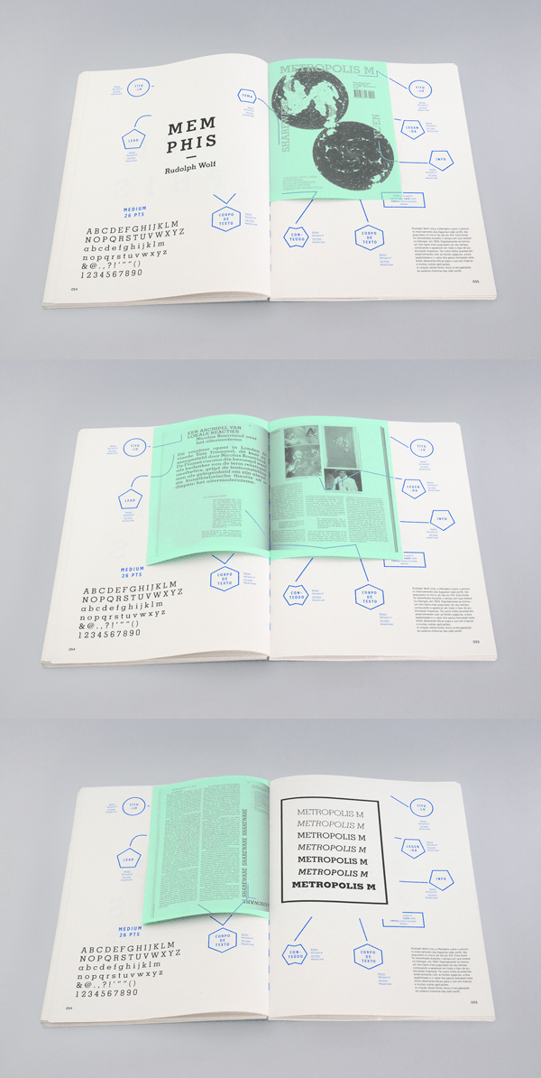
Interesting concept to cut through one page which will reveal the page below. Allows opportunity to combine subjects and imagery. If I was to take this idea into my own publication I will need to think about printing and cutting quality so that my publication is professional.
Critical Dialogues
Specifically type based double page spread. I really like how the size of typography highlights the key point of the article. The bottom half of the publication is spread across the double page as if it is a title which allows the subject from the text to be backed up. The overall layout and spacing of the page is extremely clear and harmonious and I like the contrasting font sizes.
ASTRAEA
Created by Laura Pol, Astraea is a handmade publication using screen printing, photography and book binding techniques. Some sections of typography are screen printed onto the imagery which is why they are layered. It could be argued that the publication looks disjointed and random, however I think the inconsistent type application allows the audience to view each page independently, thus making it stimulating to read.
The purpose of this publication was to showcase photography and poetry which is why I think Pol has been radical with her design decisions to emulate the poetry.
I would really like to experiment with hands-on techniques such as printing so that I can push my ideas further and work independently.
What-Not
This What-Not publication is very conceptual and takes advantage of what a book can do. The subject explores different typography but presents it in an interactive and visually interesting way. Books within books, flaps and clean, crisp layout make What-Not inspirational and I would like to experiment with some of these concepts in the future.


No comments:
Post a Comment