Friday, 11 March 2016

License to Print Money 1.2

MOROCCO

Lucky enough to visit Morocco which was an influential experience for me because of the culture and history behind Marrakesh.

Old Moroccan currency:


Use of patterns and range of colours makes the note visually engaging. The amount is clearly presented on either side of the note to make it clear to the audience how much it is worth. I will consider this because a currency needs to be efficient and practical.

RESPONSE TO RESEARCH

In response to my initial research, I have noted down a range of potential concepts:
  • Take 'character' literally and create my own
  • Use foiling to make the currency reflective so the owner sees themself as the character on the note. 
  • Use layout and imagery from playing cards to inspire new currency - Good concept as it is numeric and visual. Convenient size. Unofficial 
  • Use illusions to show how money is an illusion and people/government use it for the wrong reasons and/or don't really own it - It's all in the bank
  • Pieces of string that can be tied together to show wealth
  • Use symbols to suggest power, love, wealth, etc..
  • Use playing cards as a template for currency inspired by French card currency
  • "MONEY IS NO OBJECT" - Banks all own it
EXPLORATION

I looked into optical illusions because they could provide me with inspiration for visual content. This was influenced by Koos Jansen's article - 'The Concept Of Money And The Money Illusion'.


Fooling the audience into seeing something they're not relates to how banks hold peoples money but it can never be seen or physically held - 'THE MONEY ILLUSION'. 


Sketched out some visual representations so that people could see how my illusion concept can be transferred onto the currency in the feedback session:


Want to be conceptual because it is for a gallery so explored an option that doesn't require numbers:


Inspired by dice as people tend to simply recognise the pattern rather than individually count each circle. This provides opportunity to create patterns out of circles, depending on the amount the note is. This will make each pattern recognisable for that pattern. People associate colour with different meanings and actions, for example traffic lights.

FEEDBACK:

People thought that not using numbers would be time consuming for people in the real world to recognise. This doesn't effect me because I am making an exhibition piece. I also don't think this is incorrect as people will build pattern and colour associations with the note and amount. 

The same point was repeated a lot throughout my feedback on the illusion concept. This is positive because the concept was about how people never see their money because it's held by the banks. Bank balances are just digital numbers on a screen, the money doesn't exist. 'The actual amount on the banknote is hidden within the design so unsure what value it holds'. 

The illusion concept will be eye-catching which important in a gallery because more people will look at it and it won't be lost amongst the hundreds of submissions. 

In response to the crit, I aim to research further into optical illusions which can be combined with the circular/pattern concept. Researching deeper into optical illusions will broaden my knowledge on the subject which will allow me to create a contemporary outcome based on informed decisions from my research and crit sessions.

SCREEN PRINTING

Used Caspar Williamson's publication that focuses on traditional print methods in the world of art and design. This provided me with a range of artists and designers that use screen printing methods and also offers advice and innovative processes.


The screen printing process originated in Japan and China during the 18th Century but was picked up by an English sign painter. Samuel Simon became interested in the technique because he needed a faster way to reproduce his signs. As a result, silk screen printing has become a widely appreciated medium to design with. I will consider this printing method for use on other briefs in the future because it can be a cheap and unique was of printing a large amount of the same design.

The publication also gave me a step by step guide on how to screen print which I will use to remind me of any technical information that I may have forgotten from the induction.


Chicha Posters 
Lima, Peru

The posters are designed by hand, in their actual size, on plain white butcher paper. This design is what will be used once cut, as a template for our silkscreen prints. There is no use of chemicals and no photographic processes. It is this paper that clogs the mesh of the screen, and once finished, nothing remains of the original design, making it impossible to repeat this poster in the same way.
The information provided on the poster is structured in the same way, facilitating the reading for the viewer: Day, place and musical group. Following this formula we developed five posters, from a very satirical standpoint, about four topics that attracted our attention in Lima: The food, the weather, the submerged economy and filthy traffic.


Chicha posters have created visually intense posters using no photographic or digital process which I very much respect. The composition of typography and colour is vibrant and expressive. The type creates an illustrative style. The company are innovative when it comes to how the ink is applied as more than one colour is often used on one 'pull'. This merges the colours together when pushed through the screen, making the composition expressive and engaging.

Preparing for screen print is a time consuming process and I wasn't 100% confident about the screen printing process so I aim to go to the print room as soon as I can in order the give myself enough time to learn the process. 

LTPM Exhibition Branding 1.0

Working as part of a creative team to put together a pitch for the concept, branding, identity and promotional collateral for the License to Print Money exhibition at Bank House.


Bank House

Bank House was built between 1969 - 1971 as The Bank of England's base but it is now used as office blocks. Over the decades which passed the significance of Bank House was lost as it was overshadowed by the skyscrapers and towering structures which now litter the skyline.It is now listed as a Grade II building:

Nick Bridgland, designation team leader for English Heritage in the north said: “Bank House is a boldly designed and executed office building by a well-respected practice. Its powerful street-presence is offset by the use of good quality materials. This architectural finesse and historic interest mean it fully deserves listing at Grade II.”


The building is very geometric and reflects the Brutalist architecture movement:


Geometric qualities to produce patterns as potential visuals.


Considerations:

- Location
- Times
- Content
- Exhibitors
- Social media, links, hashtags etc
- Contact Details
- Format
- Signage, way-marking
- Opening night Invites


Restrictions:

- Costings: be aware of reproduction costs to ensure you don't propose something unfeasable
- Production: collateral must be reproducible using the college resources.


INITIAL GROUP DISCUSSION


TARGET AUDIENCE

Students are more likely to go to a free event and Leeds has a large population of students. It will naturally appeal to Leeds College of Art students because everyone has an interest in art. However it will also appeal to Beckett and Uni Of because they also have design courses and the concept of money may intrigue students from other courses and backgrounds.

Designers

Inviting designers in the working world will be a great opportunity for networking because they'll get to see my practice. They will also share an interest in art and exhibitions.

Media

Having the media present at the exhibition could lead to more exposure about the exhibition. This will attract more people and could potentially get our work recognised by more people.

INITIAL CONCEPTS

Wrote down a broad range of concepts and angles from everyone so that we had a broad interpretation of the brief. Using inspiration from personal experiences with banking was useful for generating concepts. We made sure that we considered concepts that were able to work cohesively throughout the promotion and wayfinding etc.  
  • Stock Exchange
The space available inside Bank House reminds me of the 'floor' in stock exchanges - Inspired by Wolf Of Wall Street. Leaves opportunity to make the branding and identity of the exhibition in the theme of stock exchanges.
  • 'Free Money'
Exhibition will be free
Exhibition of students own interpretation of currency
Will draw range of audiences 
  • Counterfeit 
Concept for potential imagery as security patterns and foiling, etc
  • Money Doesn't Grow on Trees
Use the common saying to inspire potential concepts for wayfinding.
  • 'Bank of LCA'
As we are creating our own currencies, we are creating a bank for LCA - Opportunity to play with this concept for tickets/poster
  • Robbers
Looking at the brief from a different angel can often inspire more concepts that can be transferred and combined with more appropriate ones. 
  • Experience of Money 
Looking at receipts and the process of banking to inspire graphic layouts for the poster, ticket and wayfinding.

IDENTITY

Formal, geometric theme inspired by the architecture. This will make the identity cohesive with the building.

PROMOTION

  • Print details on receipt to hand to visitors before or after:
Before: Provide information about the exhibition in the formal layout of a receipt. 
After: Print out a list of everyones names that feature in the gallery as if they were items on a shopping receipt. 


Could even do both, however there are over 100 people submitting so the receipt would be very long. This could be a problem however it could be rolled up like till-roll.
  • Same as the above but using a bank statement - This would be relevant for a poster because it'll be larger. It will also be wider so we'll be able to fit all the names on. 
This can involve the sponsor of the event: First Direct - Look into the layout of their bank statements and adapt it to be an exhibition poster.
  • Provide promotional material inside a money bag:

LTPM Exhibition Branding 1.1

GROUP DISCUSSION AND REFLECTION

As a group we have thought of a range of concepts, however we haven't thought about the purpose of the exhibition which is evident in the previous blog post. Thinking about the purpose of the exhibition will make our outcomes more objective and encourage the target audience to attend.

We discussed some questions that would encourage us to focus on purpose which will develop our concepts.

What is unique about the exhibition?
  • Strictly analogue outcomes
  • University students - L4+5
  • Reconceptualising money to be presented in an old banking location. 
How can the content, location, exhibitors potentially inform your design treatment?
  • Visuals inspired by the architecture of the building.
  • Located in the centre of town - Convenient + Lots of people will see it
  • Office space is formal and open which means we need to create an outcome that compliments the space and keeps the exhibition engaging. 
What do they need to know?
  • Location
  • Dates of exhibition
  • What the exhibition is about - Money
  • What's unique about our branding
How will you engage?
  • Send invitations to design studios/practitioners 
  • Posters
  • Social Media
  • Leaflet
  • Wayfinding
  • Coinage concept will make the exhibition engaging and produce an outcome. 
Considering the discussion with Simon and reflecting on our early concepts, we have decided that the purpose of the exhibition is to get our work recognised by the media and designers. If Leeds Living or a larger media site such as Creative Review were to recognise our exhibition it would provide wider exposure.

INVESTMENT

We realised that we were approaching the brief in a conceptual manner but weren't providing a solid foundation to build upon. In reflection to our initial brainstorm and the consensus in the group, we aim on creating exhibition branding based on investments.

Bank of LCA

We want creative people to invest their own time into coming to the exhibition. Creating 'Bank of LCA' will allow us to tailor our exhibition branding to get people to 'invest in our bank' and come to the exhibition.


AIMS 


To create an engaging and memorable exhibition which resembles a bank experience.
To ensure our branding showcases the work in the best possible way.
CONTRACT

The purpose of the contract is so that everyone in the group is aware of our aims and concept so that everyone creates an even amount of work.

'All members of the team have come to the agreement that we will have regular meet up sessions to discuss where we’re at in the project. We have also agreed to spread out the work load evenly across all members of the team. Any noncompliance will not be tolerated.'

This provides insurance that every member of the team will turn up to sessions to discuss work and build our concept into an outcome. Everyone knows the contract and has provided their contact details, including phone number and email address so that we can contact each other using a range of methods, this allows the group to overcome communication issues, especially over the Easter period.

Wednesday, 9 March 2016

Design Principles Publication 2.1

Binding process

Clamped pages together to stop them from moving. This is important so all the pages fit in the same place and so the stitch is evenly space.

Used a register sheet to protect the cover and also so I can mark the holes for the stitch:


The awl wasn't strong enough to penetrate all of the pages consistently, however using a manual drill allowed me to get a clean and direct hole for the needle.


I chose a white thread to contrast with the red stock and also transfer the colour scheme made by the white stock underneath:


Important to make sure the holes are evenly spaced apart so that the stitching is balanced and consistent. I didn't pull the thread tight enough which means the thread can move around - I could have used a thicker thread to give the stitching more structure as the publication is thick due to the amount of stock.

Used blue stock for the back because the binding method allows me to use whatever stock I like and it makes the publication more engaging. The blue also contrasts well with the white thread making it tactile.


Because I had already considered the page layout from draft publications and print outs, all the information is visible. This shows the importance of planning and creating mock ups because I was able to problem solve early so that my final outcome was easy to produce.

Setting the type on the far side of the page:


In some cases, the visuals are slightly cut off because I cut them central to the page and didn't consider the binding allowance. This creates a lot of empty space. 


This isn't too much of a problem because the audience can still see all of the visuals, they're just not centred on the page. 

To finish off the publication, I used a digital guillotine to trim the end of the publication where the pages weren't quite in line. I couldn't cut the sides because the stitch would also be cut and ruin the bind so I am pleased I measured each page accurately. The digital guillotine was a great tool because it cut through all of the pages in one swift movement, without this I would have had to trim the pages manually which is very time consuming and risks making a mistake.  

FINAL OUTCOME:


Saturday, 5 March 2016

Secret 7 1.6

Tame Impala - The Less I Know The Better

Chose this as my final outcome to submit to Secret 7 because it uses analogue techniques and typesetting which will be recognised by Monotype. The outcome has a lot of natural textures on a geometric shape which makes the composition tactile, even though it's strictly geometric. I think this will stand out over other submissions for Tame Impala because I predict a lot of people will go for the psychedelic angle and I have chosen a conceptual and minimalist outcome that relates the track to scientific fact. 


Using informed decisions from research and predominantly my crits, I have decided to submit these sleeves to Max Richter's - 'Dream 3'. During the crit, I asked which song people thought my compositions were aimed for and it was conclusive that people thought it was appropriate for 'Dream 3' or 'Art School'. I don't want to dismiss this because it's important to make sure the composition is appropriate. 

I have explored the relationship between shape, colour and texture to create balance and distortion which visually communicates the euphony Richter creates in his contemporary compositions. 

Rational: 'Exploring shape and texture to visually communicate the euphony created in Richter's contemporary composition.'


Max Richter - Dream 3


Evidence of Submission:


I found Study Task 01 really useful because it made me sketch out ideas and create an album cover in a condensed amount of time. This meant I needed to be practical and efficient with my design decisions. This benefited me in the early stages of development because my 

I enjoyed the brief because I was able to use my fine art background for the visuals which meant creating and pushing my designs easier. Bob Gill and Leif Podhajsky were big influences to me at the start of the project because they made me realise how expressive and conceptual the brief allowed me to be. Gill's 'problem solving' approach to his brief helped me to simplify and solve issues effectively. They also inspired me to be more expressive so I took myself away from the laptop and used mediums such as crayons, card printing and sketching. 

An important focus that I picked up early in the project was that I am designing for a competition, not a client which means my design needs to stand out over an array of entries. To achieve this I should have explored more concepts and mediums. 

Tuesday, 1 March 2016

Studio Brief 2 Publication 1.4

Double-Page Spread 

Sketched out potential double page layouts influenced by these publications which were predominantly visual and lacked typography. I can adapt to adding more/less typography depending on what's appropriate:


Behance
(See PPP)

Since getting Behance I have been able to follow successful designers that present their work professionally and to a high quality. 

Saxon Campbell is practices branding and art direction for fashion. He presents his projects really well because he creates an attractive contact sheet so people can see his style and inspiration:


What Youth Magazine

WHAT YOUTH began by documenting surfing, but quickly realised there was a lot of other 'rad shit' happening around as well. Music. Skating. Art. Fashion. Travel. Food. Drink. Life.

There layouts are expressive and contemporary which makes every page different and exciting to find. The relationship between image and type changes on each page because of the contemporary style. What Youth aren't consistent with typesetting but it's appropriate for the magazine because it is contemporary and pushes the rules of design.


Evidence of grid systems being used:


Makes the spread consistent, especially for the typesetting. Mueller-Brookman states 7 words per line is a sufficient amount for an audience to read and you can see this in practice above. The type has been justified with the last line on the left so it's easily legible. Justifying the type creates blocks of text so that the is no rag. I aim to justify my type like this because it looks formal and will be good practice for creating clear and concise information that's easy to understand.

Placing a sequence of images over the two pages takes advantage of the double page spread to be purely visual:


The image is full bleed and if I was to do this I would need to create 3mm bleed marks on my publication and manually cut it down.


The double page spreads can change from  a series of images, like a contact sheet, to a minimal layout such as the above. I like this because it creates contrast and intrigues the reader to turn the page. The publication is predominantly visual but I like how What Youth have set the type with as much respect as an image. The type is very small which forces the audience to focus on the type due to the large amount of white space. 

I can use these example of double page spreads to inspire my layout for my publication. 

Secert 7 1.5

RATIONALE

Needs to be 140 characters so I need to summarise my concept in a very short amount of characters. This will force me to condense my concept and give the judges some context to judge from. 

'Inspired by the ‘lock and key’ concept for enzymes as they only produce a product if the particles match the active site of the enzyme.'

'The activity of enzymes is similar to...'

'The relationship between enzymes and molecules is similar to the relationship issues narrated through the track.' 

'Inspired by the natural ‘lock and key’ concept for enzymes as their behaviour is similar to the relationship issues narrated in the track.'

The rational will help put my concept into context and make the composition easier for the audience to interpret. 

CRIT

Unfortunately I wasn't able to explain my concepts that I had no original imagery for because of the style of crit. If I was in a personal crit in groups I would be able to discuss concepts such as the phone cord. 

The concepts I presented:


Gained a lot of feedback because I clearly presented each concept and provided the rational:


Asking the right questions in a crit can make a huge difference for the quality of feedback. If I didn't ask any questions I wouldn't get as much feedback and it wouldn't be relevant to the problems I have. 

1- Which composition do you think is best appropriate for a record cover?

The reason I asked this question was because I was interested to see if one style was stronger than the other, even though the concept is the same. I gained a lot of positive feedback for all of my compositions, especially the monoprinted outcomes as people liked the colour combinations and texture. I was surprised by how many people liked the second monoprint publication because it was based on a very early composition and wasn't developed. People felt the monoprints were more engaging due to the abstract shapes and textures.


2- Which song do you think the compositions are for?

Surprisingly, not one person said Tame Impala which was a shock to me, however I can understand this because of the colour scheme and how geometric they are. Most people said 'Clearest Blue', 'Art School' and 'Worry'. This feedback suggests that I haven't approached the brief as conceptually as other people, however I wanted to stay away from Podjaski's style as he is already recognised as Tame Impala's style. Being given the freedom to be as ambiguous and conceptual as I like has influenced my practice as I am more confident to produce an outcome that's totally different to the expected. 

3- Should I add type to explain enzyme concept?

Every single person who left a reply said no because it's not necessary and the outcomes are effective enough as they are. I am pleased with how clear and concise the feedback was for this question as I can now make an informed decision based on conclusive feedback. 

4- Are concepts 3 and 4 too minimalist or should I add more content?

A lot of people commented on how much they liked the enzyme concept, however visually some people preferred the monoprints because of how expressive and visually rich they are. It is a strong concept that has allowed me to think about different techniques and processes. I gained some really useful information on how I can potentially improve my enzyme concept as people thought it was very flat and can see potential for more. I need to think about how the sleeve is going to stand out from the rest of the submissions by experimenting with more engaging colour schemes or multiple layers. I don't have to be strictly geometric so could try natural and rounded shapes as well. I am pleased that people like the enzyme concept because it's nice to know that people agree with what you believe in. Some people thought the simplicity and minimal content was in fact appropriate 

5 - Any Comments..

Someone suggested that I mix the monoprint concept with the geometric enzymes so that the composition had texture and wasn't too flat. I will consider this and may even print some originals. 

RESPONSE TO CRIT

The crit was useful because it provided me with the confidence to stick to certain concepts and compositions. However I received a lot of contradicting feedback which is always going to happen but it makes my decision making very hard. I could change my questions to force conclusive feedback.

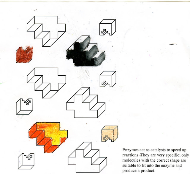
A lot of people thought my compositions were flat so I decided to make them 3D which will make the audience perceive the shape is going to slot into the available space in the cube:


Grid system on Illustrator was really useful for getting accurate shapes and perspective. I used three tones of grey to make the composition look even more 3D. I chose grey because it's a tonal colour that I can use to inspire more colour schemes. Changing the size of the forms create more perspective.

Relating back to the enzyme concept, the composition below consists of 4 enzymes and 4 molecules, however one of the cubes (enzyme) is filled in so the other part of the puzzle (molecule) can not fit in - Emphasising the story in the song. 


The colour scheme was inspired by Sue Doeksin:


Triadic colour scheme is friendly and reminds me of a children's toy because they're primary coloured and bold. This contrasts with the morbid, monochromatic forms around them. 

Expanded on the repeat pattern composition by filling the square template:


There's a lot of opportunity to play around with colour schemes that are pleasing or conflicting.

Started rotating the composition because I like the way the perspective lines create completely new angles. This is aided by geometric and concise the composition is. This may not be appropriate for Tame Impala because they are an expressive band, however I think this would be appropriate for another song. 

More layout concepts:


To make my composition more expressive, like Tame Impala, I cut the shapes out of my monoprints, transferring ideas from both of my concepts:


The tones are very muted and I tried editing them on Photoshop but the different surface textures are expressive but not consistent enough. 

Potentially card print this because there are only three tones and I create a texture that is more consistent. I can print onto different coloured stock using coloured inks too. 

Ausmuteants Album Cover


Monochromatic and minimalist colour scheme reminds me of an old instruction manual which could have originally been for the printer on the cover. A grid system has been used to create the composition because the typesetting is formal and objective. The majority of the composition consists of type and white space but I like how all of it is relevant for a record cover but is put in the context of an instruction manual. 

It would be against Secret 7's specifications if I was to include the title of the track or band but I can still be ambiguous by typesetting the purpose of an enzyme:

Placed the type at the bottom right hand corner influenced by Ausmuteants cover. I didn't place the type in the middle or at the top because I don't want all the attention to be on the text. This would distract the audience from the visual cues. Also influenced by Ausmuteants sleeve was the large amount of white space because it breaks up the content.

This places the concept of enzymes in the audiences head and make sense of the geometric puzzle. This is a very ambiguous concept for a record sleeve, especially for a track that's psychedelic, because it is very simple and geometric. The lack of curves is a shame but I think it's appropriate because it would be harder to make 3D and translate the concept. 

Bob Gill - Forget all the rules about Graphics Desgin


Gill uses colouring crayons in a very childish style as a logo for a children's toy store. This is appropriate for the problem he was given because children use crayons a lot. I would like to translate this medium into my composition because it would relate to learning science in school which is relevant for the video and adds a rough, fuzzy texture. 

The music video for 'The Less I Know The Better' is set in a school and lets the song narrate over the story:


Noticed some illustrations that use the same colouring technique as Gill:


Typeface is commonly used for sports teams and cheerleaders at schools and colleges in America. The colour is applied by hand using simple felt tip pens. This reminds the audience of school because of the texture from the pen and the font style. 


Again, there is a lot of white space and the Illustrator has highlighted certain features of the composition to emphasise the lyrics.

CRAYONS

I used these influences to add colour and also texture to my composition using wax crayons because it is monochromatic and would reflect innate colouring-in at school:


Explored the range of colours and textures that I could create with the crayons. Depending on the pressure, I can create solid blocks of colour or fuzzy, graduated tones. I experimented with different colour combinations that I could transfer into my composition. 


Found the crayons hard to control which makes my compositions look as if they've been rushed. This relates to my 'school' concept because it reminds me of children colouring in with crayons. This is appropriate to the song because psychedelic music is related to the unconscious mind which links to your childhood. I didn't colour in all of the geometric forms because I wanted some to stand out over the others, insinuating an active enzyme and molecule 

I got numerous people in my class to colour in some of the compositions without informing them on my concept. I did this in order to get a range of outcomes from other peoples drawing/colouring styles. 

Enlarged the shapes so that I could colour in accurately:


This allowed me to be a lot more expressive with my colour choices and the textures that the wax crayons create. Using the white over colours was really beneficial for creating expressive lines and blending colours to create texture.

I am glad I tried out this concept because it allowed me to be hands on with materials and make my composition more expressive. 

PRINTING

Another way to add texture and make my album sleeve more engaging is printing, specifically card printing. I have used this technique on previous courses and have become fond of the tone and texture it creates.


Drawing both elements of the design onto tracing paper provided me with the opportunity to sort out my composition before print. I want the larger shape to to look like it fits into the cube because that demonstrates my concept well. 

Process of creating the print template was made easier by the geometric shapes. Taking layers off the card creates different tones and textures when the plate is inked up: 


I know the outcome will be monochromatic but this technique allows me to simply create three tones depending on how many layers I take off. I asked the print technician what card would be the best for this technique and he gave me some useful advice that can save me money. Instead of buying purpose card, using mount-board works just as effectively and is a lot cheaper.  

Outcome:


Managed to get two solid tones and textures that make the geometric easy to recognise. I am really pleased with how accurate I was, especially when cutting the shape. I chose black ink because it contrasts with the white stock which makes the tones and textures stand out. The marble texture is created by the layers of card I took off which makes the composition a lot more engaging than the original outcome. 

Again there is opportunity to work over these using crayon or I can digital manipulate it, however I need to consider what is appropriate and avoid over working it. 


Added Times Regular type into the composition to transfer concepts and produce a combined outcome:


Tried setting the type in the white space at the top left and bottom right. I want to make the most of the space available and made sure I aligned the text in relation to the print to make my composition cohesive. 

I chose Times because of it's formality and geometric structure which relates to the visual characteristics of the imagery. It is also relevant because it reminds me of a school book - Formal type with the purpose of education.


I don't want the composition to be imbalanced and I am struggling to find an appropriate place to set the type because there will be a lot of white space on one side. Some people didn't think the type was appropriate but I think it adds context to my concept which will make the audience think about the meaning of the composition. 

Deleting the background from the scan on Photoshop creates a very flat, white background. I printed out the composition but the paper looked very yellow/creamy. I want to keep the tactility of the paper so put my composition into grey scale to be more consistent in tone and texture:


Reduced the size of the type and confined it as a block of text so that it lined up with the vertical edge of the print and the rag creates a line that is parallel to the perspective lines. This leads the eye from the text to the image. 

Exploring textures has transformed my design and I have been able to use a range of processes and techniques.