Recently inducted into mono-printing which gives me the opportunity to explore shape, colour and texture using a bespoke technique. Mono-printing is a flexible printing technique that produces numerous textures and finishes, depending on stencils and ink. I aim for my outcome to be predominantly hand made, including the imagery and information and printing is a reliable technique that I am confident with. I can also introduce other printing techniques such as lino and screen printing to add more visual information and make my book bespoke.
Here are some examples of my monoprinting:
I wanted to see how the process worked and how I can push the technique to its limits so created random compositions out of geometric shapes. The process was very expressive and creates opportunity for a range of textures and tones.
BINDING
As I am hand making a lot of the visual information by hand, I need to think about how I can put all of my prints and pages together as a book. There are numerous binding techniques that are appropriate for different purposes and stock. It is likely that I will have numerous prints on separate pieces of paper so will need to choose a binding technique that doesn't involve folding paper.
Japanese Stitch
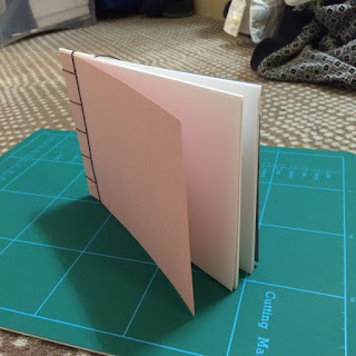
Japanese stitch will be appropriate because I can bind separate pieces of stock together without having to fold the paper in half. This will mean I can put original prints in which will make my publication bespoke.
There are a range of different stitches that can be used which can be nice when the thread contrasts a lot with the stock:
I would like to explore a different stitching techniques because it can make the publication look more bespoke and sophisticated, however I need to focus more about the content and composition of the publication.
Pamphlet Stitch
Very simple and effective way to bind pages together, however I don't think this is appropriate for my publication because I will get too many pagination problems and it would mean I couldn't use my original prints because I'd have to fold them in half.
Concertina
Concertina fold is very simple and using a hard cover/back is good for keeping the publication closed which keeps the publication smart and professional. This type of publication isn't appropriate for my concept because I won't be able to include original prints, unless I printed straight onto the book but that can be impractical.
CRIT
Explained my initial concept of using artists as inspiration for line, shape and texture and then producing my own work to accompany it. People thought this was a good idea because it allows me to express myself and also relate my work to professional practice. It was suggested that when I bind the book, I should use a hardback cover in order to keep the content smart and also add quality. I was asked whether I am going to use digital content throughout my book, specifically for the artist info and I thought I could keep my publication bespoke by screen printing onto the pages, even overlapping the monoprinted shapes with the text.
I will need to use a large paged book so that I can make my publication predominantly visual and concentrate on the composition and page layout. People agreed that I should use one page for the imagery and the other for information.


No comments:
Post a Comment