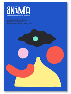
The majority of the publications use binding techniques such as perfect binding:
Perfect binding puts all the pages together, roughens and flattens the edge, then a flexible adhesive attaches the paper cover to the spine. Paperback novels are one example of perfect binding. Booklets, telephone directories, and some magazines use perfect binding methods.
Compared to other binding methods, perfect binding is quite durable and has a low to medium cost. It can be used with publications that are several inches thick.
If I was to choose this binding technique I would have to create a digital file first and use a light stock so that the pages can be turned easily and I get a smart finish. Japanese stitching is the most appropriate for my publication because it allows me to put original prints and compositions into my book and gives me freedom to experiment with what a book can be.
Japanese Side Stitch Considerations
- The stitch takes up around half an inch of space on each page which means I will need to make sure my compositions and written content is placed slightly off centre.
- As I am planning on using original prints in my publication, I will need to print off typography and information on the other side of the page. I can either print the information on one side of paper and then do my monoprint on the other side. This means I will need to choose a stock that is thick enough to stop information showing through onto the next page.
- Another option would be to screen print or letter press information onto the page which will make my publication even more bespoke but it will also be very time consuming, especially for letter press. Screen printing would allow me to print over the top of my prints to create texture.
CONTENT RESEARCH
I want to have some artist's work in my publication as demonstrations of good practice that can inspire people using shape and colour. The predominant theme of my book is going to be based on shape.
Useful article about Doeksen and her work:
Doesken's work is playful and friendly due to the primary and simple colour schemes she uses. I like the way she layers natural and geometric shapes together to create harmonious abstract compositions. Her choice of colour palette is consistently strong for each composition.
The technique that she uses is very simple and I would like to use it more to aid my work. She layers paper cut outs over each other and then photographs them from above using a copy stand which is very effective because it's easy to change the composition. This reflects my original collage concept but is still relevant to my publication and adds another design process and technique so that it's not all about print.
The shapes are block colours and don't consist of much texture which creates high contrast.
I would like to include Doeksen's work in my publication because it is appropriate for the subject and I can use printing techniques and collage to create my own compositions in response to Doesken's inspiration. When I start writing the content for my book, I will evaluate the colours and shapes in the composition in more detail.
Example of how Doeksen's compositions can be placed with type to create posters:
Matisse - Paper Cut Outs
In his late sixties, when ill health first prevented Matisse from painting, he began to cut into painted paper with scissors to make drafts for a number of commissions. In time, Matisse chose cut-outs over painting: he had invented a new medium.
I can use Matisse' Paper Cutouts Book to find information and imagery that I can include in my book. Matisse is appropriate for my publication concept because it uses printing methods and explores shape and colour.
Paul Insect
Refer to PPP blog for details about Insect - Self Branding 1.0
Insect's work could be relevant for my publication because he explores shape, colour and texture using figures and faces as his subject. Unlike Matisse and Doeksen, Insect includes facial features such as the eyes and nose which is similar to a collage. Insect uses a range of textures that I can transfer into my monoprints.
CONTENT:
- One print per page of purely just texture - Provides opportunity to die cut/laser cut shapes out of one page to reveal information below.
- Background info about artists and then info about work, etc
- Explain processes of making artists work
- Explain monoprinting
- Quotes about printing or artists work
I haven't typeset a large amount of text and I am excited to explore more contemporary layouts based on my research.


No comments:
Post a Comment