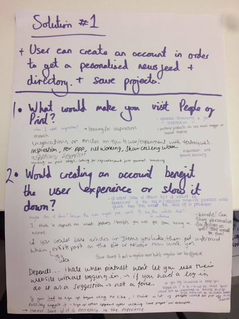
Solution 1:
'User can create an account in order to get a personalised newsfeed and directory and save projects'
People thought the concept was useful because sites such as It's Nice That and Creative Review have no way of saving projects that are of interest and want to be referred back to in the future. However, in order to allow people to save projects and articles, they'll need to create an account which can hinder and obstruct research.
What would make you visit People of Print?
The general consensus was that they use the site for looking for visual inspiration and research to do with print media. This outcome wasn't surprising and confirms that People of Print's content is relevant and useful for research. However, it was mentioned that the site was used to buy products advertised on their social media site. This highlights the importance of the 'shop' category in the menu bar. At first I was considering whether to remove it from the main navigation bar as it doesn't aid creative research and distracts the audience, however the shop draws in its target audience.
Would creating an account benefit the user experience or slow it down?
A lot of the feedback wasn't specific which could be due to how I worded the question, however it created an interesting debate. A lot of people thought creating an account would put people off visiting the site as they are looking for immediate visual information and will want to see the site before they create an account. However if the sign up process was very quick and easy and the website remembered the password then it wouldn't obstruct the experience. The general consensus felt that the sign in shouldn't intrude on the users ability to visit the site but it would also benefit the experience because people liked the fact that the site can be personalised depending on the users interests and previous searches. It was suggested that the site can be available to anyone and in order to access the personable features the user would have to create an account. A suggestion that I found really beneficial would be when the user tries to save a project without an account it would automatically transfer them to the sign up page.
Another concept that was created whilst discussing this was to give the user an incentive to sign in. Companies such as Spotify remove adverts when the user signs up which gives people more motivation to sign up and pay for it. By giving the user a motive to sign up, the sites engagement with the website will be improved. To achieve this, we brainstormed ideas:
- Sign up to get no adverts
- Sign up to get a personal account
- Sign up to view further information - Making the site completely visual, with no type whatsoever will intrigue the audience due to the contemporary work displayed but the audience will need to sign up in order to view all the images from the project and written content.
It was also clarified that people wouldn't mind signing up to the site if it was a one time thing and the computer remembered your password. This is also dependant on how often the site is visited as regular users would find an account more useful than someone visiting it occasionally. This is where the motive to sign up becomes apparent.
Perhaps just using the images, with no type or further information would immerse the user with the content allowing them to see if the site is for them, and they would have to quickly create an account in order to see further written content explaining the projects.
Perhaps just using the images, with no type or further information would immerse the user with the content allowing them to see if the site is for them, and they would have to quickly create an account in order to see further written content explaining the projects.
Solution 2:
'An interactive and immersive interface that makes navigating the site as inspiring and engaging as the content'
As this concept was less developed, I struggled to think of specific questions that would benefit my decision making process. Therefor I simply asked for suggestions on how I could achieve this.
- Iconography
Using icons instead of typography will engage the user. If the icons were inspired by the tools used in print it would immerse the user more and stimulate positive responses. This suggestion can feed into concept 1 also.
- Take advantage of design for screen capabilities and use GIF's, animations and interactive features.
- Focus on images
- Increase legibility by changing the typeface and size - This was highlighted as one of the main problems with the site.
Which concept would benefit People of Print? Why?
It is evident that I should have prepared for the crit in order to get more objective feedback, especially for concept 2. I received a lot of mixed feedback as everyone drew positives from both concepts. The general consensus was that idea one would aid their research and inspiration, however putting emphasis on making the site interactive and immersive. By combining the two concepts together answers the brief, however I aim to focus on making the user experience fluid and immersive which will fulfil PoP's objective to inspire and educate.


No comments:
Post a Comment