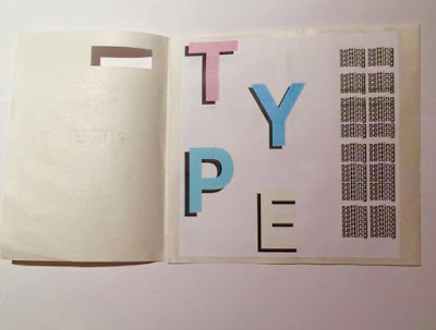
As a response, I began by experimenting with a simpler concept so that I could gain some experience with creating a publication:
Type Setting
This will allow me to be more expressive with type and give examples of different 'rules' to typography.
Came up with an interesting fold that could work well as a leaflet or small publication about typesetting:
I cut a window in the cover to reveal information underneath it. I kept the window small so that it was a block of colour or suggestive shape beneath it that would make the audience want to pick it up and reveal what's inside.
The publication opens up to reveal 3 large sections and one small. There is also opportunity to put information on the back of the publication.
Want to be expressive with the type to demonstrate to the audience how far you can push the use of typography in a post-modernist style. For 'TYPE' I used pastel primary colours because they are friendly and create a soft tone. I layered each character over a black character so that the colours stand out and look 3D. My current
The window reveals the top of the 'T' but I think I should have cut the shape of each letter out because the window is too small. This would reveal the type and if I had a heavy weighted paper it would be more robust and there would be less of a chance of it ripping.
When the publication is closed, all that is visible is the layered 'setting' which is intriguing and demonstrates how you can create texture with type but it can still be visible.
Making a prototype and printing an initial concept allows me to get a rough idea of how the publication will look when printed.
I aim to explore more concepts and introduce more techniques to push the boundaries of what a book can be.


No comments:
Post a Comment