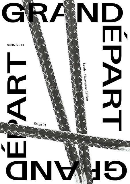
Aimed to mockup the design with the tyre scans:
Inverted image:
CONCEPT 1:
Looked at the French type foundry Velvetyne Type Foundry
http://www.velvetyne.fr/about/
Discovered the typeface Sporting Grotesque designed by Lucas Le Bihan. The inconsistencies throughout the typeface such as the stretched and cut letterforms make it contemporary but still highly legible. This would be appropriate for the context of cycling because cycling is a contemporary sport that carries a lot of aesthetic values into editorial.
Took Sporting Grotesque into my initial designs. VTF provide examples of the typeface at work:
Contemporary/experimental examples:
Formal example:
Seeing how the typeface works in different contexts gave me confidence to go forward and give cycling a contemporary edge:
Used the iconic phrase 'Grand Depart' as the main title because it defines the Tour de France and the event from Leeds to Harrogate. Setting the type horizontally and vertically was influenced by the fact that the cyclists have to deal with a variety of inclines, one of which in the Yorkshire Mores is the longest incline road in the UK:
High impact image from the edited scans aims to draw attention to the poster and inspire curiosity.
Experimented with other tyre prints:
Framed the artwork by repeating the statement which can be replaced by other information such as the date of the event. This further illustrates the change in altitude and also direction. This makes the image in the centre of the composition the main focal point:
Took the tyre print scans forward to make the composition look like it has been cycled over. I added further information to run alongside the tyre tracks to further communicate movement:
Applied some basic TDF colours to the composition as an initial experiment because I am aware that the current poster doesn't communicate the TDF. If I am to take this concept further I will accurately select the colours from the current branding.
TEST PRINT
The tyre textures don't work very well once they have been scanned in and then reprinted digitally. This also goes against the brief requirements because it must be printed manually. In this case I aim to rethink the design process and consider other printing techniques.
Started to overdevelop the concept and reached a dead end so moved onto a different concept to take a traditional approach. I can them compare my two opposing outcomes through feedback and crit sessions to see which concept to take forward.
From previous research I identified that the traditional artistic posters from the 60s used a combination of type styles to create contrast and hierarchy. The text is often set in italics to suggest the movement of the cyclists.
COLOUR
Took influence from my research into Paul Smith's cycling jersey collection to inspire the colour palette:
Black
Blue
Red
Yellow
Green
These are also the colours used on the cycling jerseys that the cyclists are aiming to take ownership of, therefore I took these colours through in order to add some colour and make it recognisable as a cycling poster for the TDF.
Onyx
As my research into cycling posters and editorial design showed a range of typographic styles, from serif, sans serif, script and oblique, I decided to move away from Sporting Grotesque and develop a new angle to take forward into a crit.
Using a serif typeface creates authority and sophistication. Selected Onyx because of its narrow structure which compliments the portrait page. The condensed structure risks being illegible, however the serifs make it easier for the reader to register the characters.
Combining serif with tyre prints:
The traditional typeface in combination with the expressive print evokes contemporary and I could see this within an exhibition/gallery context.
Typographic Composition
Increased the size of 'Grand Depart' so that it takes up the entire composition. Stretched the letterforms for 'Grand' vertically in order to give it even more authority and impact.
Considering the accent on top of the 'E' I made sure I left an equal space, however I don't think it is obtrusive at all.
Added the tyre print scans:
Colour
I removed the black strip from the colour scheme to allow the black type to be legible, however the dark tones of blue and green make the black type hard to see due to a lack of contrast.
The complimentary colour scheme is a more eye catching solution, however it is a shame to lose the tyre prints. I aim to get feedback from my peers and tutors as to which concept to take forward.
This concept would be hard to take into traditional print because it would require 6 colours.
If I was to take this concept further into screen print, this would be very time consuming and would rely on a lot of accuracy making sure that each strip of colour was placed consistently straight and in precisely the correct position.


No comments:
Post a Comment