1
2
Gained a 50/50 split between the two designs and people were indecisive about which concept they preferred. I am pleased both designs gained such a positive reaction however I can only submit one poster. It was suggested that the first example communicates cycling due to the fact that I have included the colours from the TDF cycling jerseys and the traditional serif typeface works nicely with 'Grad depart' because the serifs give it presence. For option two it was highlighted that the poster was more appropriate for a conceptual outcome for a contemporary context. Whilst I have identified that cycling does have a place in contemporary design, I feel I should choose option 1 to take forward because the typeface gained such a positive reaction.
More people however said it would be a shame to lose the tyre prints so it was suggested that I took them into screen print in order to add colour to them:
Although my feedback concluded that I should include the tyre prints, I wasn't confident with digitally printing the tyre scans because I was conscious that the brief requires traditional processes.
Some more feedback suggested that I should remove Helvetica and replace it with Sporting Grotesque to make the composition contemporary. The sans serif typeface also increases legibility which is important for small point sizes.
Adjusted the kerning and tracking of the type to make sure it was completely sound before taking it into screen print.
MONOPRINTING
Decided to look at printing methods other than screen print.
Mark David Spengler
Spengler is currently a design student at State Academy of Art and Design Stuttgart who produces small print runs using risography and screen print. The posters and zines contain geometric shapes and simple colours to create contrasting compositions.
The simple shapes can be transferred into monoprint which allows me to work autonomously with shape and colour.
Monoprinting:
Monoprinting is a flexible process that can be adapted and manipulated in numerous ways. In order to get separate shapes and include at least 4 colours, I decided to cut stencils out of sheets of paper.
Brainstormed some shape compositions inspired by Spengler and cycling:
The curvaceous shapes convey the inclines and declines of the cyclists
Diagonal lines suggest movement
Took inspiration from helmets, hills, mountains and mechanical parts of the bike such as the seat, handle bars and wheels.
Layering the shapes will blend the colours due to the opacity of the ink.
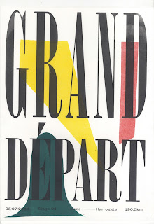
I decided to experiment with the monoprinting process to see if it capitals the tyre relief print. The abstract and curvaceous forms aim to sit in the background creating contrast with Onyx's tall grand characteristics.
Screen printed the type over the monoprints:
Stock:
Two different stocks so that I can compare the printing finish on a vintage and contemporary stock.
- Heavy newsprint - Slightly off white to lower the contrast and create a vintage feel.
- 125gsm cartridge paper - Purer white to increase impact of colour and contrast.
Monoprinting Process
Worked autonomously with the monoprinting process because it gave me the freedom to explore a range of solutions. As I am printing three colours, I printed a series of 11 using red and then layered the other colours through another two series of green and yellow. This method of printing made sure that the ink didn't dry out however it made it hard to plan out the composition. I enjoyed working in this way because I had to make decisions quickly confidently when deciding on the shape and position of the print.
When printing the shapes, I had to make sure that I masked any areas that I didn't want printing in order to get a professional and clear finish.
The shapes that I created were influenced by cycling, however due to the autonomous nature of my approach, a lot of the shapes were abstract and hard to interpret.
As I am screen printing directly over the top of the monoprints, I mixed the oil based inks with a drying agent to speed up the drying process so that I could screen print directly onto them.
Screen Printing Process
Screen printed the type directly over the monoprints using a registration sheet to make sure all of them were uniform and centred.
Thinking about it, it would make more sense if I had screen printed the type first and then mono-printed over the top because I would have had a better idea of where each compositional element could be. However sketching out some mockups and referring to a test print of the type was a useful aid.


No comments:
Post a Comment