Friday 27 November 2015

Wayfinding 1.2

Visited The Corn Exchange because of its famous architecture and prestigious and unique shopping experience:


Immediately noticed the lack of wayfinding signage from entering the shopping centre. The only signage visible were the fire exits and the large plaques above the shops stating its name. This creates opportunity to produce an appropriate wayfinding system using informed decisions from The Corn Exchange. 


I understand why The Corn Exchange haven't produced wayfinding to print and display around the shopping centre due to how treasured the building is. It could risk spoiling the classic interior, however I think it would be helpful to have a wayfinding map at the entrance so that visitors can see which shops are on each floor. I was surprised by how many shops were on each floor and due to them all looking identical, it could be hard to find a specific shop. 

Previous to this occasion, I visited The Corn Exchange because I received a flyer saying there was a film camera store. When I went, it was hard to establish which floor and where the camera store was because each store looks identical. A map inside a flyer or on a board at the entrance would be really helpful. I understand that a lot of visitors go to browse to original decor and architecture but it would be very useful to aid a shoppers experience. 

From this experience, I think The Corn Exchange would be a suitable location to create wayfinding for because it is lacking guidance for visitors. However, I need to make sure the style is traditional and suitable for the location. I will need to use successful informed decisions from deeper research to successfully create a composition that benefits this specific location. 


The lack of wayfinding pictograms is intriguing, I could add these to the floor plan and signage around the building. Common pictograms are the arrow, female and male toilet, disabled and no smoking. 

There are no leaflets or flyers that I could see when I entered which was surprising because a small publication about the history of the building and what shops they have would benefit the visitors and increase attention. 

The corn exchange has three floors:

-1: Events Space

G: Shops/Cafe

1: Shops

I need to make sure the wayfinding successfully guides customers around the shopping centre, but also make it appropriate for the building. 


I noticed that there were at least 20 shops on the ground floor, which was more than I expected. The oval shape of the building is emphasised by the domed ceiling which I could take into my initial concepts. 

Wednesday 25 November 2015

Wayfinding 1.1

Studio Matthews - EMP Museum

Emp_7

Studio Matthews has created a wayfinding solution for the EMP Museum. In order to successfully guide guests around the museum, they have used a bold numerical character to represent the floor the guests are on and changed the scale to suggest what level is above/below. This clarification will give the guests confidence to navigate independently.


The arrow acts as a visual guide for the audience, even though the weight of it is narrow, the diagonal line suggests movement. 

I took advantage of Photoshop in order to produce a mood board using  sources that I found on the internet:


Taking reference of colour, shape and line, this is a successful technique for gathering preliminary research. The predominant colour palette that I have found is primary which keeps the instructions simple and easy to interpret for the audience. The use of arrows and line are minimalist and allow the audience to follow. I like the concept of using different types of line, for example zigzag or straight and changing the weights. A key could be used to direct people to a certain part of the building. 

Noticed wayfinding is predominantly on walls and large boards. Interested in the more conceptual design such as displaying on the floor, ceiling, glass panels using vinyl or even in a leaflet. 

Leeds Art Gallery/Henry Moore 

To broaden my research, I visited Leeds Art Gallery and the Henry Moore institute to see what wayfinding techniques they use to guide their guests.


Signage was common throughout the gallery, however the type and pictograms were very small which means the audience had to 'look' for the signage, instead of being influenced by it. I think this may be because of the context, in a gallery the visitors are there to look at pieces of artwork on the walls and around the room so signage is kept to a minimum to avoid distracting the public from the artwork.  

Arrows were predominantly used to direct visitors around the gallery which was extremely clear and effective. An arrow is a good example of a pictogram because it is internationally recognised to indicate direction.


Other pictograms as seen above are also internationally recognised. Even without the type, the pictograms have become so commonly used, people interpret them unconsciously with the semantics of the toilets. I like how clear the instruction on the plaque are as the arrow is at the top which informs the audience that the typography below relates to this arrow. However it could become confusing if there were numerous instructions and arrows on the plaque. The type of arrow around the gallery was inconsistent due to some having a horizontal line joining the directional line and some just having the directional line. This didn't effect how effective they were but made the signage inconsistent. 

My favourite piece of wayfinding was in the Henry Moore Institute:


The simplicity of the layout and content makes this really easy and quick to interpret. The floor level is numerically labeled and I like how they have capitalised the 'G' and 'B' to represent 'Ground' and 'Basement' because it keeps the overall composition consistent. Subtly changing the blocks of grey is a useful and tasteful way of showing the audience which floor they are currently on. The typeface is Times which is appropriate for the gallery as it is very traditional and sophisticated. The zigzagged line is representational of stairs which isn't necessarily required but it creates cohesion between each line which makes it easier for the audience to follow. 

The floor plan inside the gallery was a useful guide, however the small scale meant it was hard to read from far away, mainly due to the small type. I think this would be better suited for a leaflet or guide for the gallery as it'll be useful for personal use:


The Light

Visiting The Light shopping centre in Leeds, allowed me too see signage and wayfinding techniques that weren't as effective. 


Although the title and pictograms are visible, the light font style made it less legible especially because it was hanging from the ceiling and from a distance. This isn't easy to read because it's so far away and the type is minimal. The font style isn't very serious which creates a friendly tone, however a more geometric typeface would be clear from such a distance. 


Another example of how pictograms and type work together as efficient wayfinding, although the baby blue type doesn't contrast enough with the white background which makes it hard to see from a distance.


A really simple guide to the floor plan that allows the audience to find a point of reference and navigate around that floor. The style again is very friendly but the colour scheme and typography seems immature which is appropriate for this context but I wouldn't like to replicate this in my wayfinding. 

Tuesday 24 November 2015

Design Principles Publication 1.0

I aim to gain experience with producing a publication, providing information on design principles. To determine the type of publication I want to produce, I researched into current publications that I am attracted to and can use to influence my concepts.

In terms of content, I aim to choose whether to explain all design principles or choose individuals:


  • Gestalt Principles
  • Colour Theory: Systematic Colour
  • Colour Theory: Subjective Colour
  • Grids
  • Figure/Ground
  • Balance
  • Alignment
  • Proportions
  • Canons of Page Construction

In order to make successful informed decisions, I visited The Village Bookstore in Leeds because they sell a plethora of publications from magazines to zines, spreading over a range of genres and themes. 

The Plantation Journal Issue #3


Format: Classic Tabloid
Size: 28.9cm x 38cm
Printing: Full colour CMYK print. Unfolded and Unstaples
36 pages 

Visually stimulating due to the limited amount of type and predominant white space


Looking at the content, there is a lot of white space which makes the publication very light and pleasant to flick through.

Printing on recycled paper is a cheap alternative which is beneficial for design and the world. However, on some pages I think there is too much white space and the images feel lost. I understand this may be in order to stimulate the eye to move around the publication but if there was more type it would give the imagery a sense of place. 


Fantastic Man

I looked more into layout and materials than the information and content the book provided so that I could inspire new ideas for my own publication:


Double page spread is visually stimulating due to the contemporary layout and devision of text and image. The large image in relation to type is appropriate for Fantastic Man because it's a visual magazine and the images support the type. 


Table4Ten


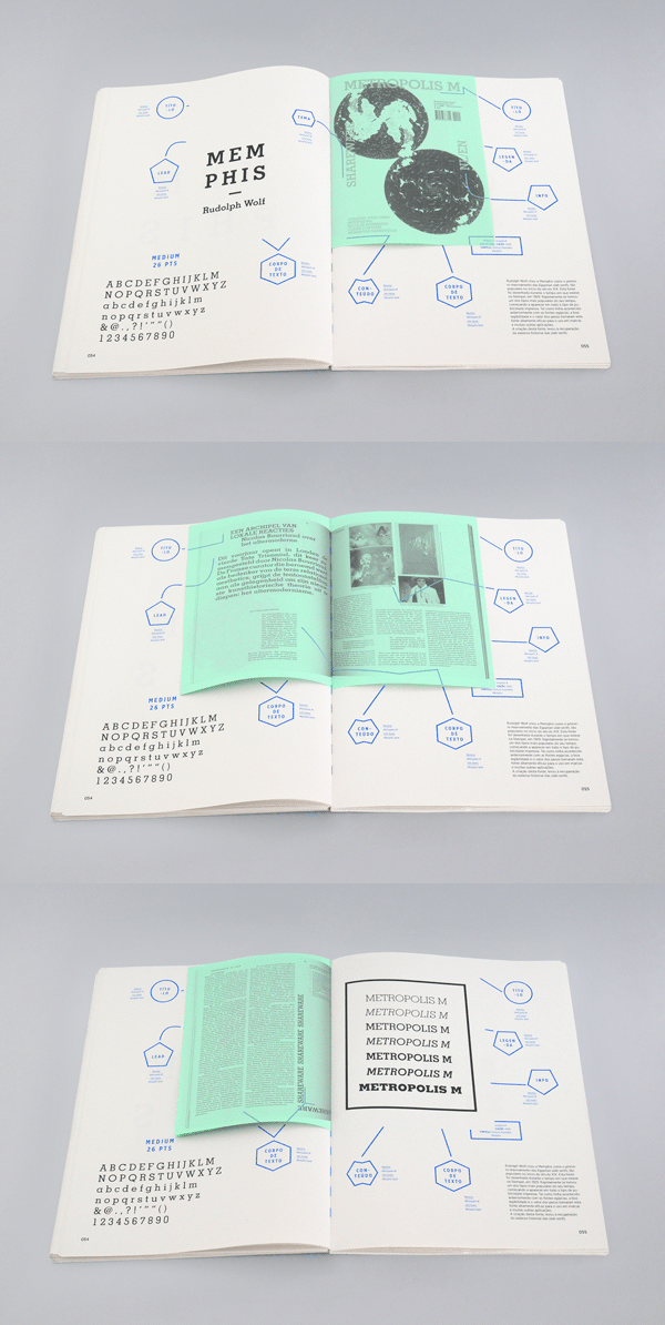
Interesting concept to cut through one page which will reveal the page below. Allows opportunity to combine subjects and imagery. If I was to take this idea into my own publication I will need to think about printing and cutting quality so that my publication is professional. 

Critical Dialogues 


Specifically type based double page spread. I really like how the size of typography highlights the key point of the article. The bottom half of the publication is spread across the double page as if it is a title which allows the subject from the text to be backed up. The overall layout and spacing of the page is extremely clear and harmonious and I like the contrasting font sizes. 


ASTRAEA


Created by Laura Pol, Astraea is a handmade publication using screen printing, photography and book binding techniques. Some sections of typography are screen printed onto the imagery which is why they are layered. It could be argued that the publication looks disjointed and random, however I think the inconsistent type application allows the audience to view each page independently, thus making it stimulating to read. 


The purpose of this publication was to showcase photography and poetry which is why I think Pol has been radical with her design decisions to emulate the poetry. 
I would really like to experiment with hands-on techniques such as printing so that I can push my ideas further and work independently.  


What-Not


This What-Not publication is very conceptual and takes advantage of what a book can do. The subject explores different typography but presents it in an interactive and visually interesting way. Books within books, flaps and clean, crisp layout make What-Not inspirational and I would like to experiment with some of these concepts in the future.


Wayfinding 1.0

Considering legibility and user experience, I aim to develop a navigational system that effectively guides and aids a user through an environment. I will research into points of interest around Leeds to see if I could benefit the location using successful wayfinding design techniques.

Pictograms 

In our culture, we use symbols to warn, guide and protect, these are called pictograms. Pictograms use simplified imagery to convey a message. Successful pictograms are internationally recognisable, for example: 


Pictograms are very simple in shape and colour to make the message quick and easy to recognise and interpret. This will be a useful tool to explore when I begin my initial concepts because it's a simple and effective way to communicate.

It's important to think about semiotics when creating pictograms. The semantics of a sign is dependant on context, knowledge, society and culture which I will need to think about in order to inform my design decisions. Pictograms are extremely effective for breaking the language barrier. The toilet sign for female and male is instantly recognisable internationally and it would be a lot harder to interpret if it was purely typography.

Syntactics needs to be considered because the colour, shape, position and scale are all very important factors of design. Pictograms usually consist of just one subject on a monochromatic colour palette so it's important the syntax is consistent. 

Margaret Calvert and Jock Kinnier

Calvert was a design student when she was approached by Jock Kinnier to produce road signage. 


Initiated by the boom of transport and motorways, Kinnier and Calvert redesigned signage to suit drivers and passengers driving at higher speeds. The radical change replaced full uppercase type and replaced it with both lower and upper case. 'Transport' ultimately made the signage easier to read due to the carefully considered size, kerning and tracking. Kinnier and Calvert have taken the responsibility of the task seriously in order for people to travel safely and efficiently which is why the signage is still used today. 

After watching an interview on Creative Review's website, Calvert puts the task at hand into context, specifically at 3:50: http://www.creativereview.co.uk/cr-blog/2013/november/margaret-calvert-interview/
I think this is an important value to consider when producing graphic design because it creates objective, informed decisions. 

Pragmatics 

The study of the way in which context contributes to meaning. 

Indicative: 


Here, an image of a 'smoking area' sign. The pictogram inside the circle suggests smoking but considering the syntactics and semiotics it allows the viewer to decide whether they want to smoke or not, depending on their lifestyle choice, etc. The black and white colour palette doesn't suggest danger but is more informative for the audience.

Imperative:


The subject, in this case the cigarette, is crossed through with a red line, suggesting danger or caution. In this context, the audience is instructed not to smoke. In a road sign context, the concept is transferred:


Keeping the same concept throughout different contexts helps the visual language grow and become more and more recognisable. It is the simplicity and clarity of signage that makes it successful and it is reflected here in a completely new context. The strong diagonal line visually forces the imperative instruction onto the viewer. Road signage needs to be imperative because it is for road safety. 

Suggestive:


The cigarette inside the lungs suggests it's a health related sign but I think this relies more on context because it would be taken more seriously in a hospital or health pack. 

It's important that I use the correct shape for signage because it can connote different meanings, particularly with road signage.

Tuesday 17 November 2015

Canons

Proximity/Unity
Alignment
Repetition and Consistency
Fibonacci - 8:13
Canons - Principles of page layout design used to measure and describe proportions, margins and print area.
Van de Graaf - Famous, divides up page
Tschichold - Golden canon, Octavo

Rules of graphic design:

  • Communication
  • Kerning
  • Readability/Legibility
  • Hierarchy
  • Layout
  • Connotation
  • Grids
  • Target Audience
  • Colour palette 
  • Avoid Widows/Orphans 
  • Print medium 
  • Objective Design
I believe the main focus of graphic design is to communicate to an appropriate audience. It is important for designers to have rules to follow so that designs are consistent and legible, however I feel that some of these rules should be broken or changed in order to push design further and break boundaries. I personally like to follow the rules and then work back into the composition, breaking rules and changing the design. Although there are rules to design, at the end of the day a designer needs to trust their eye.

Sunday 15 November 2015

Typeface Design 1.6

Evaluation

The main purpose of this brief was to create my own bespoke typeface that would effectively communicate my adjective, 'narrow'. Looking up the definition of 'narrow' and fellow synonyms inspired my concepts to grow and interpret the brief from new angles. I was limited by Müeller Brockmann's nine typefaces and I found researching and analysing each one time consuming, however really useful because I realised how subtle changes to typography can connote different personalities. Having Müeller Brockmann's typefaces as a benchmark also helped me to make informed decisions which ultimately made my design decisions efficient. I found sketching out initial concepts useful, however I couldn't be very accurate when drawing by freehand so to solve this, I used tracing paper to mirror the original typeface and then accurately adapt it. Choosing between Bodoni and Univers was challenging because I like the contrast that I could create with a serif typeface, however Univers was ultimately a lot more balanced which meant I could experiment with more concepts. 

I found creating my own manifesto challenging, especially because I hadn't created my typeface yet, but I knew it would give me some guidance and purpose for my typeface. I tried to sell my typeface, instead of just describing it, so that my audience could see why it's successful and how it could benefit them.

My key influences were useful because they allowed me to see what context condensed typefaces were used in. I found they are usually presented on large scales such as headers and titles. This influenced my design decisions as I wanted my typeface to consist of bold line so that it would impact an audience and be legible on smaller scales. Design Monsters' header uses a condensed typeface which took advantage of the space available. I liked how consistent the height and width of the characters were and I wanted this to be reflected in my outcome. Galaxians' header was influential as it allowed me to see how a serif typeface could be condensed to look balanced and consistent. My research influenced me to produce an upper case typeface because it's predominantly used for headers and commands the reader. 

Predominantly using Illustrator as my design tool was extremely useful and it allowed me to be accurate and broaden my skills with the software that I can transfer into other projects. The initial sketches pushed my idea generation, using tracing paper allowed me to accurately manipulate the original Univers Ultra Condensed. Using inspiration from my research, I decided to 'squash' the type so that it was condensed. In order to visually portray this, I 'bent' the cross bars and ears of characters. Each character consists of different elements that are available to adapt and I wanted to keep my typeface as consistent as possible. 

I struggled to keep the width of line consistent throughout each character which I think is my main downfall. During the final crit, this was picked up on numerous occasions, specifically 'M', 'W', 'X' and 'Y'. However, people thought that the consistency of the stroke made the typeface more assertive. During the final crit, it was suggested that I should evaluate consistency optically, instead of measuring which mean I need to become confident making decisions based on visual comfort. 

One of my primary aims was to produce a concept that was visually consistent throughout all characters. Feedback from my crit suggested that I did this successfully, however some people didn't like how the manipulated cross bars weren't consistent in direction. This was a shame because I'd experimented with different directions for the 'B' and decided it needed to be diagonally down in order for that specific character to look visually strong and legible. The crit was a really useful opportunity to gather feedback on what context my typeface would work well in. I got a broad response which I am pleased about because my manifesto states, 'It is a transferable typeface that creates different connotations, depending on aspects such as the kerning which makes WidthRelation a dependable and adaptable typeface.' It was suggested my typeface should be used on a fashion label because it's high impact content is appropriate and evokes sophistication. I am pleased with this feedback as the condensed structure would also allow more type on small clothing labels. Other suggested contexts were film posters, magazine title and even a soviet 1930s movie poster.

It is evident that my 'squashed' concept was successful as people thought it was unique, bespoke and emphasises how squashed the characters are. I am really pleased my typeface is still legible on smaller scales which would be useful for subheadings and I feel I achieved a goal for this brief. 

Friday 13 November 2015

Typeface Design 1.5

It is a shame that some of my manipulations aren't consistent with other concepts that I've had for individual characters and they don't always work in confined reality. This has made me want to make subtle changes to my original typeface as my aim is to create a consistent, legible typeface. 

I have highlighted some characters/sections that I feel need to be further adapted:


Adjusted the width of line to some elements of the type so that the line was consistent. I made the line thinner so that the type had room to breath which makes it easier to read, particularly on large and small scales:


I am pleased that my typeface is legible when it's small as that was one of my primary aims for this brief. Reducing the width of line allows more space for compact characters which makes the type legible and balanced.

Thursday 12 November 2015

Typeface Design 1.4

Draft One:


It is clear that some of the line width is inconsistent throughout my alphabet. Very condensed letters such as 'M' are almost too compact and I feel I need to make them slightly wider. It's a lot easier to see aspects to change once all the characters are presented together. For some characters, such as 'I', 'J' and 'O', I haven't manipulated the structure much, just made the line narrower and condensed it. If I have enough time I would like to look back at these characters in order to make my typeface consistent across all of the characters. 

Here is the original Universe Ultra Condensed typeface in relation to my adaptation of it:


I have clearly created a narrow structure in relation to height and width and I am pleased with the flow of the typeface. The thinner lines make it easier to compact the characters together which could be useful when saving space. 


Although condensed typefaces are predominantly used for saving space, I increased the kerning to see how it compared to very close kerning. I feel it could be used for film posters due to its ability to work with narrow kerning or large spacing. I like how different connotations can influence an audience, just from manipulating the kerning.

I aim to adjust the width of line which may influence how much I can adapt the typeface as characters such as 'N', 'M', 'S' and 'Y' are still a bit too large in width. If I change this, I feel that my typeface will be a lot more consistent and balanced. 

Typeface Design 1.3

Progress and Review

My concept is beginning to be transferred into each character but I need to make sure the width of the line is consistent throughout. I want my typeface to be dependable and versatile, which isn't common for a condensed typefaces, but I hope if I continue to use a medium width it will be able to work on smaller scales. Looking at type in more detail, I realised that characters aren't always the same size, this is clear when looking at 'W' and 'E'. I need to bare in mind that the overall width of a letter can be different but as my typeface is predominantly vertical, I will only need to subtly change it. I am pleased that I have managed to transfer the same structure and angled line throughout characters such as 'B', 'R' and 'P'. 

Narcos

Narcos is a Netflix Original series that uses a condensed typeface so I replaced my typeface with the original.


The original typeface is written in Univers Ultra Condensed, the same typeface that I am manipulating and I am intrigued to see if my alterations will reflect a different personality to the title. 

Wednesday 11 November 2015

Typeface Design 1.2

Feedback

During the crit, people thought the sans-serif typeface was the best option because it's balanced and leaves more scope for alterations. The condensed concept was 'visually very strong', especially with the angled crossbar which reflects 'narrow' well. The main criticism was for the lack of examples for each concept. This made it hard for others to give me feedback as there wasn't much to critique. The reason for this was because I was still teaching myself digital techniques in order to smarten my initial sketches up. In some cases, the width of the characters wasn't completely consistent so I will need to make sure I am accurate. 

Development

In order to become accurate with stroke, I used tracing paper which allowed me to accurately change elements such as the cross bar by hand and then scan it in to Illustrator to smarten it up: 


The stroke is a lot more consistent through A and B, however the width isn't consistent enough for the C. I decided to bend the crossbar on the B diagonally down instead of up because the bottom bowl needed to be taller and the same angle as the upper bowl. 


I thought about creating a diagonal line towards the top and bottom of the bowl but I thought the shape was very similar to the B which makes my concept transferrable. Tighter curves on the bowl were hard to trace but I made the stroke smaller so that it was consistent with the rest of the characters. 

I thought a lot about how I could manipulate the E due to the fact that it's not a closed character. The arms and the ear can be manipulated in so many ways but I needed it to reflect my concept and be visually strong: 


I felt the centre ear looked forced and imbalanced when angled up so I tried squashing the centre which was balanced and could be a recurring characteristic for unclosed characters. I only squashed the centre ear in order to keep it balanced. I experimented further by curving the top and bottom of the stem as I thought this would make the type flow better. I associated it with the shape of the B, however I felt like there was more I could do with the centre line. 


Eventually, I decided to go with the above. By simply narrowing the lines and cutting down the centre ear made the character friendlier and confined. 

'L' is another open character that I struggled to transfer my concept to. I previously created the character 'J' by condensing the descender and I thought I could mirror this character to make my alphabet transferable. The curved descender works for the 'J' because that is a normal characteristic, however using the same concept for the 'L' makes it look lower case. 


To overcome this, I reverted back to the original typeface and went for a geometric approach because an L normally consists of a tall stem and a right angle, followed by a shorter terminal. I angled the terminal because I thought it would make my alphabet consistent with the rest of the typeface, however the angled line is too tall which reminds me of an upside down 1 and makes it harder to read:


Reverted back to the original character but narrowed the line and cut off the terminal at an angle :


I felt the terminal was too short and the cut off angle wasn't consistent with the rest of my characters. I resorted to sticking to the original typeface, narrowed the width of the line and gave it a beak. I like how geometric the shape is and I feel it resembles the 'squashed' concept with the beak which almost turns it into a serif typeface: 


Example of how I manipulate the typeface using Illustrator:


Lowering opacity allows me to see my own line in comparison to the original. Traced accurately around the outside, however I made the bowl bigger so that the width of line was thinner and accentuated its height. 


Manipulated the tail by angling it up instead of horizontally to confine the character. 


Filled in the contours to make it bold and easier to read on a range of scales.