Evaluation
The aim for this brief was to create an informative leaflet based on a public information film, taking into account relevant research to produce informed decisions. I researched a lot into the subject area of the video which gave me a lot of scope for content. DirectGov was the most informative source I found, predominantly due to the 'THINKBIKE' campaign as there were a lot of recent facts and figures. I used a lot of research from OUDG404 because I'd looked into a lot of publications and layout techniques in that module which I was able to transfer into this one. Although I did research into different types of leaflets and folding techniques, it would have been beneficial to have found some leaflets to critique based on content, tone of voice and layout.
I decided not to use a generic fold such as the basic gateway or concertina fold because people get those posted to them on a regular basis and I didn't want my leaflet to be mistaken for a takeaway menu. I made the shape to be square because it made the designing easier and is also balanced. My research into different types of layouts and folds was a big influence, especially the farm safety publication because it was made for the same purpose. I became inspired by how a simple fold can make the leaflet so much more engaging and thought provoking.
The structure of my leaflet made placing the information into the document harder than I thought because I had folds and different sizes flaps. I had to make sure my measurements and information was all the right way round which was helped by me printing the publication off so that I could mark what side will have information on the front and vice versa.
I still don't feel confident that there is enough information as I wanted to give an advice section on how to avoid having an accident. However, I struggled a lot with the limited space and size so made the type and imagery bigger in order for it to be visible when printed to scale.
This project made me think about the delivery of the information which informed my design decisions, especially for the choice of stock and leaflet design. Unfortunately I was unable to produce the leaflet complete with the strip of card to rip off due to a lack of time and experience, however this concept was influenced by thinking how I can deliver my information to the target audience.
The target audience for my leaflet is extremely broad due to the huge age range that are motorists. Originally I was going to cater from 17-70+, however based on my outcome I think it is for 17-30 due to the friendly colour scheme. The QR code and the social media websites is also aimed at a younger audience. This is relevant because young drivers are less experienced, therefor more likely to have a crash with a motorbike.
I don't think I planned enough before putting the information into the leaflet because the layout on each section seems very random and disjointed. I experimented a lot with different variations, using grid systems, but i'm not used to working on such a small scale. As a result, I kept it simple but there is still a lot of white space which makes the information easy to read however the overall composition looks disjointed.
I found creating the infographics very time consuming, especially when I had the leaflet and content to make too which is why I have only produced one example. However I enjoyed researching into it, especially 'Information is Beautiful' as it gave intuitive examples of how huge amounts of information can be presented in a clear and concise way.
Organising numerous crits was useful because it allowed me to get feedback at different stages of my creative process. This informed design decisions backed up by my research. I need to ask more specific questions about my work, especially colour, instead of just asking for a general opinion because I struggle with bringing my concept to life with coherence and consistency. I felt I struggled a lot with finding a colour scheme that was friendly yet appropriate for the serious and sensitive issue.
I am pleased with how the leaflet unfolds as it splits the information into small sections and as a result, makes the information easier to digest. However, I should have explored more concepts with how to display the information to make it more engaging for the target audience.
Monday 25 January 2016
Friday 22 January 2016
Public Information Leaflet 1.8
FEEDBACK
We felt that there was a lot of imagery but it was lacking on informative information, which is the purpose of the leaflet.


I gained a lot of positive feedback for the social media section of the publication because people thought it was a good use of space and place to put it as it leaves more relevant information inside the leaflet which is my original concept. I used the symbol for Twitter and YouTube instead of the words as a suggestion for the audience. I changed the font from Univers Ultra-Condesnsed to Helvetica Bold on the front flap because we felt Univers was too narrow and thin, especially on a small scale. Helvetica is balanced, recognisable and bold which is more suitable for the cover of a small publication. People weren't sure whether I should change the colour of the single bike on the cover to emphasise motorcycles because it would make it prominent, however it could give away the content too early.
Printed out the current design for another critique:

We felt that there was a lot of imagery but it was lacking on informative information, which is the purpose of the leaflet.

I reduced the size of the image and layered type over it in order to save space yet still convey the same message. I made the type white so that it contrasts with the dark background and is still visible. This left me more room to add in more relevant information, thus impacting the audience more. The bottom flap, containing contact information and advice has been smartened up, using a clearer spacing and colour scheme to allow the audience to get important information easily and quickly. I added a QR code as a link to the website to add efficiency.

Printed out the current design for another critique:

Much prefer the cover due to the bold stroke and I made 'BIKE' larger because it puts the main subject and purpose of the publication into context. I asked the crit group whether I should change the colour of the bike on the cover and they thought it was a good idea, however inside the leaflet there is an example of it so it isn't required. The group thought I'd organised the information successfully, especially due to how the leaflet unfolds and the information on each layer is progressive. I asked the group about the colour scheme and explained that I wanted it to be more lenient to young drivers (because they're more likely to have a crash and are inexperienced) and they thought this was a good concept, however it might not be worth posting to an audience over 30.
Tuesday 19 January 2016
Public Information Leaflet 1.7
I have had to change my original concept due to printing and issues with creating appropriate imagery for the cover. If I had the time and facilities, I would have liked to have taken my own photographs to put onto my publication, however I resorted to using some tracings on Illustrator.
As I am limited by space and scale, I am finding it hard to get all of the information onto the leaflet. If I make it too small, the info will hardly be legible which won't be appropriate for the target audience, especially older drivers that may find small type hard to read. I want my publication to be predominantly visual which will suit the broad age range of my target audience as infographics and images provide visual stimulation, instead of just reading black on white text.

I printed out my publication to check that I have the grid set up correctly and all the information is printed correctly on the front and back of the page so that when it is folded, the content is still laid out correctly:
As a rough experiment, I printed out my design in order to see how the publication looks off screen. This is important because it is going to be delivered as print media. I kept the colour scheme to black and white as it is cheaper to print. For the final print I need to make sure I remove the grid line guides.
FRONT

This will be the first thing the audience see when the leaflet arrives. The gap between the two sides is where the strip of paper can be torn off to allow the leaflet to unfold. I like the repeat pattern as it suggests the theme of motor vehicles but it will intrigue the audience into opening it. The 'THINK BIKE' type at the top was meant to put the leaflet into context, however I think it looks slightly disjointed at an angle.

The top flat can be opened to reveal more information. This is how I can tell I have set my InDesign document up correctly as the type isn't backwards and is in the right position.

When both the front flaps have been opened it reveals a hard hitting fact, then moves onto a personal question and then finishes with contact details. I think the hierarchy of information is appropriate, however the size of the information section is very big and I could fit some other content in here.

BACK

Provided further contact information such as social media to the back of the leaflet in order to inform the audience. I placed it on the back because I am limited for space and want the most appropriate content inside the leaflet.
Printing my leaflet out was extremely useful because it allowed me to see if I had created the size of my document correctly and also whether the document was set up correctly. I now have a better understanding of my publication with gives me confidence with my concept. On the other hand, I don't think there is enough informative content.
Public Information Leaflet 1.6
Created a pictogram for a car using Illustrator because the pen tool allowed me to accurately trace around a car. I can use this for the front cover and also use it as an opportunity for info graphics:


With the above image, I could ask the audience to find the motorbike in a large amount of cars. I could keep the bike and the cars the same colour in order to make the audience look harder for the bike, ultimately stressing how important it is to look for motorbikes:

I placed this into InDesign because it is a software specially made for formatting publications:

Chosen an analogous colour scheme which is friendly and harmonious, although I'm not sure it reflects the serious message I'm trying to communicate.
Made the pictogram of a car into a pattern to connote motoring and also suggest motorcyclists. This was a good decision because it simplified the original concept and adds surface pattern.
I changed the content on the flap as it is the first thing the audience will see when they open the leaflet. I wanted it to draw the audiences attention so used a question to be personal. This will make the audience think of the biker as a person, not just as a nuisance which is how a lot of motorists view them.

I added in further social media information links on the back of the leaflet. I didn't want to include this content on the inside because that's where all of the important, relevant information will be and I don't want to distract the audience from that.
The leaflet still doesn't connote 'THINK BIKE', predominantly due to the colour scheme and lack of visual cues such as imagery.

Added image of helmet that I created using Illustrator so that the connotations of bikers was introduced. I angled the direction of the cars diagonally for the top flap because I was struggling to get the two flaps to line up and it also adds direction. This left a small section of white space where I can add in the title 'THINK BIKE' so the audience recognises the campaign and becomes intrigued by the repeat pattern.
Once unfolded, it will unveil more information:

I included the 'THINK BIKE' campaign image because it is relevant to the original video and makes the target audience realise how easy it is to make a mistake at a junction.
I chose to use Univers UltraCondensed because it is a bold typeface, especially on a large scale and due to its narrow characteristics I can fit more type on one line. I haven't managed to create any infographics out of the statistics, apart from the cover, however I can expand on that once I have got my information and understanding of layout.
I chose to use Univers UltraCondensed because it is a bold typeface, especially on a large scale and due to its narrow characteristics I can fit more type on one line. I haven't managed to create any infographics out of the statistics, apart from the cover, however I can expand on that once I have got my information and understanding of layout.
Wednesday 13 January 2016
Design Principles Publication 1.5
Target Audience
My publication is essentially based on principles of design so it will be most likely to be read by people interested or practicing in art and design. The publication consists of simple content, however the quality and originality of the publication will make a pleasing experience for people who already know of the concepts and those who don't.
Purpose
The purpose of my publication is to inform the target audience on the Gestalt principles in a concise and visually stimulating way. I aim to use a range of techniques including laser cutting and book binding to create the publication to make it bespoke and appeal to the target audience. I don't want the publication to be dull and longwinded like a lot of the current publications because my book will be a based introduction.
Scale
From physically holding and reading a variety of sizes, I preferred B5 publications because the content was limited and were often imagery based. They are also aesthetically pleasing as they're easy to hold and with a heavy weighted paper for the covers which adds a quality finish to the print. I made need to resort to using A5 people it's an easier stock to get hold of and more economical as it's simply cutting an A4 in half.
Stock
From my research, I like the feel of a heavy weighted cover and back, with a matt finish as it makes the publication rigid. I'd like the pages to be a slightly thinner paper so that the pages can be turned easier.
Laser Cutting
Booked myself into a laser cutting induction because it is an accurate way to cut shapes out and will be a skill to transfer into numerous projects in the future. The laser cutter allowed me to accurately cut the stock quickly in the desired way:

In order to visually transfer the information to the audience, I wanted to cut shapes out of one page to reveal another colour/texture below. I experimented with some visual examples of Gestalt's principles:
Similarity


Really pleased and surprised by how accurate the laser is which gives me confidence to produce some more complicated designs. I trialled different weighted paper and colours to see if that impacts the outcome but the glossy white paper and the matt blue weren't any different. I think this is due to the similar paper weight.
Closure


The process of designing and creating a document ready for cutting was very simple. The key variables to remember is the document setup on Illustrator and the power of the laser. If I am to take this concept further, I will need to experiment with all the principles and begin thinking about how I can create this as a publication.
Wayfinding 2.0
Evaluation


The process of designing a wayfinding solution for a location was made easier by my thorough research. Visiting locations around Leeds and photographing them gave me more knowledge about wayfinding in the real world. I could analyse the positive and negative characteristics of them by actually following them as a customer/target audience, instead of looking at them on a screen. I used these to inform my decisions. I chose The Corn Exchange because it didn’t have much wayfinding in the first place and what it did have was mainly for the exit and entrance. The Corn Exchange intrigued me because it is laid out in a circle and I wanted to solve the problem of creating a successful wayfinding system for such an iconic and historical building for Leeds.


The process of designing a wayfinding solution for a location was made easier by my thorough research. Visiting locations around Leeds and photographing them gave me more knowledge about wayfinding in the real world. I could analyse the positive and negative characteristics of them by actually following them as a customer/target audience, instead of looking at them on a screen. I used these to inform my decisions. I chose The Corn Exchange because it didn’t have much wayfinding in the first place and what it did have was mainly for the exit and entrance. The Corn Exchange intrigued me because it is laid out in a circle and I wanted to solve the problem of creating a successful wayfinding system for such an iconic and historical building for Leeds.
Choosing the colour scheme for this brief was influenced by the colour scheme and materials used inside The Corn Exchange. It is a very bright space due to the amount of natural light that the ceiling lets in and the white/cream walls are refreshing and give the building more space. This is why I kept to a simple monochromatic colour scheme because the black type contrasts well with the white background and surroundings. The tones created by the pale wood on the floor and stairways are natural which is why the totem concept can be appropriate for the Grade 1 building.
I experimented with a number of different variables such as typeface, colour and primarily layout because I wanted to create an appropriate solution. I settled with Superclarendon Bold because I had used it before in typesetting and I knew it was a bold and classic style font, appropriate for The Corn Exchange. I decided on a serif typeface instead of Univers because I felt it was more appropriate for the historical and traditional styled building. Setting the type around the circle was problematic because I wanted it to be as legible as possible. I changed the size of the type for how many doors the shop owned as some restaurants and stores had larger shops. This change of scale created more contrast with the type and ultimately made it more engaging.
The biggest challenge that I came across was putting the wayfinding map into context as I didn’t want to ‘spoil’ the building by putting huge signage everywhere. I tried putting the map onto the entrance door but the information may not be clear when its on glass because the background is very dark. Having the map on the entrance door could aslo cause congestion and won’t be practical for customers. I liked the idea of putting the map at the top and bottom of the stairs because it will be useful for customers but I didn’t want people looking at the floor so found an alternative inspired by PearsonLloyd’s City of Bath wayfinding system. The totems were inspiring due to the way they blended into the city and didn’t distract from the historical architecture. This concept helped me to find an appropriate way to present my wayfinding. The colour of the totem is complimented by the array of wood inside the building which made it appropriate. Using my own pictures and placing my own concepts into them was a step forward for me because I don’t like to use secondarily sourced images from google.
My time management for this project began well as I visited numerous places to gain as much knowledge as I could. However, I feel my concept is lacking in wayfinding techniques such as pictograms and signage on the walls, etc. I was influenced by a lot of informed decisions about The Corn Exchange and I think my design would benefit customers experience and still be appropriate. My concept is simple, predominantly because I didn’t want to swamp the architecture with wayfinding, but also because I realised The Corn Exchange is small enough to see from one side to the other. My map helps the consumer reference where they are in order to speed up the process of finding the specific store they want.
Tuesday 12 January 2016
Studio Brief 2 Publication 1.0
The aim of Studio Brief 02 is to create a publication consisting of 10 double page spreads on a subject of my choice. This brief gives me freedom to add my own personal style and content, exploring lots of design principles.
I have gained a lot of inspiration from visiting The Village Bookstore and also my research for Studio Brief 01 relates to both briefs. I can transfer influences and concepts between the two briefs.
Started to think about what I am interested in and the artists that I am inspired by in art and design.
LINE AND SHAPE
I am inspired by the relationship between line and shape in art and design including architecture, fine art and graphic design.

This concept would allow me to introduce numerous techniques into producing the content such as printing, drawing and digital. I like the idea of having a book filled with different techniques and textures because it takes advantage of how tactile a book is. However, having a mixed media publication can make the production harder because I will need to pre-plan the digital print ahead of the hands-on medium.
Line:
An element of art used to define shape, contours, and outlines; also to suggest mass and volume. It may be a continuous mark made on a surface with a pointed tool or implied by the edges of shapes and forms.
Characteristic:
Width - thick, thin, tapering, uneven
Length - long, short, continuous, broken
Direction- horizontal, vertical, diagonal, curving, perpendicular, oblique, parallel, radial, zigzag
Focus- sharp, blurry, fuzzy, choppy
Feeling- sharp, jagged, graceful, smooth

INSPIRATION AND CONTENT


Matisse explores the natural shapes and simplifies them with curvaceous and expressive outcomes. The negative space between the shapes create a natural line to help define the form. The shape and colours form a harmonious relationship. I aim to explore this and create my own composition for my publication. There is opportunity to use the laser cutter to cut out the shapes and reveal colour of page below.


Eugenia Loli


I have gained a lot of inspiration from visiting The Village Bookstore and also my research for Studio Brief 01 relates to both briefs. I can transfer influences and concepts between the two briefs.
Started to think about what I am interested in and the artists that I am inspired by in art and design.
LINE AND SHAPE
I am inspired by the relationship between line and shape in art and design including architecture, fine art and graphic design.

Line:
An element of art used to define shape, contours, and outlines; also to suggest mass and volume. It may be a continuous mark made on a surface with a pointed tool or implied by the edges of shapes and forms.
Characteristic:
Width - thick, thin, tapering, uneven
Length - long, short, continuous, broken
Direction- horizontal, vertical, diagonal, curving, perpendicular, oblique, parallel, radial, zigzag
Focus- sharp, blurry, fuzzy, choppy
Feeling- sharp, jagged, graceful, smooth
Shape:
When a line crosses itself or intersects with other lines to enclose a space, it creates a shape. Shape is two-dimensional and has height and width, but no depth.
INSPIRATION AND CONTENT
Matisse - Paper Cutouts


Matisse explores the natural shapes and simplifies them with curvaceous and expressive outcomes. The negative space between the shapes create a natural line to help define the form. The shape and colours form a harmonious relationship. I aim to explore this and create my own composition for my publication. There is opportunity to use the laser cutter to cut out the shapes and reveal colour of page below.

Martens Jelle


Jelle predominantly uses silk screen printing techniques to create his compositions. His work is expressive and suggests the Post Modernist movement.
After looking for some content to include, I don't think exploring the relationship of line and shape is broad enough because I am also looking at colour and composition. Matisse's paper cutouts has inspired me to look into collage as that combines separate shapes to combine and create a form. Jelle's expressionist compositions also explore shape and colour but is a printing technique so for my publication I think I should explore collage, specifically shape. This would give me the opportunity to create some hand made compositions inspired by artists such as Matisse and Jelle.
Paul Insect


Refer to PPP blog for more info.
Considering Insect for my publication because I like his block shapes of colour and texture. The lack of tone creates a very flat composition but the use of colour and shape, along with a mix of photography and paint/ink creates texture.
Leif Podhajsky
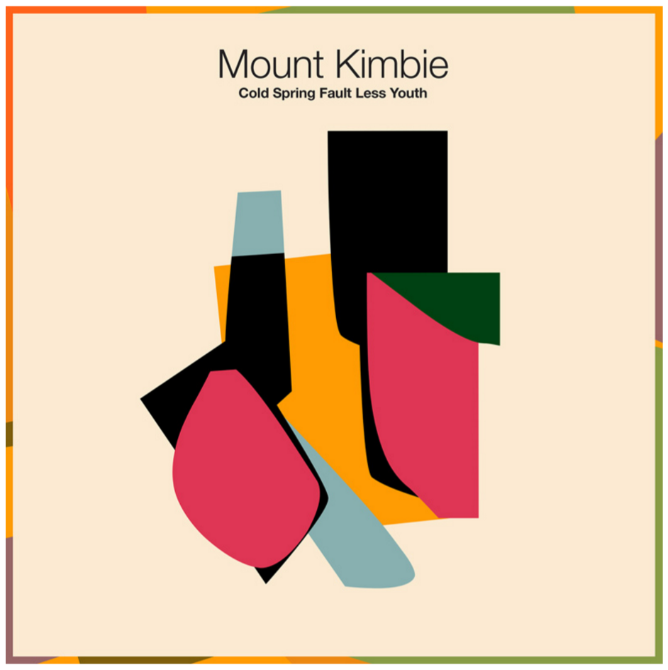

Album art created for Mount Kimbie is different to Podhajsky usual psychedelic compositions as it is composed out of numerous shapes and colours.


The photography has been collaged to juxtaposed different subjects and completely change the context. This content is more figurative as the subjects haven't been abstracted.
Monday 11 January 2016
Design Principles Publication 1.4
Crit
Spoke to a few of my classmates to see which concept they thought was more intriguing and the majority thought I should stick to creating a publication about Gestalt's principles because it is a better use of shape and is an innovative way to present the information visually. I want to push myself to learn new techniques and processes to best reflect what a book can be.
Gestalt's Principles
Gestalt's principles are 'rules of the organization of perceptual scenes. When we look at the world, we usually perceive complex scenes composed of many groups of objects on some background, with the objects themselves consisting of parts, which may be composed of smaller parts, etc'.
Exploring Gestalt's principles allows me to be visual and informative in order to greatly inform the audience. Gestalt's principles relate to all kinds of art and design which is why I think my publication would benefit anyone interested/practicing in design.
Current books on Gestalt's Principles are very informative and lack in imagery. I aim to clear any confusion with simple and effective presentation and explanation of each principle.
Figure and Ground
The word above is clearly perceived as figure with the surrounding white space - ground.
This principle shows our perceptual tendency to separate whole figures from their backgrounds based on one or more possible variables:
contrast, colour, size, etc.
Eg:


Closure occurs when an object is incomplete or a space is not completely enclosed. If enough of the shape is indicated, people percieve the whole by filling in the missing infomation.
Kanizsa Illusion

Closure occurs when elements in a composition are aligned in such a way that the viewer perceives that the information could be connected. It can be thought of as the tension or "glue" that holds a two-dimensional structure together.
Spoke to a few of my classmates to see which concept they thought was more intriguing and the majority thought I should stick to creating a publication about Gestalt's principles because it is a better use of shape and is an innovative way to present the information visually. I want to push myself to learn new techniques and processes to best reflect what a book can be.
Gestalt's Principles
Gestalt's principles are 'rules of the organization of perceptual scenes. When we look at the world, we usually perceive complex scenes composed of many groups of objects on some background, with the objects themselves consisting of parts, which may be composed of smaller parts, etc'.
Exploring Gestalt's principles allows me to be visual and informative in order to greatly inform the audience. Gestalt's principles relate to all kinds of art and design which is why I think my publication would benefit anyone interested/practicing in design.
Current books on Gestalt's Principles are very informative and lack in imagery. I aim to clear any confusion with simple and effective presentation and explanation of each principle.
Figure and Ground
The word above is clearly perceived as figure with the surrounding white space - ground.
This principle shows our perceptual tendency to separate whole figures from their backgrounds based on one or more possible variables:
contrast, colour, size, etc.
Eg:

The square is the figure and the circle is the ground as anything surrounding the focal point is ground. The white square contrasts more with the dark blue to make it the figure which is an example of how colour can create figure and ground.
Shigeo Fukuda
An iconic use of negative space to create figure and ground that the audience choose depending on the colour:

I can use this as inspiration to create my own composition reflecting the concept of figure and ground. Ideally, I want to be able to cut out the negative space on one page so that the other page shows through with a contrasting colour/texture.
Similarity
Gestalt theory states that things which share visual characteristics such as shape, size, color, texture, or value will be seen as belonging together in the viewer’s mind.

Similarity occurs when objects look similar to one another. People often perceive them as a group or pattern. In the image above, the viewer is likely to discern a triangle in the middle, though each individual object is the same colour.
Similarity or repetition in an image often has connotations of harmony and interrelatedness, or rhythm and movement.
Below, the shapes appear as as single unit because all of the shapes have similarity.
Unity occurs because the triangular shapes at the bottom of the eagle symbol look similar to the shapes that form the sunburst:

Proximity
Proximity occurs when elements are placed close together they tend to be perceived as a group. Below are 9 separate shapes:
Because the shapes are all condensed together, it is perceived as one.
Here, the 9 shapes are spread without proximity and they are perceived as separate shapes.

Closure

Closure occurs when elements in a composition are aligned in such a way that the viewer perceives that the information could be connected. It can be thought of as the tension or "glue" that holds a two-dimensional structure together.
WWF Logo
 Although the panda above is not complete, enough is present for the eye to complete the shape.
Continuation
Continuation occurs when the eye is compelled to move through one object and continue to another object. We perceive the figure as two crossed lines instead of 4 lines meeting at the centre:


Continuation
Continuation occurs when the eye is compelled to move through one object and continue to another object. We perceive the figure as two crossed lines instead of 4 lines meeting at the centre:


The horizontal lines force the eye to look across the page until the wake of the boat.
Subscribe to:
Posts (Atom)