Tuesday 28 March 2017

OUGD505 - Leeds Public Spaces - Printing + Initial Concepts

As the brief requires my poster to consist of at least 2 colours using traditional printing techniques, I began to think of the possibilities that these processes provide.

Relief Printing - Printing from a raised image
  • Letterpress
  • Lino
  • Stamp tool
  • Card print
I have a fair amount of experience with relief printing processes which has informed an initial concept for my poster. I started to research into more advanced and unconventional methods such as Anthony Burrill's steam roller press:


Large scale letterpress print made using a vintage steam roller, commissioned by Ditchling Museum of Art and Craft.


Burrill has replaced the traditional printing press for an engineering marvel from the past, combining tradition and securing history. By adapting or swapping the tools, different textures and marks become unique to certain material properties.

Printing concept 1:

Coat a bicycle tyre with ink and cycle over paper in order to print the grip marks from the tyre:


As the riders in the Tour de France use high end racing bikes, I intend to use the thin racing tyres to get a true representation of the tyres used in the race. This would count as a traditional printing method because it is completely analogue and count as a relief printing process. 

Printing concept 2:

Print the gears and spokes from the bikes:


These can be laser cut and then printed directly onto the poster.
Looking at different variations of the gears it became apparent that I could potentially include a vector of the Leeds flower as the gear:


This would put Leeds at the centre of one of the most important components.

OUGD505 - Studio Brief 2 - Village Book Store

Visited a small poster exhibition in the reading room of Village Bookstore. The exhibition is based on feminism, racism and political issues. 


OUGD505 - Studio Brief 2 - Newspaper Design

Moving forward from my research and feedback, I looked into Newspaper design to gain a better understanding of newspaper format as well as how they communicate the topics.

Sourced some books from the Library:

The Best of Newspaper Design - Twenty First Edition
Showcases designs in the newspaper industry for 1999 created by The Society for News Design.

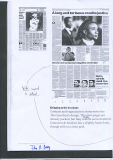
Section of the book compares The Guardian with Comment & Analysis:


The book characterises The Guardian as being very effective with contrast and organisation as the pages are densely packed but rarely seem cluttered. Comment and Analysis has a slightly looser look, though there is still clear evidence of a strict grid. I highlighted the grid for Comment & Analysis because I like how the page composition is predominantly portrait, making it easier to digest the information. I discovered 8 columns were used for both papers as a strict guide for the type. I found it harder to establish the horizontal grid lines, however I intend to research further into the grid systems used within newspaper design. 

I was drawn to this cover page for Rio de Jineiro's 'O Dia'.
Art Director: Andre Hippertt
Designer: Luisa Bousada


Contemporary style and layout as the copy has been set to surround the image, giving it authority and providing the audience with a focal point on the image. 'ADEUS' is Portuguese for 'Goodbye' which can inform the campaign if it was to go into a global campaign. Combining text and image is extremely important within editorial design. 


Newspapers are often perceived to be boring, traditional and very serious, which in a lot of cases they are because the topics they're covering are important, however I found some examples of how newspaper design can be adapted to evoke an experiential/emotional response:


Clear combination of physical artwork combined with the digital for example, 'Mural' from Mexico combines photography with the typography by overlapping and setting the type at an angle. The relationship between text and image is really important to stimulate the audience but also keep it legible. Another example can be found in Morgenvisen Jyllands-Posten as the illustration of a blind at the top of the page and the handle divides the page into two. 


Contemporary Newspaper Design: Shaping the News in the Digital Age
2007
John D Berry, Roger Black


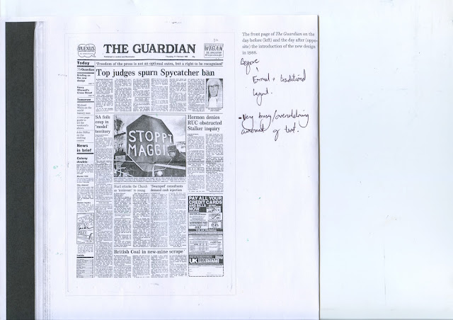
The publication compares The Guardian's design before and after it was redesigned:

Before:


After:


Before the rebrand the cover page was very formal and traditional as it used the authoritative serif typeface for the header. The page is very busy and there is an overwhelming amount of text which has stayed the same after the rebrand. The main concern for the rebrand was clearly the use of typography as the Guardian introduced a sans-serif typeface. This triple contrast in weight, form and style made it possible to close up the two words, turning them into a single visual unit. These contrasting typographic styles help to create hierarchy and clarity. 

Times Classic 

Used due to its traditional values as well as the fact it has a compatible set of display weights. Times provides contrast and delicacy within the display family. I can use these fonts to inform the text use throughout my newspaper. 


TYPE SIZES
'Decks' = Amount of lines

The amount of decks of the same typeface equates to the point size. The new design leaves more space before the start of the text. 


'The Best of Newspaper Design' also offered illustrations to accompany the articles. I was drawn to David Cowles illustration of Obama as the user can colour in the face like paint-by-numbers:


This would be an engaging feature in my magazine as the user can colour in the image to create an outcome, thus finding something that is lost. After thinking about this concept further, I can potentially create a series of dot-to-dot images of a person/symbol to do with missing people in order to demonstrate finding something that has gone missing. 

A word search can also be applied to the newspaper as the user can find words associated with the campaign. 
  • Crossword
  • Soduko

OUGD505 - Studio Brief 2 - Concept Review

After evaluating the feedback from my presentation and reflecting on all of my research, I have identified three concepts to take forward:

1- Missing People Prevention

Using the information available from 'Geographies of Missing People', create a campaign to raise awareness and prevent people from running away in the UK.

2- Missing People as Martyrs 

Commemorating those lost and never returned at the hands of drug cartels and raising awareness of the injustice and lack of closure the families have to go through.

3- Discouraging the cyclical nature of drug trade

Create a campaign that highlights the destructive impact the drug trade has had on families in Mexico and Columbia.

Feedback

After pitching my research and three initial concepts it was fed back that preventing people from running away makes more of a positive impact on society. People liked the martyr concept and the use of newspapers to disguise the graffiti stencils because it uses a newspaper which is an interesting format because it uses the media to rebel. Newspapers communicate current events and other informative articles about politics, sports, arts and advertising to the masses and it was suggested that this format would be a good context to display and distribute the campaign.

The crit group felt that trying to discourage people from feeding the drug cartels was a really good issue, however I should focus on this as more of a personal project because preventing people from running away and raising awareness of the issue is more current. However, it was suggested that I could integrate the prevention campaign with raising awareness of people who have gone missing in the past in order to commemorate.

The evidence provided by Geographies of Missing People Report will back up my campaign with sound facts and figures.

OUGD505 - Studio Brief 2 - Sting - 'The Empty Chair'

Sting was asked to create a song for the James Foley story. Foley was a journalist who was kidnapped and beheaded by ISIS and his story is being made into a film. Sting sought the metaphor of an empty chair to illustrate the loss a great man that will never return home.

'So don't despair of the empty chair
And somehow I'll be there'

'Well I was always late for every meal you'll swear
But keep my place and the empty chair
And somehow I'll be there'


Marc David Spengler 
Screen Print of an empty plastic chair offers a unique style which highlights the negative space of a plastic chair. This bold style would boldy illustrate the empty chair due to the lack of detail. 


Monday 27 March 2017

OUGD505 - Studio Brief 2 - Missing People

Mexico

More than 28,000 people have gone missing during Mexico’s drug wars and they still haven't been found.

desaparecidos — the “disappeared”

43 missing students

In 2014, a group of students from Ayotzinapa Rural Teachers' College went missing in Iguala, Guerrero, Mexico on September 26. According to official reports, the students commandeered several buses to travel to Mexico City to commemorate the anniversary of the 1968 Tlatelolco Massacre. 

During the journey, local police intercepted them and a confrontation ensued. Details of what happened during and after the clash remain unclear, but the official investigation concluded that once the students were in custody, they were handed over to the local Guerreros Unidos ("United Warriors") crime syndicate and presumably killed.

The victims:


Missing persons signage as part of a march to raise awareness of those students that went missing:


Columbia Missing Persons 

According to the Red Cross, more than 92,000 Colombians have disappeared during 50 years of war and at the hands of drug gangs. The government needs to step up efforts to find missing people as many will never be returned to their families and what happened to them will remain a mystery.

'Vanished without a trace'

The uncertainty and suffering of families which comes from not knowing the whereabouts of their loved ones is unacceptable and goes against their human rights.

In both cases, the government must do more to find and identify the tens of thousands of people missing in Colombia, raise awareness about the largely invisible problem, and make it easier for relatives of the missing to seek and get help from authorities

**Both cases are a result of drug wars**

Idea:

Perhaps this can be taken into the production and distribution of drugs - Print images of the missing persons on the drug baggies in order to raise awareness of the death and destruction caused by the drug cartel. This would hopefully discourage people from buying drugs and feeding the cycle. 

I am unsure whether to focus on specific cases such as Mexico or Columbia OR look at a UK based campaign.

OUGD505 - Studio Brief 2 - Syria Speaks


OUGD505 - Studio Brief 2 - Geographies of Missing People + Concept


Geographies of Missing People is a report by The University of Glasgow that draws on 45 in-depth interviews with people reported as missing and who have returned. The report is structured around a series of questions that people often ask as they experience being missing or absent.  Dundee University and Police Scotland also helped with the project.

The detailed report offers honest stories as well as in depth analysis of why/what people experience and the effects of running away. It is a genuine source legitimised by the fact it was created by Universities, genuine cases and the police force. This offers a great source to back up my solution. 

A section of the report focuses on recommendations that can be put in place to prevent and raise awareness for people running away. It is titled 'Provision, Prevention, Protection':


Avoid causing further stress and discomfort

Missing People are often anxious of getting into contact with authorities because they think they are in trouble with the law. However going missing is not illegal therefor the campaign should raise awareness that missing people are not criminals. 

Having people look for you causes anger, frustration and worry 


Researched into cases where missing people have returned in order to highlight ways in which I can encourage people to get in contact:
  • Being looked for
  • Thoughts of home
  • Unsure what they're doing is right or wrong
  • Reconnection with regular routines - Jobs
'Dont want to go home, dont want to see anyone, dont want to stay here' - Quote from a missing person who returned. This shows the emotional stress. 

Runaways often feel their family is better off without them. 

Friends play a key role in getting people back in touch with there family 


The report aims to define 'going missing':

  • UK social worker Malcolm Payne (1995) is available: ‘A social situation in which a person is absent from their accustomed network of social and personal relationships to the extent that people within that network define the absence as interfering with the performance by that person of expected social responsibilities, leading to a situation in which members of the network feel obliged to search for the missing person and may institute official procedures to identify the person as missing’ (Payne 1995: 335). 
  • Association of Chief Police Officers (ACPO): ‘Anyone whose whereabouts is unknown whatever the circumstances of disappearance. They will be considered missing until located and their wellbeing or otherwise established’ (ACPO 2005: 8). This definition acknowledges that people go missing in a range of circumstances, but also that they will continue to be considered missing until located in time and place.
According to the report, people who run away dont always consider themselves as a 'missing person'. The perceived stigma as to what it means to be labelled a missing person prevents adults from talking about their experience and returning home. 

This is a really beneficial source as their recommendations are backed up by extensive research and observations. I can use these to inform the range and distribution of the campaign and identify a concept.
  • Point 11 states: 'Initiatives around missing issues should be designed to raise public awareness and develop a platform for talk on missing issues. Cultures of talk need to replace the current stigmatising silence that exists around missing experience.'

CONCEPT


In order achieve this I aim to:
  • Create an informed and professional visual identity that can be transferred over a range of products and distribution methods.
  • Limit the long lasting effect that going miss can have on those involved.
  • Source appropriate and legitimate facts and figures in order to legitimise the campaign.
  • Identify an organisation/charity for people to contact for support. 

Target Audience:
  • Potential runaways 
  • Family and friends being effected
  • General public 
Distribution
  • Target Hospitals in order to raise awareness of the important issue and inform doctors and nurses to become more attuned to the warning signs and recognise who may be at risk. 
  • Public locations - Supermarket, parks, etc - These are locations people on the run are likely to visit to gain supplies
  • Major transport hubs - Train station, airport, bus station - Locations where people wanting to run away are likely to visit. 
Regulations
  • Must not be patronising or cause more stress
  • Must be anonymous as this is a sensitive subject. The campaign should encourage people to talk about their issues and problems and confidentiality supports this. 
  • Must be confidential 
  • Must be sensitive


OUGD505 - Studio Brief 2 - Further Research - Vice

Vice
'The Writing Is on the Wall'
https://www.vice.com/en_dk/article/the-writing-is-on-the-wall-00003456-v19n11


“The Martyr Ahmed Asham.”


The article, written by Angelina Fanous, covers the anti-regime graffiti throughout the streets of Syria.

The article introduces Tarek Algorhani, a Syrian citizen who was released from prison after 6 years. After his release, Tarek and eight other bloggers founded Al Domary, a political site that used cartoons and other drawings to criticise the Syrian government. The site soon became the most popular anti-regime sites in the country. However after three months one of the bloggers was arrested and tortured till the names and location of the organisation was revealed. As a result, authorities shut down the site, confiscated their computers and destroyed all files. All bloggers were convicted of treason and sentenced to 5 years, however Tarek was sentenced to 9 years because they believed he was leading the organisation. Escape was impossible and he was repeatedly beaten and tortured.

After five and a half years, Tarek was released for reasons he still doesn't understand, however his imprisonment didn't put him off the fight against the Syrian government as he still teaches activists how to record videos and upload them online, keeps details of the missing and the killed and creates contact with human rights groups for support and first aid.

Vice organised an interview with Tarek:

Tarek says that he resorted to using graffiti because it was the reason for the revolution against the Syrian government. Tarek explains how the stencil tags are used as a reminder and a symbol of what happened in that specific location, making people aware of the revolution:

'A small group of boys from Daraa watched the Egyptian and Tunisian revolution on TV, and they spray-painted the slogan “the people want the regime to fall.” The Mukhabarat, the secret police, arrested them, tortured them, ripped out their fingernails and that’s when the rest of the country broke out in protests. At the beginning of the revolution, whenever people assembled, there were only a few of them. The police and security forces could easily split them up with no trace left behind. That’s where the idea of drawings came in. Even if the police came in and dispersed people, anyone walking by later would know, “There was a protest here, revolutionaries were here.” It’s a stamp, a mark. And it’s difficult for the police, because they get tired. Every time they would clean up a wall, something else would appear.'

In the beginning:

At the beginning, activists would spray quickly and rushed, using short statements such as 'freedom' or 'down with the regime', however Tarek wanted to introduce an element of art to commemorate the martyrs lost in the revolution.  - 'USING ART TO VOICE CONCERNS'

Getting caught:

Tarek explains how if you are caught tagging a wall, 'the best possible scenario is that they will kill you on the spot.  If they detain you, you’ll go to political prison where you’re tortured and will eventually die a slower, more painful death. You’ll die either way, but dying immediately while you’re tagging something is definitely preferable to losing your mind while getting tortured.' - Shows the brutal reality of living in Syria without freedom of speech and a corrupt government. 


The dead:

Tarek thinks their are about 15 graffiti artists who have been died for the cause. They killed Nour Hatem Zahra, who was known as Al Ragel al Bakeheh, or Spray Man. He was like Spider-Man or Batman. They killed him while he was tagging. People know about Nour’s death, because his family publicised how he died and held a funeral for him, saying, “Our son died for this cause.” This is not always the case as a lot of the families of the martyrs are too afraid to celebrate the death of a loved one so avoid having a funeral.

'I think that the revolution will continue, even if Bashar falls from power and the current regime ends. There are a lot of things we want and need and I don’t think graffiti will die. People may not write about Assad, but they will write about everything from human rights to social issues and express their desires that way. And the drawings of the martyrs will always be there, so people won’t forget them.'

It's all about commemorating the martyrs, providing them with a face, instead of just a number. Tarek and other members of the revolution are providing respect to the dead. Syrian graffiti artists tag walls with the word “martyrs” and "freedom" above a row of stencilled dead revolutionaries: