Monday 31 October 2016

OUGD504 - Design for Print - Bristol Tongue

In order to appeal more to Bristolian's, I researched into the original dialect and accent which is often commented on during crit sessions. Presenting Bristol's native tongue alongside and combined with the diverse range of images will represent Bristol's busy and thriving city so the reader feels like they are there.

‘Alright my luvver?’

'Babber' - Definition: A term of endearment, meaning 'baby' or 'friend'. Babber is commonly directed to a loved one, yet some crazy cats are happy to call any old stranger this. 

’Ark at ee' - Check you out! (in a sarcastic and playful manner).

‘Innit’ 

'Brizzle/Bristle' 

‘Proper’

These quotes made me rethink areas of my publication that can be tailored to make the publication more personal to Bristol. For example, instead of having 'Alright Bristol' as the title of my zine, I have decided to use 'Bristol Babber' as the alliteration creates rhythm making it more memorable. 


To introduce the publication, I changed the tone of voice to suit Bristolian's native tongue. Instead of having the introductory passage on the first page - I introduced 'ARK AT EE' (Check You Out) which is friendly and ambiguous, depending on whether the audience is familiar with the dialect. This is still appropriate for people unaware of the saying because it will intrigue the audience to read on. 

Chose to use Univers 67 Bold Condensed as it's bold and heavy weight will impact the audience. All focus is on the type due to the large amount of white space:


Altered the leading so that the type was more condensed:


The introduction can now go on the inside of the leaflet. 

I gave my images a lot of white space so that they could breath, however the city of Bristol is vibrant and busy so in order to connote this I began to manipulate page compositions and the pagination. The addition of quotations helps me to achieve this. 

Being expressive and breaking the rules of design reflects Bristol's rebellious and creative culture:


I used Times, a traditional typeface, but manipulated it by deleting the fill in order to make it more engaging. Again, this reflects Bristol's rebellious style. Adding the quotations and juxtaposing them with the images reflects the streets of Bristol so the audience can experience Bristol through the pages. 

In order to further combine image and text, I pasted one of my images inside the text:

The audience will be exposed to the texture and context of Bristol through the type, however due to the small stroke of the type, the image isn't visible further adding to the ambiguity. Using Univers 67 Bold Condensed makes the typography look friendly, appropriate for the greeting. 


OUGD504 - Design for Print - Informed Production Summary

  • Recycled stock for the cover and the content 
- Influenced by my research into Bristol and it's achievements - EU Green City Award
- Shows that my book considers Bristol's ethics
- Tschichold and Irma Boom contradict each other in terms of the use of white stock for the cover. Boom uses white stock as a tool to see if people actually read it.
-The grey board can be stained by the oils on fingers and surfaces so the more it is used, the dirtier it gets. Therefore it reflects Bristol's rough urban environment.
  • Black Binding Tape
Represents Bristol's edge
Easy binding technique
  • Minimalist Cover
Intrigues the audience
Colour and texture of the stock resembles the urban environment 
  • Coloured Stitch
Adds to the aesthetics 
Exposing the stitch adds a slight hint of colour to the cover
Bespoke
Colours influenced by Bristol's crest
  • Debossing
Adapting the print method so I can print onto the grey board 
Bristol 'making its mark'
Black ink compliments the black binding tape
  • Coloured Stock/Intro
Takes the audience out of context - Influenced by my research into Printed Pages
Focus 
Visually engaging
Colours influenced by the colours of the crest. 
  • Zine
Printing on green stock compliments the monochromatic urban environment collage - enforces Bristol's environmental considerations
Engaging
USP
Potential to create a free zine alongside the publication
  • Pagination
No specific order
Juxtaposing image subjects over double page spread
Enforcing Bristol's forward thinking and rebellious style to creativity.
  • Sticker
Adds commercial value
Entices the audience
Promotion
Influenced by Bristol's array of stickers in the urban environment


Sunday 30 October 2016

OUGD504 - Design for Print - Crit/Feedback

During the crit session, I brought along my mockups to show my progress. My main issue that I brought up was about the front cover embossing finish as I have experimented with a range of mid-tones. I handed out samples of each embossing so that the crit group could physically hold and feel the imprinted stock and therefor my feedback will be more accurate. The main consensus was between the dry embossing and full colour. The dry embossing is subtle, however it wouldn't give the publication a lot of shelf presence, therefor the full black type will impact the audience more and also works alongside the black binding tape, creating a cohesive cover.

I handed out two of my bound publications so that my crit group could pass it around and feel it, putting them into context. The type size for the introduction was originally 10pt, however it was suggested that I should go smaller because my target audience will be capable of reading the smaller type and it also makes it subtle, forcing the audiences attention on the images.

I didn't have any prepared questions about the layout of the pages because I was just about to test print the publication using the digital print facilities. Now that I have done this, I will utilise the next crit session to ask for feedback on my layout, ready for the final print.

Overall I found the crit useful as it gave me confidence in my concept and people liked the idea of including a zine. I aim to create a list of questions that I can use in the next crit session so I can get more out of it.

OUGD503 - Responsive - D&AD + YCN

Comparing D&AD and YCN

D&AD - Design & Art Direction


In 1962 a group of designers and art directors came together to celebrate creative communication and raise standards within their industry. This is where D&AD was born. These designers include Bailey and fletcher:

Bailey

Fashion and portrait photographer:


Particularly in his older work, Bailey creates high contrasting black and white images allowing the audience to evaluate the subjects facial features and actions. Reflecting on Bailey's work and background suggests that D&AD are looking for industry standard work that is ready for the real world.

Fletcher

A spirited, witty and very personal visual style, Alan Fletcher is among the most influential figures in British graphic design as a founder of Fletcher/Forbes/Gill in the 1960s and Pentagram in the 1970s.


Caption:
'Trying to be anonymous by cutting letters out of periodicals to make messages is not exclusive to blackmailers or kidnappers.' - Demonstrates Fletcher's witty style. 

Having an awareness of what D&AD are looking for will help me to adapt my concepts and designs so I have more chance of winning the judges over. 


From reading D&AD's 'About' section online, it is clear that they are looking for innovative and professional design so I aim to do in depth research of the brief so that I have a clear understanding of what the client wants in order to get an objective response.

As a non-profit advertising association, all D&AD's surpluses go straight into programmes such as New Blood:


Looking at past briefs to see how the designer got to the final outcome in order to inform my approach to this years briefs. The D&AD annual from 2009 showcases the successful submissions with a brief explanation of the concept and original brief. The physical outcomes have been photographed to a high standard, adding to the professional quality.

Catherine Perrott

The brief required Perrott to “create a brand for a major new touring art gallery”


Perrott's solution was to use hospitals because they are located all around the world which provides opportunity for a lot of exposure. 

Everyone at some point will be admitted/visit a hospital - relatable
Brings positivity into a vulnerable/fragile environment

Relates the context of the hospital into the written content in order to advertise and raise awareness of the unique exhibition.

Name of the exhibition 'Temporarily Admitted' works in relation to the concept

Yellow box pops up on artists website - only temporary - Yellow is striking and attracts attention over large areas of white space - hospital and website 

Objective 

The concept has been adapted to work in a range of locations
And print to online

Key words after analysing D&AD's website and annual:

Corporate
Commercial
Structured and clean
Dense in content
Limited written content about the briefs - Predominantly visual
Serious but with a creative edge
Intimidating 

The professional tone throughout doesn't seem student friendly because of the use of corporate language and briefs. 

It's Nice That - 'What makes a D&AD award-winning project? The judges spill the beans…'

http://www.itsnicethat.com/articles/d-and-ad-new-blood-student-brief-advice-090316

  • Avoid spelling mistakes and cliches - Proof read
  • Adobe Foreman Craig Oldham, founder of Office of Craig Oldham, on Graphic Design/Branding:
“Try not to get bogged down in endless reinterpretation. The re-definition should always come from a place of meaning to the brand. Whether that’s in the exploration of it’s software, or more conceptual, it has to have a degree of relevance. Without that, you could fall into the trap of just playing with something for the sake of it. Find what you think is the best thing about the brand, and start there. In other words, start by finding your opinion.”

This is something I aim to consider because all the content needs to be relevant and considered. 
  • Enable long term solutions and/or behavioural change
  • Get a crowd behind it - Better for exposure
  • Strong identity 
  • 'Read the brief, read the brief and then read the brief again'
  • The key is to be clear on which issue or issues you which to address, helping your idea to be simple, meaningful and easily understood. The other watch out is not to create a solution that could patronise the end user.
Summary:

Keep it simple - Don't overcomplicate it
Get people on board
Considered
Concise

YCN

Launched in 2001, the annual YCN Student Awards uniquely shine a light on emerging creative excellence.

Submissions are rigorously assessed by the organisations that wrote each brief, before winning entrants are published and awarded at a splendid Ceremony each year. All winning work is showcased in the pages of the YCN Student Annual. 15,000 copies of the Annual are distributed across education, and across the creative industries internationally.

Atlas - Barcelona Design Museum


  • Simple and concise layout
  • Works through screen and print
  • Appropriate for the design target market
  • Considered and included the context of the buildings location 
  • "The look and feel is crisp and bold, and is based around the idea of a “connecting line” to represented the “unique geographic location of the building,”
  • Worked with the architects so the design works in tangent with the architecture.
  • "The line device works together beautifully with a simple typographic approach to make the tricky task of uniting multiple design-led organisations under one system look utterly effortless. 2D and 3D"
  • Includes the entire museum's branding - Website, signage, printed, brochure, t shirts, merch


YCN's characteristics:

Student Focus

Playful
Creative
Vibrant
Tactile
Expressive
Understated
Social awareness


Consistencies in award winning work:

Nothing is open to interpretation
Placed in context
Transferrable - Campaigns
Long lasting
Impeccable presentation - photography
SIMPLE

OUGD504 - Design for Print - Digital Print Out/Mock Up #3

Stock

To make a considered design decision, I printed my publication using two stocks to analyse the print quality and feel of the stock.

Recycled, 120 gsm:
  • Using this stock would mean my publication is made predominantly from recycled materials which supports Bristol's environmental consideration. 
  • Slightly off white and subtle freckles in the paper is similar to the texture of the greyboard.
Pure white, 120 gsm:
  • Identified this stock on a previous visit to digital print
  • Light and malleable 
  • Very strong white 

Both stocks are very similar and did not alter the colours and print of the images. Therefor the recycled stock would be most appropriate for my publication because it highlights Bristol's environmental consideration and the flake of the stock creates cohesion between the content and cover stock. The flakes in the paper and slightly off white colour take advantage of print media as the rougher texture of the stock stimulates the audiences senses.

Intro:

As my introduction is going to be on smaller stock, it provides opportunity to introduce a coloured stock as it will be visually engaging and separates the written content from the images, inspired by Flaxen Zine. The colours have been influenced by the ones used in the crest:

Recycled:


GF Smith:


Initially I was going to use red stock influenced by the colours from the crest, however I changed it to pink so that the type was legible.

Changed the green stock to navy blue as the pink contrasts well. 


The justified to the left text is too close to the bind, however moving the text to the bottom right would lead the audiences eye to the middle of the page, focusing the audiences attention on the written information.

At the back of the book is an extra page created by the introduction. To utilise this, I credited Arcane Photography for their contribution. However, this should be inside the page:

References:


  • Needs more work on layout
  • Commercial considerations - The back page can be used to state copywright, stock choices and date it was published.


Zine

Recycled:


Pink:


Blue:


Green:


  • Content is still visible on all stock choices.

Bound the zine in the middle of the publication. To separate this content from the rest of the publication, I included a double page spreads worth of coloured stock:

Creates contrast between the look and feel of the stock:


Printed the black and white zine on green stock to reflect Bristol's Green capital city award - Mixing urban with nature/greenery.


Centre page exposing bind:


  • Grainy texture from the paper and scans make the zine tangible.
  • Surprised by quality of print on the darker stock.

Need to include some content on the back page to avoid misleading the audience:


Printing onto coloured stock will be expensive because it is from GF Smith (industry standard). The stock came in A1 sheets so I had to cut them down myself to fit in the printer. I had to be extremely accurate so I cut it into 4 A3 pages - leaving room for the crop marks. This is an expensive alternative, however in the industry I would buy the coloured stock in bulk which won't be as expensive. 

Binding

Bound the publication using chosen stocks to see how they deal with the large needle and thread and also the range of page sizes.

It was hard to secure all of the pages and booklets together so that they all lined up as the A3 paper and A4 leaflet/zine need to be positioned flush at the top and then centred inside the cover. To achieve this I used the binding clips, however the pages still moved around a lot. Needed to be accurate when piercing the 5 binding holes so that the stitch is straight - This is important as I can not hide the stitch 
from being visible. 

The thickness of the thread secures the publication so that it doesn't slip around the cover, making it consistent. Accurately piercing the pages with the binding tools avoided chewing up the stock, however it was hard to pull the thick needle and large thread through the thicker stocks. The only way I could achieve this was to continue using the pliers.

Type Problem

Even though I packaged the document, Univers 67 Bold Condensed wasn't available, so I was forced to use Ultra Condensed which effected my typesetting. I asked the print technician if I could over come this for my final print, however Typekit doesn't support my chosen typeface.

  • 'Culture' is no longer justified to the same width as 'clash' because of the ultra condensed style.
  • Not so much of an issue for the references as they are subtle additions to the page and don't effect the typesetting. 


I bound the publication using the pamphlet stitch and twisted thread - Taking my time and using the correct tools allowed me to bind the publication accurately so text is still aligned accurately across the bind.


The printing cost was high due to my unique page size as I am charged on the amount of ink I used, not just the size of the stock. Overall the test print was a success as I have identified my stock choices for the final print. I can now tweak and adapt the images and layouts based on the test print. I still need to choose the coloured stocks so that they work harmoniously.

OUGD504 - Design for Print - Zine

Aiming to visually engage the audience with Bristol's type out of context, the zine will be predominantly playful and image based. Used my collage scans so that I can print the publication in black and white, making it cheap to produce. Dedicating each page to a traced letterform to spell 'Bristol'. This is my interpretation of Bristol.

Front Cover:

Titled the zine 'Alright Bristol' because it is a common greeting throughout the city. There is potential to create multiple editions of the zine, each with their own greeting inspired by the different cultures. This would make my publication more commercial value.


Including the rough texture from the rip marks reflects Bristol's 'edgy' culture and intrigues the audience to look closer at the content. 

To create consistency and a continuous flow, I placed each letter centrally on the left page and artwork on the right. Each character was found in Bristol:


Being playful with the typography is appropriate for a zine as they are an expressive platform:


There is more opportunity to be expressive in order to engage Bristolian's, especially with the typography.

OUGD504 - Design for Print - Test Print/Collage

Printed out my publication as a simple A3 spread in black and white which is a lot cheaper and also gives me a feel of my printed publication.

First:

During the first test print I forgot to tick 'print blank pages' which meant the pagination was incorrect. I have highlighted areas that need to be changed and edited but also highlighted some double page spreads that were unexpectedly intriguing.

The quote doesn't relate to the image accompanying it on the double page spread as originally they both had there own double page spread. However traditional Times juxtaposed with the urban environment and graffiti illustrates my interpretation of Bristol through the publication:


Full bleed and double page spread images were nudged so images I didn't intend being together:


I will consider these alternative layouts when finalising page composition because they are really engaging and reflect my concept well.

Second Print

Printed my second test correctly:


The limitations of printing in black and white means I can't judge the colour management and quality of the images. Seeing the images in print allowed me to gain an understanding of page composition, especially making sure the images are completely visible. I noted down specific images that were blurry in order to resize them in Photoshop. 

Colour Print

My previous test prints have been a standard A3 double spread, however my publication is going to be an original size to give my publication more presence, therefor I printed my publication to the correct measurements and in colour:

Before I did this, I made sure all the images placed in the document were CMYK so that the colours are correct when printing. I noticed that some of my images were out of focus because they had been enlarged too much, to overcome this, I aim to resize the image using links with Photoshop in order to get the best possible print quality. The links panel is a really useful tool for checking images are to the best quality.


The image below was duotoned instead of black and white so the colours aren't completely monochrome. This was barely visible on screen which shows the importance of test prints.


High quality image is still crisp when applied to full bleed:


Need to make sure the images are aligned accurately on the page, particularly full bleed:


The black and white image needs to be smaller because it is slightly pixilated. Both images need to be separated because they don't compliment each other. The intention was to inform the audience on the environment as well contrasting the colours to connote emotion between the two subjects:


The grey board doesn't contrast with the white pages so I introduced coloured stock that protects the information and also creates contrast against the grey board, focusing the audiences attention on the content.


Green stock influenced by my research into Bristol's colours. Instead of having an introductory page, the green stock compliments the graffiti so it is appropriate to leave it blank. I could print the introduction onto the green stock, however it would be harder to read as there is less contrast between the stock and the text.


To overcome this, I can introduce a small page that wraps around the whole publication that can be used to introduce the publication. Presenting the introduction at against the coloured stock is aesthetically pleasing and also puts the audience into context without them seeing any of the content.


I aim to research into stocks that can contrast/compliment the green stock.

Jesse Draxler

Mix media collage:


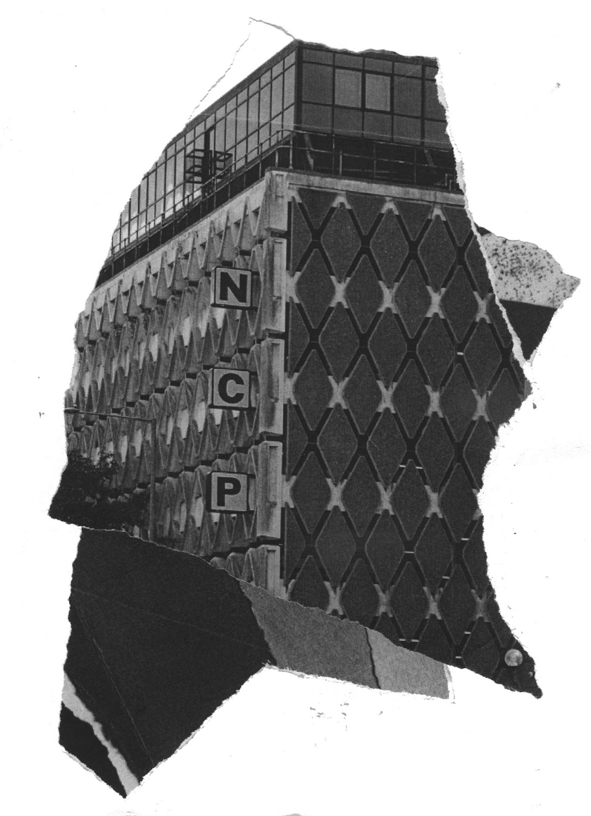
As I have printed out a lot of test pieces in black and white, instead of wasting them, I created some collages that juxtapose environments and typefaces to engage and appeal the target audience. I used influences from Draxler's monochrome compositions as it is a similar technique. Draxler has manipulated and combined photographic images to create contemporary compositions based on the human form.

Collage

Ripping the paper creates rough edges that highlight specific areas of the photographs. Juxtaposing the typography and monochromatic tones creates engaging textures. I aim to use these images inside the small publication leaflet.


Manipulating the paper by scrunching into a ball, folding and ripping creates a rough textures and natural lines that compliment the black and white colour palette. 

There is opportunity to introduce the collage to the introductory page as the abstract content will intrigue the audience.