During this module, I made sure my secondary research was broad by using internet and library resources, however I should have done this more for my primary research in order to create more engaging outcomes. This module made me identify how important research is at the start of the brief and the importance of reflecting on it. This is more relevant to studio brief 02 and 03 because my outcomes could be much improved. The most successful brief for me was studio brief 04 because I really enjoyed reflecting on the year and using my experiences to influence my outcome. Throughout the whole of this module I have been developing my design and learning new techniques and processes, digital and analogue, and I think this is apparent in this submission.
Time management was really important throughout this module because we had 4 briefs to complete and they often overlapped. This made me create time plans and calendars to help me with organisation which I am grateful for because I have submitted every brief on time. When we were set studio brief 04, I began to struggle with keeping up to date with all four briefs and as a result, studio brief 02 and 03 lacked in development. However, towards the end of the module I began to combine organisational skills that I'd learnt over the year by makint a time plan to motivate me to finish the briefs in time. Using a range of techniques and processes such as screen print, monoprint and digital manipulation takes advantage of the colleges facilities which improved my outcomes.
The module required me to work solo and in a group which both had their advantage and setbacks. Working on my own allowed me to plan my own development process in relation to the brief. When working in a group we could all share our creative concepts and abilities so that more work could be produced and we introduced each other to new processes. This was really beneficial and I feel more confident when working in a group. This process also made me think about the purpose and aims of the briefs so that I, and the group, could make informed decisions.
During this module I introduced myself to a mix of techniques and processes which I weren't 100% confident with, as a result I made a lot of mistakes during experimentation. This was a setback, however I efficiently problem solved and adapted as a designer in order to solve these problems. For example, in studio brief 04 my production method helped to inform my printing method.
I have demonstrated that I can problem solve during the production of my outcomes because I have more of an understanding of techniques and processes.
Friday, 29 April 2016
LTPM Exhibition Branding 1.4
My outcome:

Listening to the feedback has really benefited the composition of the letter as it is now a lot more visually engaging because I have emphasised the card print. Using a grid system helped me to create a smart, consistent layout that informs the target audience. As well as informing, the poster aims to provide engaging visuals that will intrigue the audience so they will want to come and see what it's all about. This composition focuses more on the relevant content as I haven't wasted space with sponsors.

Listening to the feedback has really benefited the composition of the letter as it is now a lot more visually engaging because I have emphasised the card print. Using a grid system helped me to create a smart, consistent layout that informs the target audience. As well as informing, the poster aims to provide engaging visuals that will intrigue the audience so they will want to come and see what it's all about. This composition focuses more on the relevant content as I haven't wasted space with sponsors.
Thursday, 28 April 2016
LTPM Exhibition Branding 1.3
As a group we dedicated each other with different tasks in order to spread out the workload:


Took on the role of creating invitations/potential poster design based on our concept and print:
Included our sponsors logo at the top of the composition in support and recognition. Kept the typeface as Helvetica because that is what first direct use. I included the adapted LCA Logo made by another member of the team. We tried to spread the workload out as evenly so that it was fair and we could get more work done.
I set the message in the letter like a traditional banknote and contrasted it with a disjointed composition due to the staggered typesetting for the title, sponsor and date, etc.


Listened to the feedback I was given and adapted the poster using a grid system so that I can accurately and consistently set the type and image.
Used the whole print instead of just a section which makes the composition engaging. It looks more like a poster for an art exhibition now which I am pleased about. Listening to the feedback has definitely benefited my outcomes which is what I think us as a team needed, we have a good concept but we need to pull it off visually.


However due to lack of communication over the Easter break, some of these changed and we had to drop some concepts because we are running out of time.
Created a print using geometric shapes and repeat pattern which resembles the architecture from Bankhouse. If people see a poster or invitation it would remind them of the Bank House as it is a recognisable building which is memorable because it used to be a major bank.
LETTER POSTER
Took on the role of creating invitations/potential poster design:
LETTER POSTER
Took on the role of creating invitations/potential poster design:

Took on the role of creating invitations/potential poster design based on our concept and print:
Included our sponsors logo at the top of the composition in support and recognition. Kept the typeface as Helvetica because that is what first direct use. I included the adapted LCA Logo made by another member of the team. We tried to spread the workload out as evenly so that it was fair and we could get more work done.
I set the message in the letter like a traditional banknote and contrasted it with a disjointed composition due to the staggered typesetting for the title, sponsor and date, etc.

By adapting the tone of voice, I make the target audience feel as if they are an investor and we are asking for them to invest their time in us. This will make the designers, studios and media feel important and they will be more aware of the exhibition because they have had a direct message to them.
Also created a stamp to go onto the letter. This will intrigue the target audience so that they open it. This is a personal element to our exhibition.

PRESENTATION
The advantage of being in a team means getting opinions and techniques from a range of other people benefits the design process. This was evident in my group as we were introduce to Google Drive Presentations by a member of the group. This allowed us to create the presentation all at the same time. As a group we agreed that we would create the slide and present the content that we focused on.
Presented visuals for the judges to see, showing them how the building influenced the print and then how I combined it into the letter. Overall the presentation went well as we showed that we had identified a definite concept that provides a lot of scope for engaging ideas.
FEEDBACK
The judges thought that having the First Direct logo at the top and at such a large scale isn't a good representation of hierarchy because it distracts the audience from the important content, such as the title of the exhibition. The panel liked the print and suggested that I used it more within the designs.
POSTER CONCEPT:
Listened to the feedback I was given and adapted the poster using a grid system so that I can accurately and consistently set the type and image.
Used the whole print instead of just a section which makes the composition engaging. It looks more like a poster for an art exhibition now which I am pleased about. Listening to the feedback has definitely benefited my outcomes which is what I think us as a team needed, we have a good concept but we need to pull it off visually.

Using grids so that I continue to create consistent layouts throughout the poster and letter:

All of the information is set so that the key information is visible first. I used a large section of the print and scaled it up so that it filled the majority of the composition. This is visually engaging which is appropriate for our concept and an exhibition.
In order to make the exhibition branding and promotion consistent, we introduced the print into more areas of the exhibition:
Wayfinding:

Using the print to represent 4 and 5 will show the gallery visitors what section of the room level 4 and level 5 pieces are.
Reflective Practice - Speaking From Experience 1.2
Evaluation
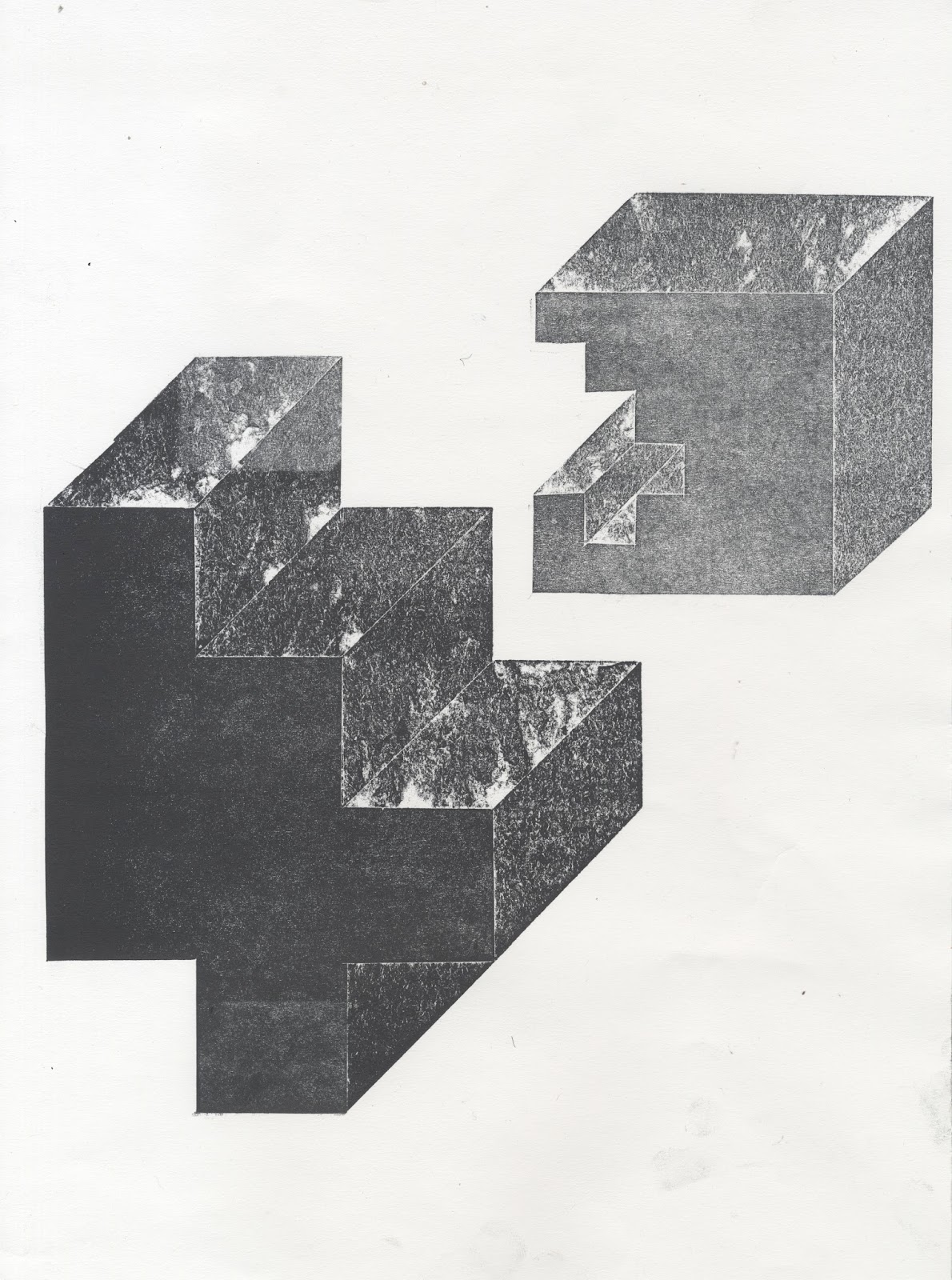
Setting my own brief was an exciting prospect as it gave me the opportunity and freedom to tailor the project to me. This helped to develop deeper concepts because I had an interest and passion for being creative on paper rather than computer. This is something that I have learnt this year and I feel it is appropriate to share this experience to the first years.
My concept was to produce an graphic outcome that encourages first year students to move away from digital sources of design and use practical techniques, particularly at the start of a brief. I reflected this throughout my project as I created some monoprints of texture and tone which is an analogue technique and then, as my concept developed, took them into digital to add depth and visuals to my composition. However, if I had managed my time better when juggling other briefs, I could have explored other processes such as letterpress and screen print as this would have emphasised my concept even more. I think the decision to digitally produce and print was a good one because it makes reproducing it easy and quick, allowing it to be shared to all members of the year.
I am pleased with the research that I did before choosing a concept because it helped me to produce a more appropriate response for my target audience; first year graphic design students. Using the library sources broadened my research as I looked into 'RAVE ART' which showed a lot of examples of ticket and poster designs from 1986. My research into Konig was really beneficial because of his rebellious use of type which gave me the confidence to experiment with experimental typesetting. Playing around with the type definitely influenced me to create a contemporary, post-modern outcome because I enjoyed being expressive with it. My research was really broad with impacted a lot of areas of design that was relevant to my concept and brief, this made making design decisions a lot easier.
I would have liked to add colour to my composition, however I was pleased with the layout and monochromatic colour scheme as it was, and I began to run out of time. I am pleased that I didn't rush this process because the compositions we made using a 9x9 grid system and I couldn't find space. In this case, less is more.
I believe I have taken advantage of the colleges facilities and worked with the inspiration and skills that I have been introduced to this year to produce one of my strongest pieces of the year in my opinion.
I believe I have taken advantage of the colleges facilities and worked with the inspiration and skills that I have been introduced to this year to produce one of my strongest pieces of the year in my opinion.
Reflective Practice - Speaking From Experience 1.0
Creating Brief
Created my own brief in order to define my own aims, outcomes and processes.. I don't want to be too specific with my brief because I am still in the early stage of the project and I want to leave room to develop my concepts.
Studio Brief
Reflecting on my year on the course, I aim to produce an ambitious piece of graphic design with the purpose to inform and inspire first year graphic design students to approach briefs using analogue techniques and processes.
Background / Considerations
Think about my experiences on the first year - What did I struggle with? What did I like/dislike?
What processes did I enjoy? How did they benefit me?
Consider creative processes I have used this year in development and outcome
Primary and secondary research
Primary and secondary research
Mandatory Requirements
Blogging throughout the brief, reflecting on my practice and creative journey.
Evidence experimentation
Use a range of media
Professional outcome
Deliverables
Blog
Final outcome
Experiments/mockups
Supporting Resources/Information
Village Bookstore
People of Print
Library sources
Library sources
In response to my first year on the course, I intend to create a piece of graphic design that makes a statement, comment, observation or gives advice about my experience on your first year of the course, as well as living in the city of Leeds.
Calendar
Due to the amount of briefs that we have going on at the same time, a calendar would benefit organisational skills as the deadlines can be written in, along with any other events going on around Leeds, academic or social. This could be pinned on the student's new halls as a friendly reminder of the college. It will also be practical.
Avoiding Digital
Looking back at my PPP blog, I have identified an interest in contemporary graphics but combining it with traditional and analogue techniques. When I first started the course, I pushed my artistic and expressive background away by focusing on digital outcomes. I found my concepts and outcomes were limited as I only had a basic understanding of the software and I was limiting myself. As the year progressed, I started to be more proactive by booking myself into inductions and using the printing facilities available at the college. As a result, my outcomes became more expressive and professional compared to how they were when I was limiting myself to digital. I found my concepts started to grow when I let myself make mistakes and I have a much better understanding of these techniques.
Galleries
Obviously first year graphic design students will have an interest and understanding in art and design so I could create a map/guide to the best ones in the Leeds area. This was influenced by our visit to YSP because it was really inspirational and I have been back to see other shows. I can even add design studios that are based in Leeds so that I encourage first years to go and visit them.
Map of Leeds
Being new to the city was tricky at the start of the year because I had no idea where anything was. A map/guide to where the supermarkets and shopping areas are in relation to college would be really beneficial. I can also include the halls of residence that are most likely to be used by the students such as Liberty Park and IQ. I can also recommend places.
Guide to pubs, bars and clubs
Before I came to Leeds I researched a lot into the nightlife, specifically live music venues. I found this really beneficial for recognising places around Leeds. As a student, going out and socialising is a big part of university so a guide to the best places would help create friendships and memorable nights.
Map/Guide of Leeds College of Art
Finding my way around the college was difficult so could produce a map to give out to first years when they arrive at the college. This would provide opportunity to be more contemporary and engaging and show examples of graphic design:

Decision:
I have decided to create a piece of graphic design that encourages first year students to move away from the computer, especially at the start of the brief, and explore expressive and new techniques and processes. This will help make their concepts more engaging. These processes include:

Do you think a zine is appropriate for displaying the content or should I create a series of posters?
The majority of people thought that a zine was appropriate because it allows me to showcase a range of techniques and processes. Using examples of work created by the technique was also suggested so I have confidence to move forward and start creating an engaging publication. It was suggested that I should use manual letterpress to emphasise my concept which would be appropriate, however I will need to consider how much time I have to produce it as letterpress can be a time consuming process. I will definitely include some letterpress in the publication however.
It will be predominantly visual to act as inspiration, is this appropriate?
Everyone said that this would be appropriate because the purpose of the publication is to inspire creatives. However it was suggested that I should include a step-by-step guide to each of the processes. This is something I am willing to consider but again I will have to consider the amount of time I have to complete the project for hand in.
Avoid using the word 'stressful' - It is important that I don't reflect the course in a bad light, although it can be stressful due to the amount of deadlines the course is designed to push us to our limits in order for us to develop. 'It is for our own good'.

I have decided to create a piece of graphic design that encourages first year students to move away from the computer, especially at the start of the brief, and explore expressive and new techniques and processes. This will help make their concepts more engaging. These processes include:
- Screen printing
- Monoprinting
- Linoprinting
- Laser cutting
- Typesetting
- Sketchbook
Critique/Feedback

The majority of people thought that a zine was appropriate because it allows me to showcase a range of techniques and processes. Using examples of work created by the technique was also suggested so I have confidence to move forward and start creating an engaging publication. It was suggested that I should use manual letterpress to emphasise my concept which would be appropriate, however I will need to consider how much time I have to produce it as letterpress can be a time consuming process. I will definitely include some letterpress in the publication however.
It will be predominantly visual to act as inspiration, is this appropriate?
Everyone said that this would be appropriate because the purpose of the publication is to inspire creatives. However it was suggested that I should include a step-by-step guide to each of the processes. This is something I am willing to consider but again I will have to consider the amount of time I have to complete the project for hand in.
Avoid using the word 'stressful' - It is important that I don't reflect the course in a bad light, although it can be stressful due to the amount of deadlines the course is designed to push us to our limits in order for us to develop. 'It is for our own good'.
License To Print Money 1.3
Experimentation

Mirroring the 5 creates balance and negative space that could be used to create an illusion:

Cut into the 5 to show hints of the number, this relates to my illusion concept as the audience will have to interpret the value of the currency from limited information:

Repetition can confuse the eye:
 After looking at the grid of numbers, the eye is tricked into seeing threes. Layering the characters over each other creates interesting negative space:

Op Art


Riley is an English paiter currently based in London. The compositions are predominantly black and white which creates a lot of contrast, making the illusion more prominent. The geometric qualities also impact the audience more, often confusing the eye. This is a promising concept that would work with screen print because the bold lines and shapes will transfer well.
I used inspiration from Op Art and Riley and began creating compositions based on the geometric shapes.
Used repeated diagonal lines to suggest movement which will distract the audience from the value of the note:


Hid the value behind the circles because it suggests pixels on a screen - Relates the the illusion of money because it's all digital and physical currency isn't being used as much.

SYMBOLS


 Below is a relief print from Mexico

Reflecting on my research and experimentation, I am interested in the playing card concept for money and I want to relate it to my illusions concept because card tricks have been used for illusions by magicians and tricksters. As a result, I have started to look at the layout of playing cards and the characters that feature on them.
The joker would be a good character for my currency because it was created as a trump card for the card game Euchre. It has since been adopted into many other card games where it functions as a wild card.

Creating a currency based on the IOU currency created by Jacques de Meulles during the 17th Century. An IOU (abbreviated from the phrase "I owe you") is usually an informal document acknowledging debt.
Experimentation


Used the composition of a playing card to inform my decision as to where to put the value. Putting it in the corner will make it visible when stacked and I rotated it so even when the card is upside down the owner still knows the value. Futura is a minimal and curvaceous typeface so when 'IOU' is upside down it looks like 'NOI'. To overcome this I could use a serif typeface as the serif's make the type more recognisable when rotated.
Added the suit of hearts symbol so that my design resembles a playing card. However choosing a specific suit isn't based on informed decisions. Made the £10 bold so it's easier for the audience to see it.

CRIT
During the crit, I showed my playing card currency concept looking for peoples feedback and opinions. I asked whether I should use numerical values in the corners or stick with my symbol concept. A lot of people didn't get the pattern of circles as the value of the currency until I told them about my concept. If I am going to continue using the 5 dots to represent £5 I am going to have to make it more obvious. To do this I need to make it more consistent. I can also provide a rational of my concept to support my outcome.
RESEARCH


FURTHER EXPERIMENTATION
'I promise to pay the bearer on demand the sum of' features on all GBP notes - the crucial feature that made Bank of England notes a means of exchange was the promise to pay the bearer the sum of the note on demand. This meant that the note could be redeemed at the Bank for gold or coinage by anyone presenting it for payment. This is appropriate for my IOU concept:


Placing the dots in the centre of the composition makes it balanced and the joker becomes more prominent. Making the type in the corners blue makes the value prominent so the audience is more likely to associate the dots with the value.
BACK
Decided to create the back of the currency because I became inspired by the elegant patterns that are printed on the back of cards. I thought I could use a pattern of symmetry and balance and incorporate it into my design. Here are some examples of traditional playing cards:


Mirrored the design:

Overlaid the two layers to create a symmetrical pattern:

Used the circle to break up the pattern in order to fit the value on the note. Centred the value as the pattern draws the eye to the centre of the composition making it a focal point.


Playing cards are usually made out of a sturdy stock to deal with the wear and are covered with a gloss to make them waterproof and long-lasting. This is relevant for a currency as it would be used for years.
Chose two stocks that I will screen print directly onto:
SIZE
The size and shape of my note was influenced by my previous research into playing cards. Playing cards come in two sizes - poker size and bridge size. Poker size is 63.5mm X 88.9mm. Bridge size is narrower at 56mm x 88.9mm. This makes more sense in old fashioned imperial measurements - both are 3.5 inches high, but poker cards are 2.5 inches wide while bridge cards are 2.25 inches wide.
Took my two main concepts; illusion and pattern into Illustrator because it allowed me to make my sketches more accurate and speed up my idea generation.
Chose 5 because it is a single digit and is an interesting shape compared to 10 or 20 due to the combination of straight and curved lines.
ILLUSION
Using equally spaced lines create rhythm, however adding the 5 breaks them up making use of negative space:
Chose 5 because it is a single digit and is an interesting shape compared to 10 or 20 due to the combination of straight and curved lines.
ILLUSION
Using equally spaced lines create rhythm, however adding the 5 breaks them up making use of negative space:

Mirroring the 5 creates balance and negative space that could be used to create an illusion:

Cut into the 5 to show hints of the number, this relates to my illusion concept as the audience will have to interpret the value of the currency from limited information:

Repetition can confuse the eye:


Op Art

Op Art, also known as optical art, is a style of visual art that uses optical illusions. Op art works are abstract, with many better known pieces created in black and white. Typically, they give the viewer the impression of movement, hidden images, flashing and vibrating patterns, or of swelling or warping.
Bridget Riley
Researching into Op Art has provided me with visual inspiration that I can use to represent the illusion of money. Bridget Riley is one of the most recognised Op Art artists:


Riley is an English paiter currently based in London. The compositions are predominantly black and white which creates a lot of contrast, making the illusion more prominent. The geometric qualities also impact the audience more, often confusing the eye. This is a promising concept that would work with screen print because the bold lines and shapes will transfer well.
I used inspiration from Op Art and Riley and began creating compositions based on the geometric shapes.
Used repeated diagonal lines to suggest movement which will distract the audience from the value of the note:

Added lines to create negative space around and inside the numerical value:

Contrasting the stroke width and direction of line was inspired by Riley and distracts the audience better than having a repeated line in the example above.
Repeated and layered contours of number 5 to suggest movement. However the filled character in the middle makes the currency more recognisable.

Hid the value behind the circles because it suggests pixels on a screen - Relates the the illusion of money because it's all digital and physical currency isn't being used as much.

Interested in using symbols and signs instead of numerical characters because I explained the concept in my crit and I gained positive feedback but I needed to do more experimentation.
Dice use dots to show the numerical value of the throw. People become so familiar with the dots on the dice that they don't need to count the dots but recognise the pattern and associate it with the number. I aim to look further into this concept as I often only look at the colour and size of the note to see its value, instead of reading the copy.


Began to think of other ways people recognise values with patterns or symbols and created a tally chart concept:


Reflecting on my research and experimentation, I am interested in the playing card concept for money and I want to relate it to my illusions concept because card tricks have been used for illusions by magicians and tricksters. As a result, I have started to look at the layout of playing cards and the characters that feature on them.
The joker would be a good character for my currency because it was created as a trump card for the card game Euchre. It has since been adopted into many other card games where it functions as a wild card.
I asked numerous members of the class on their opinions of the joker card when playing cards. The results concluded that many people don't use the card because they don't know what it does and it doesn't feature in the game. Due to this the joker has gained many negative connotations towards it as it is 'annoying' and 'untrustworthy'. This relates to the current affairs in banking because people are relying on digital transitions and they don't physically own their money, it's owned by the bank.

Creating a currency based on the IOU currency created by Jacques de Meulles during the 17th Century. An IOU (abbreviated from the phrase "I owe you") is usually an informal document acknowledging debt.
Experimentation

Introduced a boarder to centre the content on the card and focus the audiences attention. This features a lot on standard playing cards:


Used the composition of a playing card to inform my decision as to where to put the value. Putting it in the corner will make it visible when stacked and I rotated it so even when the card is upside down the owner still knows the value. Futura is a minimal and curvaceous typeface so when 'IOU' is upside down it looks like 'NOI'. To overcome this I could use a serif typeface as the serif's make the type more recognisable when rotated.
Added the suit of hearts symbol so that my design resembles a playing card. However choosing a specific suit isn't based on informed decisions. Made the £10 bold so it's easier for the audience to see it.

During the crit, I showed my playing card currency concept looking for peoples feedback and opinions. I asked whether I should use numerical values in the corners or stick with my symbol concept. A lot of people didn't get the pattern of circles as the value of the currency until I told them about my concept. If I am going to continue using the 5 dots to represent £5 I am going to have to make it more obvious. To do this I need to make it more consistent. I can also provide a rational of my concept to support my outcome.
RESEARCH


FURTHER EXPERIMENTATION
'I promise to pay the bearer on demand the sum of' features on all GBP notes - the crucial feature that made Bank of England notes a means of exchange was the promise to pay the bearer the sum of the note on demand. This meant that the note could be redeemed at the Bank for gold or coinage by anyone presenting it for payment. This is appropriate for my IOU concept:

Set the type on a curved path to be playful and friendly which is appropriate for my currency because it's based on a pack of cards. It was influenced by circus banners and also children's board game boxes. Thinking about my printing method means I had to simplify the joker otherwise I would need to do a 4 colour screen print just for the joker. It will also be hard to align the colours correctly as it will be on a small scale.
Added IOU and changed the layout of the card and experimented with the layout:

Made the layout very clear and concise by making the audience read from top to bottom but my design is still very basic so I looked into the layout of playing cards to inspire my a more engaging response.
Used Futura as the typeface as it is used in Monopoly and old propoganda posters. I layered the type using red and blue which are traditional colours worn by Jesters/Jokers. I haven't included yellow because it doesn't stand out well on white stock and would also add another layer to my screen print. Printing yellow over dark colours such as blue and red would be tricky as the other colours are likely to show through,
Overlapped the 'IOU £5' with the playing card content so that the value and IOU concept was clearer. Although the majority of the joker has been covered it reflects the stamp/writing that Jacques de Meulles introduced for the soldiers as they just wrote over the top of the card. This also makes my concept more apparent.

Used illustrator to create a patterned boarder which adds depth and concentrates the audiences attention. This was influenced by my traditional playing card research.
During my crit, I asked whether I should use numerical values or the dice symbol to state how much the currency is worth. I swapped the position of the IOU with the dice to see if this would benefit the composition:

BACK
Decided to create the back of the currency because I became inspired by the elegant patterns that are printed on the back of cards. I thought I could use a pattern of symmetry and balance and incorporate it into my design. Here are some examples of traditional playing cards:


Often repeat pattern and takes up the majority, if not all, the card so the players can differentiate the front and back easily. This works for my money concept as people can tell the difference the worth of the note it is by a different colour/pattern. This would be more relevant if I was creating a set of notes, however it shows my concept is transferrable.
Template:

Created a pattern inspired by Op Art as the black lines contrast with the white stock and the angled joins create a spiral:

Mirrored the design:

Overlaid the two layers to create a symmetrical pattern:

Used the circle to break up the pattern in order to fit the value on the note. Centred the value as the pattern draws the eye to the centre of the composition making it a focal point.

Outcome:

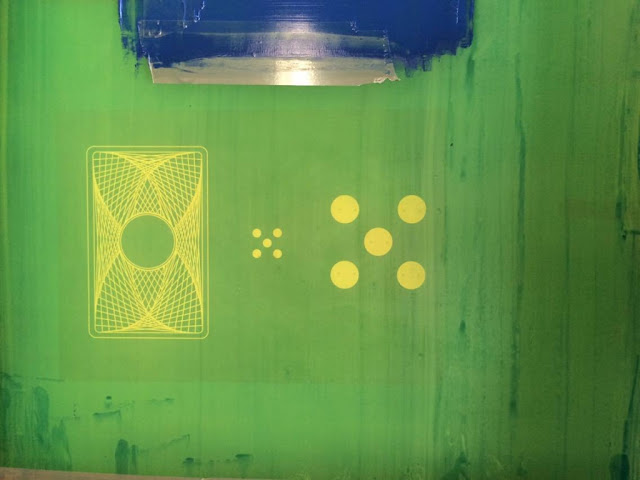
I decided to choose the dice symbol instead of the large 'IOU £5' written over the top because the design is balanced. The front and back both include the red circular symbol inspired from dice. The five dots represent the amount of pounds the note is worth which will become more recognisable than the numeric symbols if it's on both sides. This reflects how the suits on cards become recognisable as they are presented as a symbol.
I am going to experiment more with other colours when I am screen printing because the process allows me to mix ink freely. However I will start with black red and navy blue because red is associated with playing cards and also power. The red contrasts well on black and white which makes it the focal point. The navy blue was influenced by the colours the Joker wear
STOCK
Playing cards are usually made out of a sturdy stock to deal with the wear and are covered with a gloss to make them waterproof and long-lasting. This is relevant for a currency as it would be used for years.
Chose two stocks that I will screen print directly onto:
- Thick newsprint - Off-white finish which may make my playing card currency seem old and traditional which reflects my main influence from the French at war during
- Cartridge paper - Much thicker stock which means it is less malleable. The stock is pure white which will allow me to judge my colours to see if they're appropriate.
SIZE
The size and shape of my note was influenced by my previous research into playing cards. Playing cards come in two sizes - poker size and bridge size. Poker size is 63.5mm X 88.9mm. Bridge size is narrower at 56mm x 88.9mm. This makes more sense in old fashioned imperial measurements - both are 3.5 inches high, but poker cards are 2.5 inches wide while bridge cards are 2.25 inches wide.
Physically playing with cards and exploring more contemporary designs, I came across a large pack of cards. A single card was 9cmx15cm so the information was a lot larger and clearer. This is appropriate for an exhibition because I want people to see my composition when it's on the wall. My currency is inspired by a historic event and doesn't have to have a function to be used in real life.
PREPARING FOR PRINT
Separated each element of my composition into layers so that I could use more than one colour when printing. The smallest amount of type that I used was 10pt so I considered using acetate when exposing my screen because I want a sharp and clear print finish. However after speaking to the technicians they clarified that I would be alright exposing my screen from paper.

Made sure I flooded the screen so that the ink didn't dry out and my prints are consistent in quality and clarity.

As I have three colours that I am printing, I made sure I was accurate with the alignment of information when I was printing. Printing onto tracing paper first allowed me to register my paper so that I knew exactly where it would print:


OUCOME:
Front:

Back:
(Poor photograph)

I am really pleased with the clarity and sharpness of the print as I thought the back would be too complicated. The red dots were hard to align so I had to re-register my registration sheet in so that the dots were dead centre. As they are the focal point it is obvious if it''s out of line.
My outcome is made for the purpose of an exhibition piece because I used a lot of inspiration from the 'Show Me The Money' exhibition in Manchester. Even though I had a broad range of research, visiting the gallery was enlightening and inspiring because I was able to see other peoples opinions in the context of money. I became really interested in the French playing card currency from the war, my playing card concept is inspired by this. The aim of my outcome would be to feature in an exhibition similar to 'Show Me The Money. However my concept will bring an interesting historical twist to the exhibition.
My research into French playing card IOU's from 1685 made me focus on the composition of cards and die because I became interested in the historical elements and wanted to create a composition inspired by Jacques De Muelles. Looking at symbols and illusions influenced my final design as Op-Art inspired the back of the card due to the contrasting black lines on white stock and geometric shapes. Instead of using a numerical value, I used the symbol from a die. This links to my experience with money, as I often associate the size/colour of the note to the amount without having to read the type. Using this concept made my currency predominantly visual as I had very little copy. During my research, I became interested in the characters that feature on the notes so I used the joker to represent the illusion of money.
My time management was efficient and effective at the start of the brief which is reflected in my broad research and idea generation. However, my design is very simple, particularly on the front of the currency so if I had a chance to do this again, I would explore more engaging visuals and texture. The concept is strong but I haven't pulled it off visually. However the minimalist and simple layout inspired by playing cards is simple and easy to read, making it easy to see the amount the currency is worth. The stock I used was appropriate because it was sturdy and very white which meant the ink contrasted well, however I would have liked to have explored more adventurous stock choices such as silk finish and highly textured. I feel this would have made my simple and clean design more tactile. I took the final outcome into screen print fairly early into the project which was proactive and allowed me to create a three colour screen print successfully. However, I would have liked to have revisited the composition by printing more content over the top in order to make it more engaging.
PREPARING FOR PRINT
Separated each element of my composition into layers so that I could use more than one colour when printing. The smallest amount of type that I used was 10pt so I considered using acetate when exposing my screen because I want a sharp and clear print finish. However after speaking to the technicians they clarified that I would be alright exposing my screen from paper.

After exposing my screen I realised that each element of my design was placed close together. This didn't take advantage of the space I had available on the screen. As a result I have to make sure I tape up areas that I don't want to print:

Made sure I flooded the screen so that the ink didn't dry out and my prints are consistent in quality and clarity.

As I have three colours that I am printing, I made sure I was accurate with the alignment of information when I was printing. Printing onto tracing paper first allowed me to register my paper so that I knew exactly where it would print:


For the red dots I struggled to get a consistent and bold colour but after mixing more acrylic paint with the

OUCOME:
Front:

Back:
(Poor photograph)

My outcome is made for the purpose of an exhibition piece because I used a lot of inspiration from the 'Show Me The Money' exhibition in Manchester. Even though I had a broad range of research, visiting the gallery was enlightening and inspiring because I was able to see other peoples opinions in the context of money. I became really interested in the French playing card currency from the war, my playing card concept is inspired by this. The aim of my outcome would be to feature in an exhibition similar to 'Show Me The Money. However my concept will bring an interesting historical twist to the exhibition.
My research into French playing card IOU's from 1685 made me focus on the composition of cards and die because I became interested in the historical elements and wanted to create a composition inspired by Jacques De Muelles. Looking at symbols and illusions influenced my final design as Op-Art inspired the back of the card due to the contrasting black lines on white stock and geometric shapes. Instead of using a numerical value, I used the symbol from a die. This links to my experience with money, as I often associate the size/colour of the note to the amount without having to read the type. Using this concept made my currency predominantly visual as I had very little copy. During my research, I became interested in the characters that feature on the notes so I used the joker to represent the illusion of money.
My time management was efficient and effective at the start of the brief which is reflected in my broad research and idea generation. However, my design is very simple, particularly on the front of the currency so if I had a chance to do this again, I would explore more engaging visuals and texture. The concept is strong but I haven't pulled it off visually. However the minimalist and simple layout inspired by playing cards is simple and easy to read, making it easy to see the amount the currency is worth. The stock I used was appropriate because it was sturdy and very white which meant the ink contrasted well, however I would have liked to have explored more adventurous stock choices such as silk finish and highly textured. I feel this would have made my simple and clean design more tactile. I took the final outcome into screen print fairly early into the project which was proactive and allowed me to create a three colour screen print successfully. However, I would have liked to have revisited the composition by printing more content over the top in order to make it more engaging.
Subscribe to:
Posts (Atom)