I haven't explored much brand identity this year so I took the opportunity to imbed my knowledge from first year and this year to practice branding.
Initial Sketches
Started off by sketching some initial ideas based on the fact that The Tab are looking for a contemporary logo to represent their fresh style of journalism. Sketching allowed me to explore the spacing and shapes of the 6 letterforms that I have to work with which will be useful when I transfer my designs into digital. I was immediately influenced by the 'tab' button on the computer because of the arrow symbols which is used to advance the cursor to the next tab stop. This reflects The Tab's forward thinking and current brand.
Other concepts were drawn by the physical button which provides a 3D effect, giving depth to the new logo.
Keyboard as a grid:
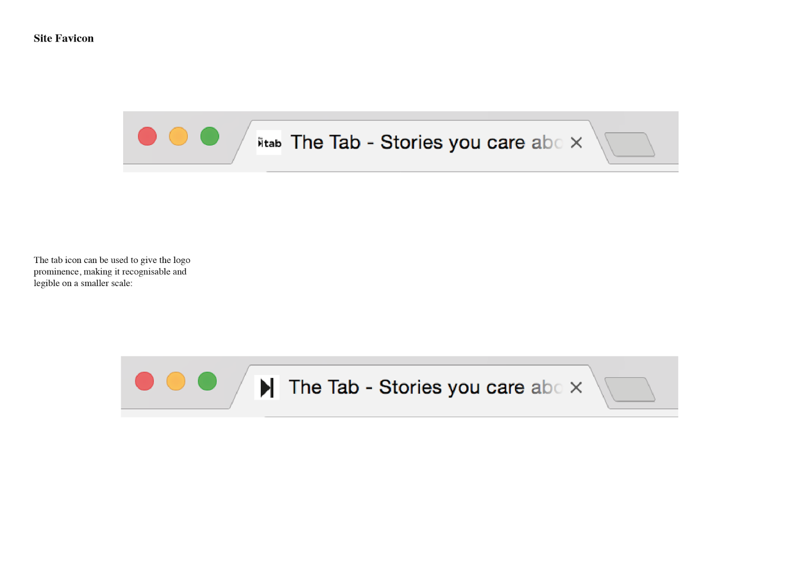
Digital:
Initially experimented with Helvetica due to its basic geometric and neutral qualities which make it easy to visualise ideas. Layering the two words creates a solid block one the kerning and tracking has been adapted. Centred the 'T' of Tab so that it sits in a central position with the H and reflects the forward movement of the organisation. Perhaps making 'The' smaller will emphasise 'TAB' more.
Added the arrow as an extension of the 'T' to unify both words. Again, the arrow suggests the forward thinking and current news published by The Tab:

Simplified the arrow to contain the letters because the logo needs to be compact in order to work on both a small and large scale.
Inspired by the keyboard: Playful, friendly colour scheme and typesetting may be slightly patronising and won't be taken seriously.

Added a CMYK colour scheme to the top blocks and an RGB colour scheme to the lower to represent how the brand is distributed in print and on screen.
The blocks can be rearranged to create more of a condensed format which would work better on a small scale, particularly for the Facebook logo. The blocks can also be rearranged to spell different words which would be a successful way to show the city as an example of how your Tab logo could be customised for a local site.
Mixing the CMYK with RGB, however some letters aren't legible:
Moving away from this concept, I looked further into the tab keyboard symbol by taking the unique arrow into the design. I moved away from Helvetica and used Gotham because it is a contemporary sans-serif that is clearly legible. This was influenced by The Royal Opera House brand guidelines as they use Gotham for the display type which is highly legible and organic. To create more of a contemporary logo, I made all of the type lower case which also increases legibility and creates rhythm with the two 't's. I developed the arrow from the original tab keyboard logo as a symbol to accompany the name:
I put the a arrow before the title to increase authority:
Used the gap inspired by the advancement of the tab key and filled it in with the arrow to create more unification between symbol and copy.
Created more cohesiveness by linking the left stem of the 'h' with the vertical section of the arrow, however I am conscious that it may not be legible.
Simplified the composition by putting the title on a pedestal inspired by the arrow:
Rotated the composition and removed the line to make the composition more dynamic:
Feedback:
I showed a group of 6 creatives these initial designs, making sure that the logo was displayed on a large and small scale. I also made sure that they were aware of the current Tab logo and asked for their opinions on it.
- Logo needs to be less brash
- Current logo looks like The Sun
- Needs to be smaller so it works better on a small scale such as an App or Facebook icon.
- More friendly
- Make 'the' smaller and less dominant to emphasise 'TAB'.
Logotype
Michael Evamy
Laurence King Publishing
2012
Evamy emphasises the importance of broad experimentation and research will help to inform the outcome:
'Verbal and visual unite in logotypes. So do art and craft. The art is in the concept of a logotype; in the crystallisation of a visual idea. This can emerge from extended, educated experimentation with type and letterforms until something - a solution - appears.'
Vignelli's logo designed for JC Penney was replaced by a third year graphic design student because their logo was an example of 'flexible' or 'dynamic' identity which has multiple, interchangeable variations so it can be distributed around different touchpoints of the campaign. This is something that I intend to consider for my logo as a flexible logo will be able to transfer from print to screen yet still be recognisable and associated with that brand. This questions the value of a fixed, never changing logo in a' brand world of constant flux.'
Logotypes need to be faultless, particularly in the composition and setting of the type as it is the face of the brand. Professional consideration is essential.
Mixed Fonts
Great by Homework (Denmark)
Jack Dahl has combined both serif and sans-serif for the delicatessen Great. Using two typefaces creates a contemporary contrast andr Dahl has managed to blend the different styles together cohesively.
Super Bold
Superbold typefaces would be appropritaate for The Tab because they describe their brand as 'bold' and the style of typeface is very current and contemporary:
NCM
John and Rob Dowling logotype for an interior design company:
The condensed typesetting creates an interior due to the subtle negative space.
Eddie Opara (Pentagram) for Delle Valle Bernheimer Architects:
Visual simplicity removes the negative space from inside the letterforms to create a bold, high impact composition. It is interesting that both superbold examples from LogoType are used for an interior design/architecture company.
Alternative Arrangements
B+W Studio for Seven:
An edgy and current identity characterised by the cut off bleed on the top of the 'n' which creates the illusion of a 7.
Atelier for Nau Capital:
The circle was used to symbolise capital around the world and the upward tilt of the logotype indicates the direction of the results. Suggesting a direction using different typesetting techniques helps to identify the overarching ethics and ideals of the brand.
Cropped
Michael Bierut and Paula Scher (Pentagram) for Brooklyn Accademy of Music:
The solution appeared as the result of design experimentation described by Evamy as an 'accident'. Not only does the negative space give the word extra presence but it also provides room for other info and imagery to accompany it. As the brief requires me to demonstrate how my logo can work with further information such as the different cities, using negative space can be utilised to add further information and context.
Design Development
Imbedded my knowledge from reading Evamy's 'Logotype', specifically with using negative space.
Positive:
Negative:
Different logo:
Landscape:
Positive:
Negative:
Made the type smaller
Squared for social media icon: