Wednesday 30 December 2015

Wayfinding 1.8

Upper level

Revisited The Corn Exchange and took note of the name and position of the current shops on the upper level. I immediately noticed there are more shops on the top floor. To inform the customers of the position of the stair case I tried adding a pictogram of a staircase. 


Chose to use the simplified staircase without the arrow because I have limited space and don't want the map to feel crowded. However, the staircase on the map above looks confusing and disjointed.

When you're standing in The Corn Exchange, it is easy to see where the staircases are because it is a fairly small space and the stairs are big and grand. Because of this, I don't think a pictogram is required and I could make a gap in the circle, like the entrance. This makes my concept transferrable. 


Very subtle difference that may not be interpreted as the top of the staircase. I could have a plaque at the top and bottom of the stairs showing what's on that specific floor. A leaflet with the map in it could also be useful to have at the entrance and the top/bottom of the stairs. 

Need to get pictograms for 'way out' signs and also the management office and experiment with adding food/catering pictograms. 

'WAY OUT' DESIGN IDEAS

Inspired by previous mind map; old, classic, American diner style. I used Helvetica instead of Superclarendon because it's balanced and more consistent in weight. 


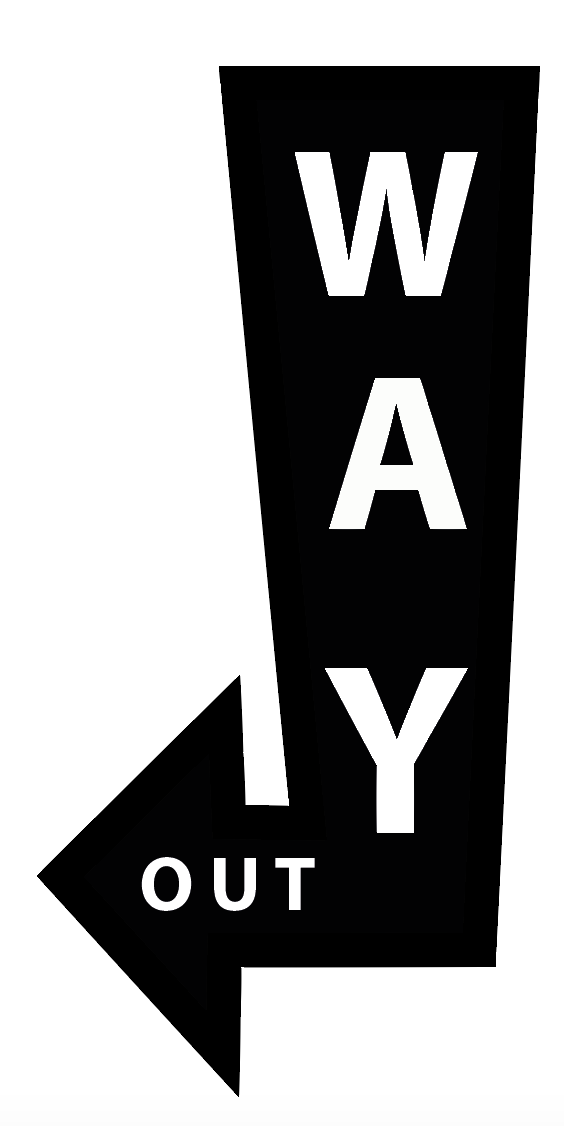
Although the syntax is backwards, the eye is immediately drawn to 'way' before 'out'. However, 'out' may be hard to read on a small scale/from a distance. Tried it in positive and negative to see which is more visible and I think the white text contrasts more with the solid black arrow so would be visible from a distance. 

Tried putting this arrow onto the map, however due to the amount of shops, the circle was becoming crowded and the arrow didn't fit on without being too small:


'Out' is impossible to see on this scale and without this legibility, it is unclear to see that that's a way out sign. To overcome this, I simplified the shape of the arrow to save space.


Aimed to find a simpler solution to this problem by taking inspiration from the current arrow and adapting it:


Kept the old style arrow currently used because I like the traditional bow and arrow style but I tried to simplify it. 

Used Helvetica because it is instantly recognisable and balanced in weight and shape. I wanted the exit signs to stand out over the shops because it will be important for an emergency and will be helpful for the visitors to define shops from the exits. I chose a burgundy red instead of the usual blood red because I don't want the wayfinding signage to overpower the classic style of the map/building. 


Removed the line going through the typography so that it was easier to read and didn't cross out the word:


Filled in the arrow head in to see if the three lines were needed:

I prefer this because the arrow head stands out more and has forced me to make the arrow 'feathers' longer and wider which ultimately creates balance.

Management Office/Information

Decided this needed a pictogram because it also houses the lift and disabled access onto the upper floor. The information point may be required in an emergency situation and needs to be recognisable to save time. The type all blends together so the pictograms add a visual cue that's quick to interpret.


Noticed a lot of information point signage in airports, train stations and public attractions consisted of just a single lower case 'i'. I think the question mark with the 'i' is very successful because it connotes Q&A. 

Wanted to use a circle as a boarder as it highlights the information enclosed inside it:


Used Didot Bold because it is formal, due to the serifs, and contrast well in the white circle due to how bold it is. This makes it easier to read on a range of different scales, relevant for wayfinding.

Also tried it with a question mark:


The question mark for Didot Bold is still not bold enough, especially the stem, and it could be a bit informal. This will make it hard to see when the composition is presented on a small scale. I decided to stick with the 'i' because its simplicity is bold and the lower case tittle is recognisable on a range of scales. 

Decided against using the question mark because it is irrelevant and will only confuse the eye when small scale. 


Presented all of the current elements in one completed composition on a large and small scale:


Didnt make the exit signs red because it wasn't an informed decision from The Corn Exchange and didn't work with the current style and colour scheme of the building. The arrow acts as the pictogram and makes it recognisable. The pictograms are all recognisable on a small scale which will allow me to print my maps on a range of different mediums such as on a leaflet or large scale glass panel. 


Sunday 20 December 2015

Design Principles - Typesetting

Research into David Carson
Post-modernism - expressive
Futurist

Lewis Carrol - 'The Mouse's Tail'

Original:

Fury said to a mouse, That he met in the house, 
“Let us both go to law: I will prosecute you.”
Come, I'll take no denial,
We must have a trial,
For really this morning I've nothing to do.
Said the mouse to the cur, 
“Such a trial, dear sir, 
With no jury or judge, 
would be wasting our breath.”
“I’ll be judge, I'll be jury” 
Said cunning old Fury; 
“I’ll try the whole cause, and condemn you to death."

The typesetting has been manipulated to produce concrete poerty; using the typography to create a shape and stress how the word 'tail' and 'tale' can be interpreted.

Adapting the type setting to bend the design rules of Vignelli and Mueller-Brockman creates a shape that resembles a mouses tail. Even though there are orphans and hyphanated words, they're appropriate in order to create the shape. 

David Carson

Carson is a post modernist graphic designer, renowned for his expressional compositions:


Random overlapping of typography and inconsistent stroke width pushes the boundaries of design to create an expressional and textured outcome. 


Changing the scale of the type creates contrast and negative space. Personally I don't think the imagery is required, however it does put the poster into context. I like how Carson's work is unconventional and pushes the boundaries of graphic design and self expression combined. 

Carson has been criticised for his controversial practice, however I believe the rules of design are made to be broken and post-modernism should encourage this type of design. However, it does need to be changed depending on who and what you're designing for. 

Anotel Knotek 

http://www.anatol.cc/concrete_poetry.html#.VmmQBeOyOko


Depending on the typesetting, it is possible to change the way the audience reads a section of text:


Tried to re-typeset 'The Mouses Tail':


Wanted to put the type inside the 'H' for 'House' to make the type give a visual cue as it's being read. Used Didot because I thought the structure of the type, with the serifs, would be better to symbolise the 'house'. However, the 'H' is far too close to the 'o' which makes it unpleasant to read.


I made all of the type Helvetica due to its consistency and balance. Objectively made 'mouse' smaller to connote how small the mouse is in relation to the size of 'house'. Setting the type with large spacing and disjointed lines forces the audience to look around the page as if it's imagery, not like conventional text in a book. 


Created the title, incorporating the author. Like Knotek, I played with the kerning and spacing of the characters to make the text disjointed. I like how adapting the position/kerning of the characters and words change the way it's read. 


Continued to experiment with typesetting, changing the  size of some words to fill blocks in a narrow composition. 


Added pictogram of a house because it fits neatly in the space and adds a visual cue next to the lexis 'house'. Reminds me of the typesetting layout when physically printing with lead type. 

Other example of typesetting:


Layering type can make it illegible, like some of Carson's work. However, putting a bold colour in the foreground and gradually fading it using an analogous colour scheme can make it easier to read and the colour makes it harmonious. 

Typesetting can be used to express a certain mood or tone, no matter what the copy says. Post modernist graphic design pushes the boundaries of design to make simple typography visually interesting. It is important to think about what is appropriate for the purpose of the design.

Saturday 19 December 2015

Design Principles Publication 1.2

After researching into publications and seeing how they can be made, I have realised the possibilities a simple book has. 

In order to improve my design decisions, I am interested to see what size of book is relevant for different genres of publications:


Books

B Format 
Medium sized paperback
198mmmx130mm
Cheap, small, literary novels for different genres

Novels/Memoirs
A4 portrait

Childrens Book
Flexible
178mmx124mm
200x200
250 x 200
Tend to be larger for kids as its visual

Common Paper sizes:

A4 - 297x210

Letter - 279.4 x 215.9

Legal - 355.6 x 215.6

From my previous research, I looked into different way books can be made. Books within books and different sized pages allowed a other elements to be visible. This opens opportunity to play with visual qualities such as colour and shape.

Researched into folds to increase my knowledge and practice of paper folding for publications:

Folds


Spent some time practicing these folds in order to create a publication:

3-Panel Gate Fold

Simple fold that require the two sides to be folded into the middle.


As a result there are 4 narrow section and one large section. I thought I could take advantage of the small sections and use one as a window to suggest information below.


Noticed I should have cut a smaller window as the paper is very filmsy. I would need to use a thicker paper/card to use a large window. 

Quickly hand rendered the type to get an idea of how I could add the title of the fold. 


Typography takes up majority of space on the largest section which means less room for informative instructions for how to make the fold.

Searched Pintrest for more editorial inspiration and paper folds:


Books don't have to be confined to just one size of page/cover. Cut into pages/change size of page to change subject matter or add visual cue - reduces the size of type. 
A book within a book

Public Information 1.0

Close To The Edge

'Close To The Edge' was created in 1983, it is a public information film by The Green Cross advising the public on how to cross the road:


Key Message:


Informing people to wait away from the edge of the pavement before crossing the road to avoid 'losing your head'. 


Uses visual and verbal cues to stress the message and impact the audience more. The type is informal due to the lower case and inconsistent typesetting which makes it friendly. The animation changes with the beat of the music which adds rhythm and makes the information visually and verbally cohesive. 

Audience


I can tell the video is aimed at young teenagers due to the parody mix of The Message by Grandmaster Flash & The Furious Five. The creators have tried to make the video friendly for a younger audience due to the use of vibrant colour and animation. The subject of the video being the same age as the target audience makes it relatable and when the teens see the subject being criticised in the film and lyrics, it'll have a better impact. 


Tone of Voice


'Jonny was a fool, he didn't act cool,
he walked on out, he broke every rule'


The tone of voice is transferred from the original song which is successful because the target audience will recognise it and listen more intently to the changed lyrics. Having rhyme in the song also makes the information flow which reduces tedium. Informal language such as 'cool' suggest the target audience, however it's still appropriate for the serious content. It's interesting to see how the video wants to show the public what is cool, as many teenagers think acting dangerously is cool. The video is aimed at teens and young adults. 

Key Facts

Compared to other public information films there weren't many facts, it was predominantly made out of imperatives such as 'stop', 'look' and 'don't step out when you're close to the edge'. The visual information shows what happens when you don't comply with this. 

Be careful when crossing the road.


Think Bike
Created in 1978 to create awareness for car drivers to be more aware of motorcyclists. 

http://www.nationalarchives.gov.uk/films/1964to1979/filmpage_jimmy.htm

Dramatic crash between car and bike is immediate which draws the audiences attention to the film and makes them think just how suddenly a crash can happen. The dramatic slow motion crash isn't censored which makes it honest so that audience can realise the impact. 

Narrator Jimmy Hill is well spoken which influences people to believe he is smart and trustworthy. It also makes him easily interpretable. The tone of voice is clearly for adults because they're the legal age to drive and it is a serious tone. Hill is trying to educate the audience to the dangers of pulling out of a level crossing. The video really helps because his advice is backed up by the mistakes you can see the driver making. 

Key quotes:


'That car driver will be more careful next time. For the motorcyclist, there isn't going to be a next time'

Forces the audience to think of the consequences of driving. 

'Think once, think twice, think BIKE'

Memorable instructions for the audience due to how short and simple it is.

The message of this video is to be aware of bikes at junctions because they can be obscured by other objects such as lamp posts or bushes. It's best to take your time and 'think once, think twice, think BIKE' to avoid crashing. 

Monday 7 December 2015

Wayfinding 1.7

Final Crit

Times and Clarendon most appropriate for Corn Exchange as people agreed the classic and traditional style associates with the building well. Personally I think Clarendon is bolder and consistent in stroke width which makes it legible on a range of scales. It was suggested that I should add pictograms to the genre of shop, such as jewellery, fashion and food. However, I thought this would be too confusing for the audience so decided it would be appropriate for just cafes and restaurants to have pictograms. This is because people would be able to immediately differentiate shops from food. 

I suggested some places where my map could be put into context to see if people agreed and could suggest any other mediums. It was agreed that the floor plan could be shown on a glass panel in the entrance, however it may be hard to see if the glass was completely see through. People thought that the composition would work well printed on a leaflet, roughly A5 size that people can pick out at the door and at stations around the building such as at the top and bottom of stairways. 

I was debating whether to keep the circle in the centre of the type because I thought it pushed the type away. However, people thought it needed to be grey and was required in order to show the entrance. 

Wayfinding 1.6

Experimentation

When I visited the Corn Exchange, I noticed there was no map to find where the shops are. I took note of what order/position each shop was in, in relation to the entrance. 

Initial concept - Take advantage of the whole circular shape:


Sketching out how I am going to get the 24 shops onto a circular map. The shape of the corn exchange is predominantly oval, however I think the connotations of a circle are wholesome which will be visually balanced. Tried splitting the circle into 24 sections so that I had an even amount of space for each door. Used Illustrator to get an accurate result:


The shape reminds me of the ceiling of the Corn Exchange as the lines and act as the supports for the roof and it's also a circular shape:


Used the circle as a grid to plan out the order and position of each shop easily:


Some of the shops have more than one door, such as King Koby, Primose and Yellow Sunshine. To represent this, I left a segment out for each door, however I think I need to find a way to fill this space, possibly by enlarging the type. I chose Univers Ultra Condensed because it's a balanced typeface that's legible, however as you can see above, it's not legible on a small scale due to how condensed it is. I decided to put the type on the outside of the circular grid so that the type was evenly spread and gave me a bass to work with. The type on the right hand side needs to be rotated the other way, mirroring the other side as it isn't legible upside down. I had to rotate the type in order to make each shop name legible because I underestimated how many shops are on each level. 

Removed outer circle because it felt like it was closing the type out. The lines resemble the ceiling of The Corn Exchnage, however I think they lines draw the eye to the centre of the composition, drawing attention away and distracting the audience from the information.

Completely removed grid line which allowed opportunity to group the type together more and increase the size of type because as you can see above, some of the type isn't legible:


As a result:


Used sans-serif typeface to state floor level because it contrasts with the narrow Univers and fills the white space. Chose Times because it's bold and traditional which is appropriate for The Corn Exchange because of the history behind the building. I rotated the type on the right hand side so that the type wasn't upside down and easier to read, however Humpit could be problematic. 

Altered the size of the type depending on how many doors the shop has. I don't want this to create an advantage for shops with large type, however once the audience recognises it'll make sense. This created contrast between the type on the page and reminded me of Bauhaus graphics:


Being playful with typography is a legacy left by the Bauhaus movement.

Needs pictograms for entrance because it blends in a lot with the type and acts as visual cues:


Cut subtle gap into the circle to suggest the entrance. I may need an arrow and type to make this clear. The entrance will be a key referencing point for people to find their way around. Added in a lift pictogram instead of type so that the audience has visual cues to interpret quickly. 

Leeds offers a huge variety of tourist attractions and The Corn Exchange is one of them. The pictograms are internationally recognisable so it's a good wayfinding system for tourists. 

Wanted to reflect the age and historical architecture and decor more with typography so adapted the type to be Times Bold:


Due to the uneven stroke width of each character, some of the type is hard to read on smaller scales. I made the circle grey so that it was subtle and didn't push the type away.

I recently had an induction in letterpress and typesetting in which I used another classic sans-serif typeface; Clarendon. This was my main inspiration for using it because it is bold and impactful so may be easier to read on a range of scales:


Used SuperClarendon:


Superclarendon Bold is a strong typeface due to the thick stroke, particularly on the serifs. This makes it a lot easier to read.


Even on a small scale, it's more legible than Univers Ultra Condensed.

Noticed that on the top floor there are numbers above the shop:


As a response to this, I have replaced the type with numbers:


Right side is heavier than the left due to double figures. I didn't rotate the numbers because it wasn't relevant and made the composition disjointed. The pictograms are a lot more prominent due to the numbers taking up less space. I would make a key to go along side this, however it wouldn't be interpretable from a distance.