Saturday 25 February 2017

OUGD503 - D&AD - Monotype - Street Market - Fruit Stickers


Fruit stickers not only allow the customer to distinguish one provider from another, but they also allow the buyer to identify how it has been grown.

4 digits = Conventional methods
An 8 at the start: GMO
A 9 at the start: Organic

The example below shows that the product has been produced organically because it has a 9 at the start:


This method of labelling has been used in supermarkets since 1990.

It's thought that one of the earliest fruit companies to use fruit stickers as a form of branding was Fyffe's in 1929. The little blue labels were, and still are, used so that customers could distinguish the fruit apart from other growers.


Kelly Angood
http://fruitstickers.xyz/

Angood is a fruit sticker enthusiast who has studied and collected fruit stickers for a number of years. She has identified that:

  • Oval shape is most common
  • 65,000 varieties of fruit stickers
  • Unique designs

Angood's Instagram account; Fruit Stickers 


Showcases the unique, often humorous and friendly fruit stickers on a white background so that the audience can see all of the design detail. 

The 2017 Fruit Sticker Year Planner

Angood set out to create a 365 day calendar to encourage people to collect the stickers. One piece of fruit a day would allow the user to gain a sticker and also encourage healthy eating and support organic producers. 


Researching into Angood's work introduced me to Dole's Bananimals which originated in 1980 America. For three years, Dole's Bananimals distributed over 100 million stickers:

Dole Food Company's worldwide team of growers, packers, processors, shippers and employees is committed to consistently providing safe, high-quality fresh fruit, vegetables, and food products, while protecting the environment in which its products are grown and processed.


Other collections inspired by Angood:


GREEN, RED, BLUE 


Design characteristics:
  • Playful and friendly
  • Simple shapes - Oval and circle
  • Range of typographic styles - Vernacular/organic structure and official sans-serif 
  • Arced typesetting
  • A lot of them have a character or symbol suggesting fruit
  • Simple colour palette - Primary colours are natural and vibrant

The visual characteristics of the fruit stickers provide a range of different templates to work in and the diverse amount of typographical styles is reminiscent of the fresh produce that the markets provide.

Using the format of the fruit sticker will help with the distribution of my campaign.
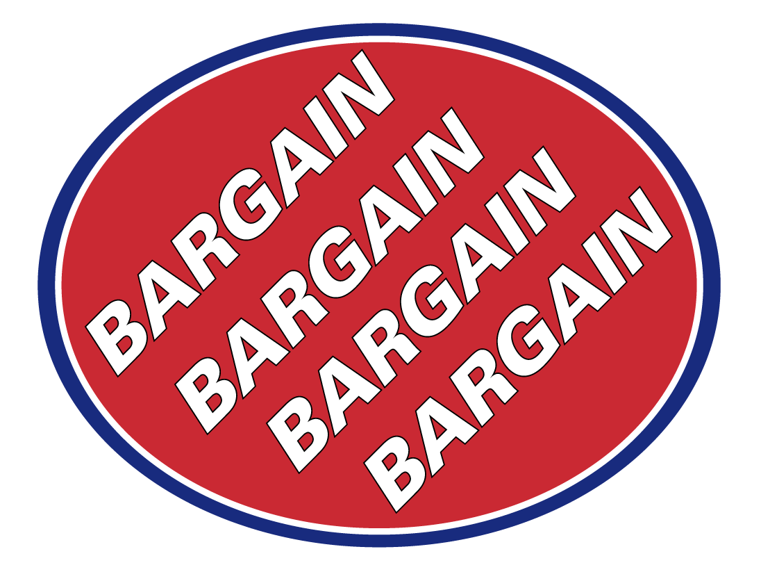


INITIAL DESIGNS


'FEELING THE SQUEEZE'
Reflects how markets are struggling against big brands.

Used Goudy because of it's traditional serifs but it is also friendly and inviting due to the curvaceous structure.


Univers 75 Black Oblique


Helvetica Bold


Helvetica and SignPainter - HouseScript


Dalcora LT Pro Regular


Frankfurter Com Medium


After experimenting with a few different words and phrases inside the oval, it is clear that I need to explore a range of vernacular typographic styles so that I can juxtapose them with more geometric, formal fonts. I am feeling a lot more confident with this concept, however I need to work on composition and layout from analysing the existing fruit stickers and imbed this in my designs.


Friday 24 February 2017

OUGD505 - Studio Brief 2 - Feedback

I identified 3 issues from my initial research to take to a one-to-one crit in order to gain another perspective and identify if the issue has enough facts and sources to work from and whether it has enough scope for primary research.

Death Penalty

We highlighted the fact that the death penalty is a current debate and is still practiced in countries such as America. There has been a lot of campaigns against the act which I can use to back up my project and support my concept such as the facts I have identified from Amnesty International.

Suggested that I should look at more examples of how people raise awareness and try to tackle the death penalty in order to abolish it and find a unique angle to take forward. I want to avoid repeating previous campaigns in order to be innovative.

Syrian Freedom of Speech
Inspired by my research into V&A.


  • Spray painting technique used is associated with rebellion, disobedience and a fight for freedom so they naturally seem to go together and compliment each other.
  • Tackles the issue of giving the victims an identity, rather than just a number. 
With the Syrian refugee crisis being a current issue, this would be a current issue which means I can gain primary research and make an impact on society. 

It was also fed back that this concept would inform the production and materials for the solution. I explained how the civilians use newspapers and DIY methods to produce the stencils and paint whilst staying inconspicuous because they are at such a large threat.
  • Needs more research - Build a better understanding of the events that took place in Syria that forced people to act.

Sea pollution

A current issue which is supported by Greenpeace and a variety of other independent charities.
We brainstormed some angles to which I can tackle the issue by focusing on a specific problem. Initially I have been looking at plastic in the ocean and washed up on beaches, however we identified there are more issues:

  • Effects it is having on corral and marine life
  • Look at how it effects surfing - The big clean up
  • Oil spills
  • Wildlife
This provides evidence that this concept has a lot of scope and I wouldn't be stuck for finding content as it is still an issue today. Peers thought an environmental issue would be strong because it is relevant today. 

Feedback Evaluation

Out of all three issues, I gained the best response for the Syrian freedom of speech issue because it is a current issue. I didn't gain a lot from the one-to-one crit so I decided to go out in search of more feedback and opinions based on the three identified issues.

CREATE/RAAISE AWARENESS OF THE ISSUE - CREATE A CONVERSATION


Further feedback...

Spoke to John regarding the Syrian issue because I was anxious that I was delving into a sensitive subject. He saw the spray painted portraits of the martyrs as giving them an identity which is something I am passionate about, rather than giving them a number. He suggested looking at missing people to see how the spray painted portraits could be used to increase awareness of the identities of missing people.

I intend to carry out some more research based on missing people from around the world and the UK.

I explained the fact that they disguise the stencils in newspapers and paper bags to avoid being shot on the spot if they're caught. This would be an appropriate distribution method.

MISSING PEOPLE

Relate to the Syrian spray paints

Create a broadsheet with peoples faces/names/dates as stencils for people to go around and spray on buildings in order to find them?
A broad sheet would be appropriate format because it is light, reusable, cheap and tactile.


OUGD505 - Studio Brief 2 - RESEARCH

Amnesty International

Death Penalty: 'The death penalty (also known as capital punishment) is the premeditated, judicially sanctioned killing of an individual by a state.'

According to Amnesty International, the death penalty is the ultimate denial of human rights:

Political Tool - You are more likely to be sentenced to death if state authorities see you as a threat which is why the death penalty can be perceived as a political tool. Opposition = Threat = Death

It discriminates - You are more likely to be sentenced to death if you are a member of a minority group within a state that executes. The death penalty disproportionately affects members of racial, ethnic and religious minorities, as well as those living in poverty.

It's irreversible - Mistakes happen

It doesn't deter crime - A 2012 report by independent researchers at America’s National Research Council of the Academies found that US states using the death penalty have a similar murder rate to states that don’t use it: the threat of capital punishment did not appear to prevent homicides.

'If the death penalty is not a deterrent, and it is not, and if the death penalty does not make us safer, and it does not, then it is only high-cost revenge.' - Florida judge Charles M Harris


  • Torture
  • Mass Surveillance
  • Women's Rights


Greenpeace

Ocean Pollution - Plastic

The oceans are at their choking point, for every mile of beach surveyed there are 159 plastic bottles found washed up.
A big part of the problem is plastic bottles. They take more than 450 years to degrade
Plastic doesn’t belong in the ocean, but there is 12.7 million tons of the stuff entering them every year, that’s a rubbish truck every. single. minute.


V&A Disobedient Objects

Syrian Graffiti

An artwork designed by Zaher Omareen and Ibrahim Fakhri. Their work documents some of the individuals lost in the Syrian revolution. The piece was created using stencils and spray painted directly onto the gallery wall. Similar stencils have been shared online to encourage people to repeat them on walls around the world as they have done and continue to in Syria. The text in the artwork reads ‘Freedom':


The artwork documents the martyrs lost in the revolution. 
The news stated the number of deaths however nobody knows their names or faces so they made it more human by using the faces of the martyrs as stencils. 

Once the revolution started they began to shoot people so they started to spray on walls as a way to express themselves. 

Graffiti in Syria - If you get caught. you're shot on the spot
Can't speak out and say what you want to say

Tools to conceal a stencil:
  • Made from newspaper, concealed inside a newspaper
  • Xray sheets - Easy to cut and fold
  • Paper bags
Don't always use spray paint, other materials such as shoe polish are used. 

'It's a newspaper.. It's paperback.'

People demanding their rights
Tortured to death, shot on the spot.
Children amongst them
Need to be acknowledged - Not numbers, humans. 

Could potentially create a broadsheet newspaper with ready made stencils that people can use to raise awareness of the controversy in Syria and providing the public with a tool to encourage freedom of speech. 

Banksy's Dismaland

Dismaland was a temporary art project organised by street artist Banksy, constructed in the seaside resort town of Weston-super-Mare in Somerset, England in 2015.

Darren Cullen - A UK based artist and political cartoonist.

Cullen initially thought he to go into advertising as a career, studying it at Leeds College of Art where he learned the language and techniques of the medium but became steadily horrified at the ethical implications involved. 

“Manipulating the desires and aspirations of the public, and especially children, using an arsenal of sophisticated and emotionally damaging psychological techniques is an appalling way to make a living and an even worse way to sustain an economy.” 

Cullen abandoned advertising to study Fine Art at Glasgow School of Art. He now uses the language of advertising to make work about the empty promises of consumerism and the lies of military recruiters.

As part of his practice, he created the website, Spelling Mistakes Matter to showcase his work and highlight issues:


Join the Army - Recruitment Comic
2013
Award winning video:
Campaign as a response to the Army recruitment campaign:

https://vimeo.com/131462825


The campaign challenges the British Army's policy of recruiting 16 year olds into the most dangerous army jobs.


Cullen has used the iconic children's toy Action Man and takes the tone of voice from the adverts in order to juxtapose the negative facts with advertising. 

 Cullen has also related his work to the Navy campaign as well:


Satire definition: 'The use of humour, irony, exaggeration, or ridicule to expose and criticise people's stupidity or vices, particularly in the context of contemporary politics and other topical issues.'

Cullen's work is satirical as it mocking and sarcastic tone of voice throughout his campaigns. 

Wednesday 22 February 2017

OUGD505 - Leeds Public Spaces - What to Include?

Reflecting on my research into previous cycling posters I have identified the information that would be relevant to present:

1 - RACE INFORMATION

Leeds - Harrogate
Grand Départ
Stage 1
5/07/2014

Leeds Town Hall

This concept would take influence from my research into the art deco posters I previously found.

2 - QUOTES
Christian Prudhomme:
  • "I can see the Tour in their hearts, and in their eyes. For that, I say thank you to everyone in Yorkshire who has made this Grand Depart so very, very special."
  • “The grandest Grand Départ”

3 - INFO GRAPHIC

Create a poster that presents the positive points from the report using infographics to organise the information in an easily interpretable manner.

4 - OTHER

The route:


FEEDBACK

I asked for feedback in order to determine which content they think is the most appropriate considering my concept.
  • Infographic concept may be a little too dry as I have created concepts that would compliment a poster format more successfully. 
  • It was fed back that I should try to include a quote from Prudhomme because it is directly aimed at Leeds.
  • LOOK AT PAUL SMITH and his collection of old cycling jerseys

Poster Design - Josef und Shizuko Muller-Brockmann - 'History of the Poster'

This blog post is relevant for both OUGD505 and 503. 


The publication sets out to define the nature of the poster and indicates the laws of designing which determine form, colour and composition.

'The laws of poster-designing'

Muller-Brockmann states 'a poster in the street should attract attention, interest or - at the every least - curiosity' suggesting that the message shouldn't be too ambiguous.

Cassandre believes a poster should be 'unexpected and surprising' even though it is pasted on a wall and is immobile. It should make an emotional impact on the audience in order to break the barriers and draw the audiences attention.

General demands of poster design:
  • The poster must be legible and its message understandable.
  • The poster must be innovative and arouse interest
  • The poster must be designed with large shapes so that it is also effective at a distance. Closer, the poster must generate a response by means of easy recognition and the sum of details. 
  • The poster should remain in the memory of viewers
Lettering in poster design:

MB believes the type should be sized and placed correctly so that the type becomes a component of the pictorial information - 'Both elements then merge inseparably in the memory'. For example:

Otto Baumberger
Poster for a hatter's shop
Lithography
90x128cm


Henri de Toulous-Lautrec
Theatre Poster

1895
59.5x79cm


Theatre Poster

1892
98x140.5cm


  • The lettering should help to impact information quickly, and this is best done if the style is clear. 

The infomation must be concise, simple and exactly complement the pictorial element. 

Shape in poster design:

  • Forceful presentation can intensify the impression.
  • Pictorial elements of the design should be correlated and ordered in order to create a compact effect.
  • A diagonal composition produces a dynamic effect. Example:
Josef Muller-Brockmann
Less Noise
1960
90 x 128cm


This corresponds with my findings from the research into previous cycling posters as diagonal and italic typefaces were a consistent theme. 

Gerstner and Kutter
Newspaper posters
Screen printed
1960
90.5 x 128 cm


  • Rhythmic forms also have a dynamic effect. 
Ernst Deutsch 
Poster for a make of shoes
1912 Berlin
94 x 70cm


  • It is advantageous to have the optical emphasis above the centre of the poster. - Lighter and more elegant.
  • Create unity between text and image


Colour in poster design: 
  • Colour as the bearer of the symbol - Emphasise the subject of social, economic, political and cultural campaigns.
  • Colour can strengthen a scene or atmosphere
  • Colour can be a connecting element in series posters. 
'Designers generally examine their design subjectively and emotionally, on the basis of their experience with an instinctive feeling for what is admissible or superfluous.'
-MB
-p.19

Quote suggests its okay to be experimental and ambiguous with posters.


The Experimental Poster
p208

'Experiments in the sphere of design are generally the direct consequence of revolutionary breakthroughs in concepts of form which previously had fixed conventions.'

'The mainspring of experimentation - leaving the familiar, safe ways and methods and thrusting forward into the unknown - leads, at the very least, to the experience of new perspectives.'


OUGD503 - Responsive - Collaborative Practice - Third Meeting

Ballet Terminology and Annotation Concept

We had previously discussed the concept of introducing ballet terminology to the campaign in order to allow the audience to appropriate and gain a better understanding of the art form. This would add a USP to our campaign which will be desirable for the culturally engaged target audience.

Annie introduced the group to Nicolas Burrows' new children's book 'How It Is...' which plays with concepts of sound and colour. 'It is a visual sequence that uses bold, block images and playful language to reinterpret the world around us':


The simple addition of typography creates a fluid rhythm between the pages. This example has proved really useful because it shows how typography can be combined with an illustrative style and texture. 

Illustration Style

Annie showed us some initial sketches influence by her research into the Bauhaus ballet productions:


I identified that the shapely illustrations would lend themselves well to collage which Tom confirmed would be a suitable animation method. Annie's style is original and wouldn't be immediately associated with ballet, however it is still very much appropriate as it brings a unique style. The brief requires ballet to be presented in a contemporary fashion and this style abstracts the human form in order to stand out against the other submissions. Annie's knowledge on colour theory is evident in her initial sketches which is a really beneficial skill to have on the team. 

Feedback

After feeding our story boards back, we agreed that the Production concept would be a good scene to focus on. We began to create a narrative that would showcase all of the small details that help to create a ballet.

PRODUCTION


  • Ripping the ticket 
  • Orchestra Warming up - Potential for some sound
  • Getting a drink
  • Conductor taps and the orchestra goes silent - screen could go black?
  • Lighting man turns on lights
  • Figure on the stage

TRAINING/DEDICATION

As we identified that Annie's illustrations are very shapely, we thought that we could separate parts of the body into individual shapes. The hand the feet and the legs, etc will all be moving around on the screen with no particular order. The animation will then zoom in on each feature and explain the definition for that particular movement.


I thought this could be used as an interactive feature as an extra touchpoint. The interactive web page would show the shapes and colours moving and the user can click on one and the animation will zoom in and explain what the movement is in relation to the context of ballet. This would look attractive for the judges because it engages in the world of ballet on screen. 


Reflecting on the progress so far, as well as considering each others visual styles, we confirmed that working with paint, collage and type would allow us all to contribute to the design process and it would also lend itself to the stop motion animation. This will ultimately share the work load between us all. Tom said that using stop motion animation isn't very time consuming however it is the preparation before filming the scene that takes time.