TYPOGRAPHY: 'The art or procedure of arranging type or processing data and printing from it.'

Bristol has a thriving current and historical arts scene. Some of the modern venues and modern digital production companies have merged with legacy production companies based in old buildings around the city. In 2008 the city was a finalist for the 2008 European Capital of Culture.
I visited various locations around Bristol to capture the diverse use of typography:
- Stokes Croft
- Cabot Circus
- Clifton
- Avonview Cemetery
Overview contact sheet of all images:


DSLR camera allowed me to shoot high quality images, however a larger lens would have benefited me as I could zoom in further and focus on specific characters. Shooting with a high quality camera means my images are at a better standard for presenting in a final outcome. Collating all of the images together allowed me to review them, making sure they were all to a good standard.
Chosen images:
Aimed to capture one letter per images, critically analysing a single letter in context with the whole word.
Ashton
Located on a derelict building near Temple Meads Station, this character is part of a scaffolding companies branding. The logo is appropriate for its purpose due to its consistent stroke width, creating a bold and legible typeface that can be seen from far away. Being in a busy environment this is important, with traffic and pedestrians making their commute, the sign is in prime position for commuters to see because it’s above head height, meaning less obstruction.
Connecting the characters creates a flowing cohesion that imitates the constructive characteristics of scaffolding.

Sobeys
A retail store specialising in vintage and reworked clothing, located on one of Bristol’s busiest roads; Park Street. The bold serif typeface is easily legible due to the bold, gold type contrasting on the black background. This is important as the shop is located in a retail area and needs to attract consumers. The colour scheme and serif typeface gives the audience a sense that the shop has class and gives a vintage feel which is appropriate branding for the shop. Park Street is home to a lot of high end shops which use contemporary branding such as a clean and crisps sans-serif typeface. This traditional typeface therefor stands out more in this environment.

CRACK is a free magazine designed and published in Bristol. Managing director, Jake Applebee graduated from a graphics course and set out to produce something he could physically hold, instead of an online resource. 7 years on, print is still their passion. CRACK hosts an independent platform for contemporary culture such as music, art, film, theatre and fashion, making it widely accessible for a range of ages, predominantly young adults. It’s available in the foyers of public spaces such as pubs, cafes, restaurants and shops and also in those of cultural venues such as galleries, libraries and cinemas.
‘C’ is an appropriate typeface for the cover page because it is bold, geometric and strong making it easily legible and recognisable. The stroke width is high and consistent and, along with the strong geometric qualities, make the negative space reveal a ’T’ on its side.

EL COLMADO
A traditional Spanish shop located in Stokes Croft. The colour scheme reflects the ones used on the Spanish flag which shows a strong visual identity. The characters are layered which adds depth and form to the signage, ultimately capturing the public’s attention.
The quality of the image is poor so it will need to be small to avoid pixelation. It would have been better if I had got the whole shop front in, however a car was parked in front and I thought I should focus on the type. Looking back I should have photographed the whole building with the car because it would show the audience more context.
The quality of the image is poor so it will need to be small to avoid pixelation. It would have been better if I had got the whole shop front in, however a car was parked in front and I thought I should focus on the type. Looking back I should have photographed the whole building with the car because it would show the audience more context.

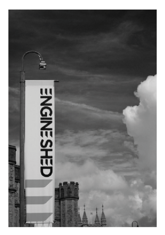
Engine Shed
Located in Brunel’s original station building, the Engine Shed is a space that’s been created to encourage young people and businesses to host meetings and rent event spaces. To achieve this, the ‘E’ has been simplified due to the removal of the stem, however it is still legible due to the three parallel lines being so recognisable in an upper case ‘E’. This unique adaptation of the character makes it recognisable as an identity for the business as they have repeated the 'E' faintly at the bottom which shows how successful the branding is. The type is aligned vertically, making the most of tall, narrow sign so the type is legible from far away.
Bristol Festivals
Bristol is renowned for its celebration of creativity, whether that’s music, art, fashion or cultural events. The face of the company that promotes these events is a classic serif typeface that has been adapted by breaking components of the character. This puts a contemporary twist on the traditional serif typeface due to the breaks and bloated elements. Even though these changes have been made to the typeface, it is still easily legible against the sophisticated grey background.
Bristol is renowned for its celebration of creativity, whether that’s music, art, fashion or cultural events. The face of the company that promotes these events is a classic serif typeface that has been adapted by breaking components of the character. This puts a contemporary twist on the traditional serif typeface due to the breaks and bloated elements. Even though these changes have been made to the typeface, it is still easily legible against the sophisticated grey background.

The Gryphon
Best known for its live metal nights and array of beers, The Gryphon’s signage is an example of hand lettering on a pub sign in an illustrative style. It reflect a gothic style which is appropriate for the pub because it is well known for it’s heavy metal gigs and scene. The serifs have been morphed and manipulated to create a unique and natural letter form. The fact that the typeface is not permanent makes it even more original. Photographing the whole sign and building would give the audience more context.

Human Rhythm
Serif typeface found inside CRACK magazine is intriguing due to how balanced the typeface is. The archaic style works in the context of CRACK magazine because of its contemporary nature that manages to feed new life into traditional, serif typefaces. The short serif’s and solid pillars give the ‘H’ a solid structure which ultimately makes the character easily legible.

I photocopied this page of the magazine which is high quality and includes the creases in the stock so the audience know it was in a printed publication. This adds context to the typeface.
Blitz
Located on Park Street, Blitz is a strip club which have replaced the ‘I’ with the figure of a woman, suggesting what genre of club it is and it’s target audience. The word is still legible when read in context which is an example of good branding.

Costume Hire and Joke
Located on Colston Street, the signage for this joke store is an entertaining serif typeface. The upper case type is strong and the flairs that come off the serifs are elegant and engaging, however the glossy finish over the signage means it is hard to see/photograph due to the light reflecting off it. The flourishes found in each character fit in context with the playful shop.

‘Drek’ is an informal lexis meaning rubbish or trash. Bristol is well known for its graffiti which has diverse examples of type that range on the legibility scale. Specifically looking at the composition of ‘K’, it is probably the most legible and recognisable character due to its elongated and angled legs. This is a very informal, expressive form of type due to the inconsistent stroke width, size and layering of type.

Punchbowl
A Victorian city pub dating back to 1872 use a simple sans-serif typeface which allows it to be legible from far away, attracting more customers. However, the historic pub would be more suited to a traditional serif typeface as it would compliment the pubs historical background.

Arnos Vale Cemetery
Once a Victorian Cemetery, Arnos Vale is used as a public park in the centre of Bristol. Serif typefaces are common due to the gothic impact for the gravestones, as this ‘M’ demonstrates. The symmetrical shape brings harmony to the character and by joining the apex to the base creates a solid letter form. This makes the character intriguing to look at as it reflects the historical nature from where it was found.

The Exchange
The Exchange is a small music venue in the centre of Bristol known for its diverse gigs and small capacity. During a refurbishment of the building, the workmen discovered old signage when stripping back the paint. This evidence suggests that the building was once used as a cafe/restaurant. The hand painted type also suggests that the old business was running during the early-mid 19th Century as the sans-serif type is typical during this time. There are examples of kerning and condensing the typeface so that the composition is correct. For example, ‘Not Sundays’ has two different sizes of type to accommodate the whole word so that the statement is balanced when aligned to the centre.

Piano Bar
Alongside Bristol’s famous Hippodrome, the Piano Bar host events before/after performances for guests to drink and listen to a pianist. The mosaic type and background offer an elegant style. The techniques and processes used to create this composition influenced the style of design as there are ridges in each joint creating patterns of geometric symmetry.

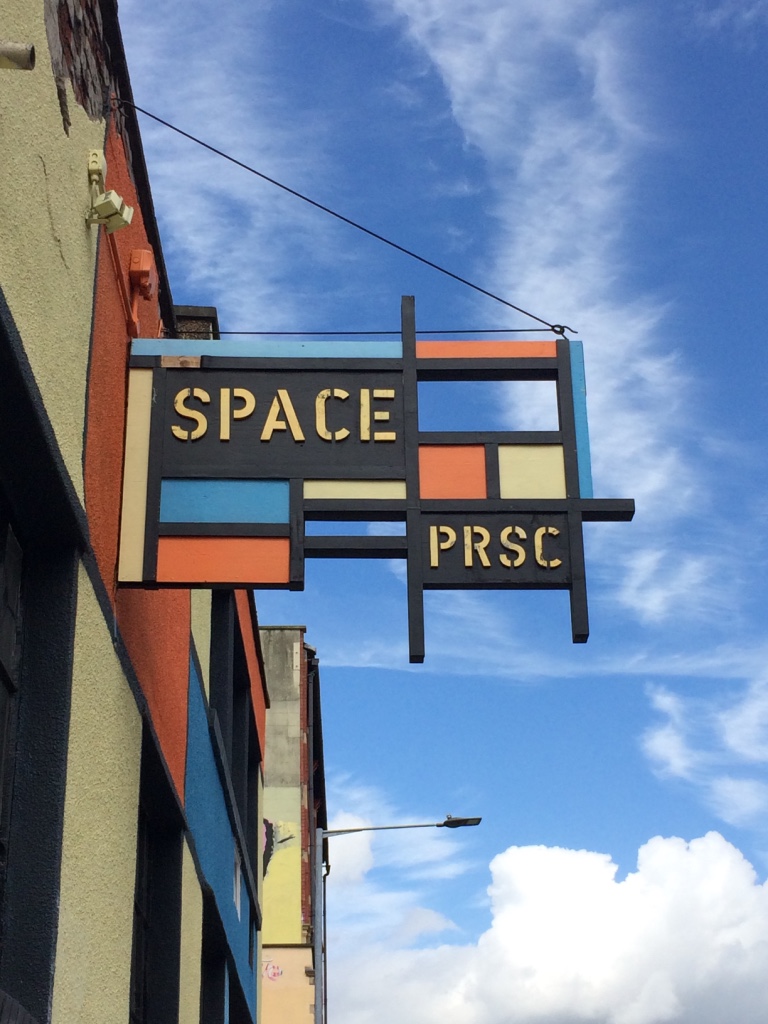
Space PRSC
Located in Stokes Croft, this signage is the front for some creative studio spaces. The sign itself reflects the work of fine artist Mondrian due to the geometric shapes which create a grid system for the type to be placed into. The ‘P’ itself has been dissected into two simple shapes which are still legible from ground level.
Front signage for an independent antiques store is made of very simple letter forms. The lack of curves makes it geometric and sharp which may be hard to read from a distance, especially the Q, however the black contrasts well with the white background so the characters stand out more and aid legibility.

The Bristol Pack
To celebrate Bristol’s artistic culture, a pack of cards was created where a number of artists and designers could create there own specific card in any style they please. As a result, a range of techniques and processes were used to create a diverse pack of cards. The stroke width for the typeface is very prominent creating white space that also reveals an ‘R’ making the typeface legible. Each character is condensed into almost a perfect square which gives the characters consistency which ultimately makes them easier to read.

Sequences
Sequences is an event set in the heart of Bristol around the iconic Motion nightclub. To promote the night, these stickers were placed around random locations around Bristol. The typeface used is Universe Ultra Condensed which allows the who word to fit onto the sticker with even spacing, however due to how close together the type has been set, the vertical lines make it hard for the eye especially from far away.

Another example of graffiti in Bristol, Stokes Croft. Composed using standard Helvetica, the statement is legible from far away. However the composition is made unique and expressive due to the running paint. It’s interesting to see an industry standard type taken into a new context such as graffiti as it puts a contemporary twist on the type.

Bristol Temple Meads Station
A lot of the signage and wayfinding throughout Bristol Temple Meads is still original and handmade in a traditional style. The changes in font style make key information more prominent which is an example of hierarchy as key information is larger. The sans-serif typeface is easily legible because of the contrasting colour palette and simple letter forms which is appropriate for an environment such as a train station.


Uncertain World
The ‘W’ on this Bristol University mural is another example of type in graffiti. Its jurassic style is represented through the jagged serifs and is large enough for passers by and drivers to see. Placing the mural right next to a road creates a lot of exposure because it isn't blocked by obstacles. Capturing the car and pedestrian in the image gives a taste of the busy environment the text is in.

Spike Print Studio
Letter press from some old woodblock type from Spike Print Studio, the largest open-access print studio in the South West. The traditional printing method and worn printing block creates a fuzzy texture that is typical of old letterpress. The unbalanced weight of the ‘X’ and distorted excess print brings character to the traditional process, however it makes for poor legibility.

Mack Daddy’s
“Mack Daddy” is an urban term meaning ‘the king of the street’, or the ‘best at what you do’ which is appropriate for this bespoke hair salon. The archaic, expressional serif typeface suggests a mature and intriguing branding for a hair salon but that is what makes it unique. Each character is composed using a traditional calligraphy style which is hard to read due to the exaggerated and expressive serifs, especially in this modern age where communication and typography have grown to be read quickly and efficiently.


These images show the audience type in context:

As I was walking around the city I wanted to capture more of the urban environment that the type was presented in, instead of cropping the character. This will show the audience type in context which is the purpose of the study task.

Possible themes to look at:
Graffiti
Serif
Sans-serif
Old/New
Abstract
Hand Made
Photo Shoot Evaluation
When I was photographing the type around Bristol, I found it hard to get in a good position to shoot the signage as I was often too close or too far away. This was more of a problem in urban areas as traffic, pedestrians and obstacles meant I couldn't get in a good position to get a complete image of the sign. To benefit my project, I should have photographed the surrounding environment so that the audience can see the context.
After visiting Bristol two times, I managed to gather a broad range of Bristol's typography which will provide me with a lot of opportunity as the project progresses.
Having a different lens that would allowed me to zoom in further would have benefited me a lot as I would have been able to capture the environment that the type is shown in.
Presentation Preparation
Presenting my findings needs to be engaging and informative in order to entertain and keep the audiences attention. To achieve this I will predominantly use images as visual stimulation.
Instead of presenting each individual letter on separate slides, I thought I would summarise my findings with examples and themes that I discovered when reviewing my images. This will be more thought provoking and stimulate the audience.

In order to inform the audience about the type in Bristol, I will introduce the theme of diversity with this example:

Here I will explain how typography has developed on the streets of Bristol. The historic hand lettering found on an old building is still visible, even though it has been covered up for decades which shows how durable hand painted signage is. The texture of the concrete and faded colour work as a reminder of what a lot of signage was like during the early 19th Century. Now, wall art has become a lot more expressive due to urbanisation and creative drive. The typography is a lot more expressive and official because of the graffiti influences.
The very official and refined sign for Bristol Festivals is alongside a doorway covered in random graffiti, celebrates a natural freedom with type and image. These two contrasting uses of type are juxtaposed together, yet the audiences attention is still drawn to the Bristol Festival sign. This could be down to consumers and members of the public being tuned in to look at official shop fronts and signage.

For the third slide I aim to compare the type used for Bristol nightlife:

Found as a sticker on a bin, 'SEQUENCES' promo logo is made using Univers Condensed which, in a busy environment, people can read as they're walking past. However, unless the audience are informed about 'SEQUENCES' before, they will be likely to know what it represents. The sign for Blitz nightclub is a lot more suggestive due to the figurative letterform 'I' being the shape of a woman, this immediately gives the audience an insight into the type of place.
When I was walking around Bristol, I photographed type in a range of environments so I aim to talk about the array of different letterforms from different contexts:

Noticed that in busy areas such as the city centre, the type was a simple and clear sans-serif because people on the move need to navigate effectively. In more remote areas such as Arnos Vale Cemetery, the type was more traditional because it was one a graveyard. It is clear to see the difference between type depending on what context it is in.
Type out of Context:

I traced the photographed letterforms using the pen tool on Illustrator because it gave me freedom to accurately make a copy of each letterform. Seeing the type out of context from where I took the image reveals a plethora of different letterforms. I want to touch on this in my presentation to highlight the importance of context and environment.


Making the letterforms the same colour, size and placement will impact the audience by highlighting the anatomy of each letterform out of context when I flick through the slides. It also provides opportunity for more visual content.
Tracing each image is something that I can use to explain each character of the alphabet, however it will be hard to make sure each letter is exactly as it looks. Small serif's and subtle curves may not be picked up and can change the audiences opinion on the character. To overcome this, I aim to focus more on the environment and context where I found the character.
I will ask the audience on their opinion on comparing type in context and out of context in order to make an informed decision. The presentation is a good opportunity to gain a broad range of feedback
Another way I can present my content is by showing each individual letter. However, this is more likely to become tedious and I have limited time. Here are some examples including the image, statement and traced character:


The traced characters make the slide a lot more engaging because of the bold, contrasting lines. Having the image next to the traced character shows the audience the type in and out of context. As I want my presentation to be predominantly visual, I made the copy small which the audience may struggle to read. As a result, I will talk over the slides using a friendly and informative tone of voice.