Initially wanted to screen print the promotional posters -
However upon reflection I felt that it wasn't appropriate to screen print the design because the print quality wouldn't add anything digital print can already achieve. I prepared the screen for the first talker, Dines, however I would need to set up 7 individual screens for each professional and print each poster the morning before each talk. I felt this was cutting it fine and the effort putting into the screen prints wouldn't be reflected in the final outcome.
As an alternative I proposed digitally printed posters to allow us to flex our creative skills in a more reliable format.
Concept 1:
Created engaging visuals using the visual language from ITC Avant Garde:
Concept 2:
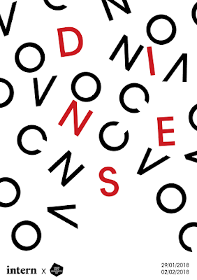
In order to reflect conversation I created a randomly typeset the composition using the characters from 'convo'. I aimed to consider spacing and white space in order to create a balanced composition. In order to personalise each poster for each professional I can potentially incorporate the name of the speaker into the falling characters, highlighted by a different colour:
This concept works well for DINES however longer names such as Chris Shuttleworth will make it challenging to fit all the characters on whilst being legible and consistent between all creative speakers.
Concept 3:
Using the descending characters gained positive feedback as it is a playful alternative and continues the visual language from the original brand.
Explored colour - I decided to break away from the brand colours (black, white and red) in order to be personal. I have identified colour as a weakness within my practice, as I tend to rely too much on black and white, therefore I took inspiration from Sanzo Wada's A Dictionary of Color Combinations, a really useful tool for referencing colour combinations and pantone colours.
Final composition:


No comments:
Post a Comment