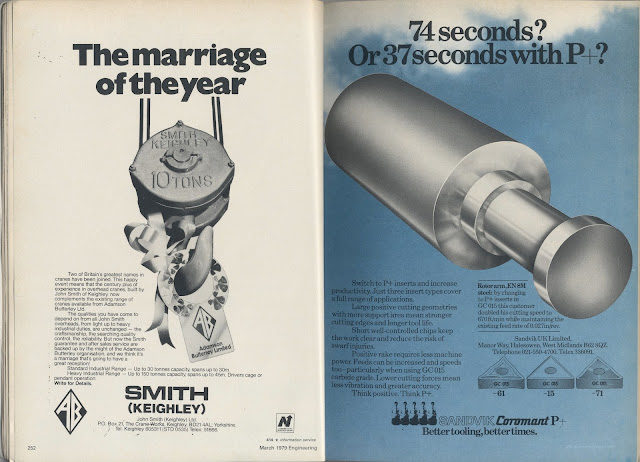
Engineering - The Design Council's Magazine for Engineers
1979
Observed layout
Interesting advertising - Tone of voice
Typography - Helvetica, YoungSerif?, Futura
As technology is having a huge impact on farming methods, I can use this source to observe how mechanical advertising and layout can be implemented into my outcome.
Advertising:
Asking the audience a question.
Short, snappy statements.


Editorial spread:
Clear use of a grid system to accurately organise information with images.
Direct tone of voice for advertisement.
Do you even reap?
Read it and reap.
Inspirational double page spread. The heavy serif typeface compliments the angular, geometric machinery images.
Find a font like this.
Change of stock within the magazine from gloss to matt. The contrasting stock textures promote a sensory experience. The green ink on pastel peach is unconventional and I am surprised to see it in an engineering magazine as my previous research highlights function being priority over aesthetics. However, this research has informed me that perhaps agriculture is in need of being revamped in order to appeal to a wider audience.
Courier
October 1965
My attention was drawn to an old edition of Courier magazine due to the photograph on the cover featuring tram lines.
Gaining some inspiration on how to combine text and image on a spread:
The large format images have a fairly low print quality, however the graininess works with the tactility of the publication.
Setting the type on a black background unites the entire composition.


No comments:
Post a Comment