Explores typography from the Victorian era to the digital age. It is important to gain a diverse knowledge of typographic history in order to reflect the traditions within farming and contemporary developments.
Humanist typefaces: Bodoni, Garamond, Jensen
Type faces don't have to be read, but experienced.
Designers were routinely called upon to amplify old letterforms to give the appearance of the new.
Legibility has traditionally been the goal of type designers, some text faces have been designed to act more like wallpaper or background than the instrument for conveying meaning clearly. -
"Gray Matter"
Three considerations that have governed type:
- Utility (how a face functions)
- Aesthetics (how it looks on a printed page) governs readability and legibility
- Style (affects what cultural code a typeface evokes)
Arts and Crafts - US
Italian Old Style - Specimen sheet, 1924, Bruce Rogers
The Packard Series - Specimen Sheet, 1913: Oswald Cooper / Morris Fuller Benton
Observations:
Prominent use of serif typefaces
Type is accompanied by repeat patterns and floral structures - ORNAMENTS
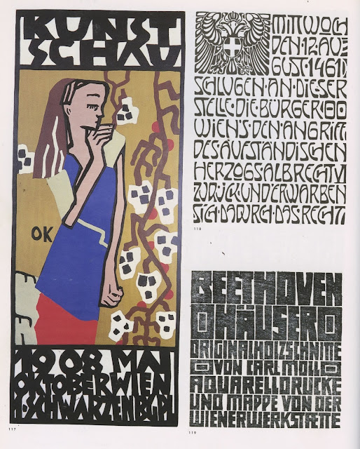
Art Nouveau Germany
'A' by Peter Behrens, 1899
Flowing typographic forms weaved into patterns
Kunstschau, 1908, Oskar Kokoschka
Similar print and line qualities of linoprinting.
Black Letter
Germanic
Commercial Modern - France
Modernistic -1932 - Samuel Welo
Serifless type attempt to eliminate the non-essentials
Bottom two: Samuel Welo, 1928
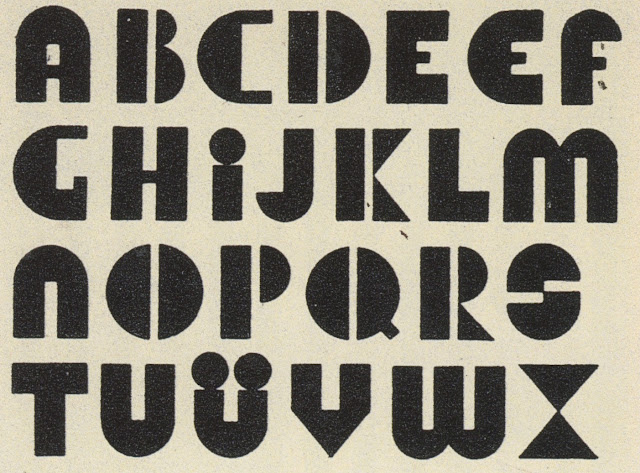
Tempted to explore the simple geometry that creates Klein's typeface. Characters such as A, F, H, M, N, U, W and W are all reminiscent of farm sheds. This reflects the relationship between nature and industry.
German
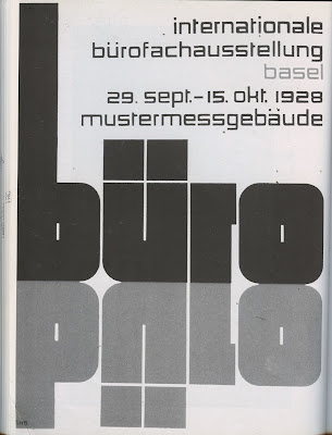
Industrial display typefaces suggest power and authority. The stretched 'L's emulate the tramlines created by ploughing.
Decorative typefaces:
Title, Alphabet, 1930, School of Decorative Art, Stuttgart
Buro, 1928, Theo Ballmer
Late Modern -1940s
Paul Rand:
Willem Sandberg
Tearing paper
Concrete poetry
Large characters as objects
Experimenta Typografika
Commercial Art (CA), 1960, Ivan Chermayeff
Late Modern - 1950/60
Texture and type:
Postmodern
Odermatt and Tissi
Wolfgang Weingart
New City Theatre Poster, 1990 by Art Chantry
Transfer type provides a DIY aesthetic
Layering the typographic composition over the figure suggests movement
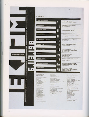
Russia
Table of contents for Reklame, 1990, Zelmanovitz
As a response to this research, I explored art-deco and nouveau typefaces due to the playfulness and emphasis on style.
Art Deco Display Alphabets
Selected by Dan X. Solo
Tramlines are reminiscent of art-deco line and pattern
Hotline:
Matra:
Neon:
Piccadilly:
Prisma:
Stencil
Can be easily applied to farm machinery and materials:
Bust:
Monogram Stencil:
Sheet Steel:


No comments:
Post a Comment