Showing posts with label Study Task 2. Show all posts

Tuesday, 1 December 2015

Wayfinding 1.3

Pictograms

Pictograms are often used to instruct, however another use for pictograms is for sport categories, especially in the Olympics. Due to the amount of Nationalities that attend the Olympics, it's important that the pictograms are consistent and internationally recognisable. Using pictograms is a useful tool for this guiding and informing international athletes and tourists, avoiding the language barrier.  


Munich 1972
Otl Aicher


Simple, geometric shapes make it easy to interpret and read on different scales which is appropriate for signage inside the stadium or campus. The contrast of colour, along with the circle being representational of a head, reflect an iconic action from the sport to make it recognisable. Keeping the same line width and simplifying the human form creates a unisex pictogram which is successful, especially as the attention to gender in sport is becoming prominent. Aicher has thought about the angle of limbs in order to portray movement. 

To create these pictograms, Aicher uses a grid system: 


Aids accuracy for width of line and angles to create consistent compositions. 
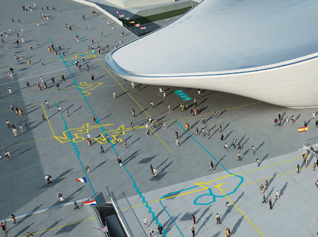
London 2012
SomeOne 


Interesting to see the style is still similar to Aicher from 1972 as it is a simplified body form, showing a recognisable action for each sport. Instead of consistent line, SomeOne has created an angular line to emphasise proportion, perspective and which ultimately portrays more movement. Seb Coe explains the purpose for the pictograms during and before the London Olympic Games. 

'The pictograms will be a vital wayfinder for spectators at Games-time and will become recognisable come 2012, but by unveiling them now we have a fantastic opportunity to use them as a tool for people to find out more about the Olympic sports.'


These dynamic versions of the pictograms were developed for banners and decoration throughout the athletes village and inside stadiums. Supposedly they were inspired by the London Underground map.


Using the extended lines clearly resemble the London Underground map and it has been conceptually adapted for an objective purpose. Putting the pictograms on the floor of the stadium and campus created an ingenious wayfinding tool for the visitors, guiding them constantly through the park with the coloured line.


My Pictograms

High jump:
Initial Sketches


Using Aicher's 45' grid system was useful for planning out geometric shapes and keeping the stroke equal. Sketching preliminary ideas is very time efficient which allowed me to progress faster. I wanted to capture the flexibility and strength of a high jumper, specifically the arched back and flow when jumping. I was influenced a lot by Aicher and SomeOne's pictograms due to the simplified form and angular line to suggest movement.  


Traced over an image of a high jumper but simplified the limbs and broke the figure into sections. In order to emphasise the flexibility required for the sport, I needed to make sure the back was bending the correct direction. I included the bar to help put the pictogram into context and made it grey so that the audience can clearly distinguish the figure from the bar. The foot on the right is angled awkwardly and is too close to the other shape. I need to make the spacing between each shape consistent. Presenting it on different scales allows me to see if it would work on a small or large scale as I am thinking about the different contexts it can be displayed in. 

Made the right food smaller to put it in proportion. Used Illustrator to finalise my pictogram because it was accurate, quick and allows me to save multiple versions.

Hammer Throw


Used the same concept but created curvaceous shapes to resemble the powerful figure of the athlete. The curved lines suggest stability and balance because they can slot together like a puzzle.


Created by unknown source, however I really like the simplicity of the figure due to the consistent line which is very similar to Aicher's style. The parallel diagonal line that resemble the arms and upper leg suggest tension and movement that the thrower is going through. However, due to the hammer being so long, it could be hard to fit it on signage, along with other information.

Noticed the shape was similar to when pole vaulter's are executing a jump so I put the same composition in a different context:


Suggests pole vault, however I think the London 2012 style would be more appropriate because it's an explosive and acrobatic movement. The angular line would suggest movement and therefor emphasises the agility of the athletes.

Atlanta 1996
Malcom Grear


The clearly marked muscle structure create accurate representations of the human form and the agility and strength required for each sport. 

Hurdles

To replicate Grear's style, I traced around an athlete doing hurdles from head on. I wanted to separate the iconic athletics vest from the rest of the body because it is associated with athletics and draws attention. Like Grear, I aimed for an accurate representation of the figure, however I avoided used curved lines so that the geometric limbs and angles. I didn't spend a lot of time making sure I traced it exactly as the original image because I wanted to make the pictogram emotive and expressional. 

Realised that wayfinding pictograms, specifically for the Oympics, need to be unisex which is why the simplified forms from Aicher and SomeOne are more appropriate because there is no classification of gender. The circular head is also very neutral and doesn't suggest a specific gender.

Feedback

consider;
Audience
Scale
Contrast
Impact
Clarity

Asked for feedback about my different style for each sport to see which elements were successful and what needs improving.

High Jump
I was worried the figure didn't reflect the dynamic bend of the back but the addition of the bar put the figure into perspective. People thought making the bar grey was successful otherwise there could be too many separate shapes to process. It was suggested that I reduced the amount of separate shapes but I think this allows the angle of the figure to be visually transferred. Having the shape of the iconic athletics vest was successful because it makes the sport recognisable. The pictogram needs to be recognisable on a small scale in order to fit on small maps and signage 

Think about CONTEXT

Wednesday, 28 October 2015

Design Principles - Colour Theory 1.1

Dimensions of Colour

COLOUR RELATIVITY

Choosing a colour palette can change the perception of the composition. Josef Albers unites two colours together using basic geometric shapes. When the colours are then separated the association is changed and the tone of colour looks completely different. 

'There are no ugly colours' there are only ugly colour combinations' - Josef Albers

'When I put a green, it it not grass. When I put a blue, it is not the sky.' - Henri Matisse

Brown is my least favourite colour as I find it really hard to find colours that would compliment it. I decided to see which colours work well with brown so that I feel more comfortable using it in the future. I have choose an objective colour scheme to work on a children's book cover. This is the colour (Pantone 732 C) that I don't particularly like to work with, mainly because I find it difficult to find a colour that compliments it. It's a very earthy, dull colour and this particular shade isn't used a lot in design unless it's to resemble an object, rather than typography or shape. 


Used Pantone 2716 C as the brown is a complimentary colour to blue on the colour wheel. I decided to go for a lighter tone of blue, that almost has a hint of purple. 


It's interesting to compare the two colours with text. The blue makes the brown text look darker and stand forward where as the brown looks a lot darker with the blue on top of it. This is due to the contrast. 


I was surprised at how much I liked this colour palette as they were both natural colours and the toned down green helps the brown stand out. 

I couldn't find any other colour schemes that worked with the brown so I decided to change the shade/tone of it to see if I could make better outcomes:


A very mutual palette that I believe to be very balanced. The brown is very dull and flat but the blue makes it look a lot friendlier.


Josef Albers 

Monday, 19 October 2015

Symbol - YSP 1.2

Feedback 


During the critique, I pitched my idea to a group and explained my concept and creative process of how I got to my final outcome. A lot of the feedback was positive as the group liked my primary research from when I was at The Yorkshire Sculpture Park. This gave me a strong starting point, and I think my group picked up on that as they all liked the way I developed my ideas from primary sources to secondary sources. I was successful in identifying the positive and negative aspects of my work as I wanted my presentation to be balanced. I showed everyone my thoughts and processes which allowed the audience to see how my ideas grew and I was praised for justifying why I made those choices. I think the audience is then put into the same context that I was in. A lot of the feedback that I received said that I had a 'deep, thorough, varied approach to the brief' which I think is due to the amount of research I did before designing. This research and my take on the brief created a thorough concept. A lot of people picked up on how I justified my colour theory which I was really pleased about. I have struggled a lot with colour palettes but they liked how I justified my change to a monochromatic scheme. 

On the other hand, it could be argued that all of these influences have been mashed together to create a visually confusing outcome. It was suggested to me that I should just use the geometric shapes, without the background because then it would be more likely to work on different scales and in different mediums. My group also felt that I should have showed them more of my initial ideas in sketches because this is a better way of translating ideas. 

I decided to see what my final outcome would look like if I simplified:


I much prefer this outcome because it is extremely simple yet only the shapes are required. I feel this outcome better reflects The Yorkshire Sculpture park because it is crisp yet visually interesting to look at because of the different qualities of line and shape. I could see this being much better for other mediums such as websites and phones as it's simple but strong due to the contrast in black and white. Without all of the previous research I wouldn't have come to a conclusion like this so I am still pleased but I need to remember that I can go back on myself as I can sometimes bury too deep. I also need to keep the medium in which it will be displayed on when designing which is important, especially in this technical age. 

Friday, 16 October 2015

Symbol - YSP 1.1

After visiting The Yorkshire Sculpture Park, I was surprised by how large the place was and the amount of prestigious artists work there. The work spans fields and fields along with galleries and an educational centre and cafe. Immediately, I could see the range of different age groups that go to the park. It attracts a lot of school trips from primary schools to elderly people going for walks and enjoying the countryside which reflects the diversity of the park. The symbol needs to be able to stand alone to create an iconic, memorable identity. 

This is Yorkshire Sculpture Park's current logo:


It uses the shape of a circle which I think reflects the countryside because it's a natural shape and the type is more geometric which reflects the angular and manmade sculptures. The soft grey toned circle is contemporary, like the sculptures, and the type is aligned off centre. I like the simplicity and it works on small and large scales.

I took some pictures of the permanent sculptures and the environment I was in to inspire my work and as reference to my designs:


An initial concept that I thought of as I was walking around is how YSP mix the natural countryside with man made sculptures of different styles and mediums. I could also use the negative space to create a more abstract symbol.


I really liked the work of Henry Moore because of the abstract shapes. The soft curves of the huge sculptures instantly attracted me to it. A lot of his pieces also had negative space which was a concept I was looking into. 
I used a primary sourced image of one of Henry Moore's sculptures to create a silhouette. I didn't think about colour but used blue because it stands out and makes it easier to work with. I really like the shape, although it does almost resemble someone putting their thumb up. - Reminds me of some of Matisse's paper cut outs. 

I liked the concept of showing how the sculptures are placed in the countryside as a lot of them really stand out. They contrast in material, colour, texture and shape and I wanted to reflect this as a symbol to represent the park. I noticed the trees were extremely old and dominant over the sculptures so I thought I could incorporate these ideas together. To experiment, I sourced an illustration of the age circles inside a tree:


Using the natural shape from Moores sculpture, I tried incorporating it into the inside of the tree:


I don't think the shape is right to go into a circle because there are two natural shapes overlapped. It is very monochromatic which is likely to get lost on paper or on display.


I didn't want to add a solid green onto the background because it was too overwhelming so I tried using a softer palette but unfortunately it didn't benefit the composition enough to take forward. 
 I still really liked the silhouette of the shape because of the natural curved qualities. I decided to purely stick with it and use simple techniques on Photoshop to see if I could create some interesting negative space or symbol.


I rotated the shape to avoid it looking like someone with their thumb up and made it vertical instead of horizontal. I much prefer this. I then simply layered the shape on a graduated tone. Used natural colours along with greys to give a sense of nature and man made. I like how the colour and shape softly evolve into the next. It reminds me of minerals. I still don't think this idea would make a strong, iconic symbol because the shape isn't balanced and it's still very subtle. I zoomed in on the composition to see if I could focus on certain areas that had interesting tone and shape:


Despite having colour scheme, I put it into black and white because I thought the monochromatic tones were softer and easier to look at. I put a boarder around the shape in order to create more negative space and confine the shapes. This definitely benefited the piece because it felt lost. 


I am really surprised by how well this concept turned out. I was experimenting with lines cutting through the natural curves to suggest a structure. Cutting through the negative space created expanded it. They almost remind me of flags. I still don't think that this is a iconic enough to be the symbol.


I liked the idea of using a boarder to create more negative space and make the symbol easier to see. I used a lot of natural colours to represent the nature such as blue and green. The connotations of coral are calmness and inner piece. I thought this would be a good colour to use as I found the YSP a peaceful place to be. The composition reminds me of looking down onto a map. It still feels very flat and some of the colours are too pastel coloured.


To stop the symbol from looking too flat, I went back and added the original tree print over the top. If If I had more time I would have liked to have taken my own print of the trunk of a tree using traditional techniques. The lines added a texture that reminded me of the contour lines on maps. I have lots of natural shapes and colours but I need to add some geometric shapes in to resemble the sculptures. 


I wanted the shapes to be dissecting the composition as I thought they'd help to break down the colours and textures and make it easier to read. I like the balance between straight and curved lines, however I'm still not happy about the colour scheme because it's so flat. 


Once again I decided to change the colour scheme to black and white and I am very glad I did. I feel like the composition is more complete and all the shapes work together subtly. The line from the tree stump is easier to see because of the bigger contrast which I'm happy about. 


I found the same composition works when rotated to landscape, although it starts to look like the ocean washing up on a beach but I don't think this relates to The Yorkshire sculpture park as it a very rural, rather than coastal. The growth rings from the tree represent the contour lines found on maps. This represents the vast landscape and environment that the sculpture park is in because there are hills and rivers. 


Rotating the composition so that the circle was at the top created balance because of the geometric shapes. The circle at the top also inspired me to add in the current type:


My final outcome isn't made out of lots of different shapes combined. The addition of the geometric line and shape divides the composition up and makes it easier to read. I am going to present my work in a crit to get feedback which will benefit my work. 


Tuesday, 13 October 2015

Symbol - YSP 1.0


Businesses often use symbols alongside type to represent themselves. The symbols are usually abstract or representational of the brand and need to work together or as separate components. 

A businesses that has successfully created a symbol to represent their company: 

Centre Pompidou


This symbol was predominantly inspired by the Pompidou building in Paris. The Pompidou is architecturally iconic due to the inside of the building being visible from the outside. The symbol is made out of horizontal and diagonal lines which resemble the visible pipework and construction lines in the building. The diagonal lines resemble the staircase that's visible from the outside and almost divides the building in half. I like the simplification of the complicated building by using bold lines. 

Negative Space

Negative space is the space around a shape or object. It can often form an interesting and artistically relevant shape. I have worked on previous projects in art and design that focus on negative space. I enjoy adding a different perspective and it is important for the overall composition. 


FedEx's logo uses negative space between the 'E' and the 'x' to create an arrow which reflects their postal service. This is due to clever kerning, however I think 'Fed' is too close together. 


The Hepworth


The Hepworth is an art gallery in Wakefield that is known as one of the finest contemporary art museums in Europe. Its type logo was produced by a London based graphic design studio Sumo. They have echoed the angular shapes from the David Chipperfield's minimalist gallery building: 


Sumo instantly wanted to take advantage of the dramatic, bold building which would be memorable for the audience and become very recognisable as being the Hepworth Wakefield shape. They used this as inspiration for the type and the symbol: 


I like the way they have used a sans-serif font but cut subtle areas off the ends to look like the angles from the top of the building. This is a recurring theme with the symbol as well: 


They have used the silhouette of the building to create a negative space which allows the type to show through. I like how the angular theme from the building is put into the style of text.  


Other example of negative space:


Food Writers Guild


Symbol for Food Writers Guild. I really like how clever yet simple the idea is. Using the nib and creating a spoon in the negative space is a good way to incorporate the food and writing in a well thought out way. 


My Cuisine Canary Wharf


I really like design that has multiple purposes. This concept works in print as effectively as the real stainless steel versions. The vertical line and negative space is balanced to create a smart clean composition, I should always consider negative space.