Concept 1: Short flashing images of scans and images I have captured throughout my experimental practice. As I am running out of time, this would be a good opportunity to bring all of my physical and photographic content together.
Concept 2: Using the numbers inspired by the market price tags and making the composition ambiguous to intrigue the audience to click and look further into it. This is reminiscent of the market experience as consumers can discover new foods, products and experiences in the market. This will encourage the audience to interact with the link and find out more.
Concept 3: Create a narrative
Explored these concepts in AfterEffects:
Composition 1:
Short, flashing, engaging images:
Potential title composition including the logo:
Composition 2:
Moving elements and overlapping the numbers creates an intriguing video, however the message is very ambiguous. I experimented with lowering the opacity to create more tonal variation.
Composition 3: Narrative
Still needs smartening up and I feel that the stickers could feature more in the video because they are playful and add colour to the minimal layout. Instead of having the moving components, which with my knowledge and skill looks very amateur, I intend to have short flashing images but crop the compositions to achieve ambiguity. I aim to use ambiguity to my advantage by forcing the audience to investigate and interact by guessing what the video is about by referring to markets as 'we'.
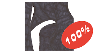
Addition of the 100% sticker compliments the monochrome colour scheme. I placed the sticker at an angle to represent sticking the sticker randomly on the produce. This adds a contemporary voice.
Changed the sticker to add more clues to the video whilst intriguing the audience. This sticker was influenced by the signage in Kirkgate market which is honest and witty.
Layering the stickers over my compositions makes them even more tangible, even though the outcome is on screen because the rough texture contrasts well with the bold, flat digital colours.
Added the RGB colour scheme to the words by alternating between each word informed by my research. Each frame adds a new sticker which has been placed obtrusively around the words:
I have found working with the templates of the fruit stickers really engaging and enjoyable because the limited space compliments simple compositions. From my feedback, 'feeling the squeeze' was a favourite out of them all. I didn't feel comfortable using a secondary sourced image of the orange therefor I simplified the composition by taking advantage of the linear sticker. I presented this sticker as the final slide for the 'we are..' concept because the statement illustrates the market struggle in a playful yet authoritative style due to the capitalised titles.
Short snappy sentences simplify the message and make it more hard hitting. Again I experimented with a range of typographic styles and developed the composition below. I made sure I emphasised 'OUR' because markets are a big part of local communities.
Finished on the campaign slogan/title phrase:
Added a few alterations for the final video:
Typesize for adjectives and verbs: 71px
Added one of the images of my market posters to reinforce the campaign:
Final Video uploaded to YouTube:
The video aims to intrigue the audience using


No comments:
Post a Comment