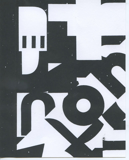
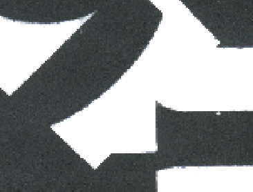
Grey:
Black:
During the printing process, I used too much ink in ratio with the emulsion which meant my ink was too think. As a result, my prints weren't consistent as some ink bled through the screen causing unwanted ink marks. The results were also covered in random white dots for reasons I am yet to identify. Possible reasons for this:
- The screen was blocked due to the thick ink drying too soon
- Screen wasn't clean
- Exposure unit could have been dirty
This demonstrates how many factors need to be correct in order to produce a professional print.
Scanning my screen prints in allowed me to add the copy:
The fuzzy lines replicate the inconsistencies of print at the time which reflects the aesthetic values:Scanning my screen prints in allowed me to add the copy:
I removed the ink blotch in order to smarten the composition, however this risks losing the print aesthetics:
Feedback
To overcome this I asked for feedback to see if they prefer the composition with the accidental print marks or an edited version. The overall consensus was that the edited composition would be more appropriate for the professional brief as it could be interpreted as lazy practice. However these marks represent the charming imperfections of print media, found throughout the The Voice of Action of the 1930s as well as contradicting Scout's idealistic character.
Editing
Edited the scanned composition by simply removing some unwanted print marks as well as deleting the background so that once it is prints cleanly and professionally.
Justified type to the left to increase legibility as the centred typesetting creates an inconsistent rag:
By breaking up the text with the scales of injustice icon, the information because easier to digest. Truman Capote's quote is given more authority as it is separate from the rest of the copy.


No comments:
Post a Comment