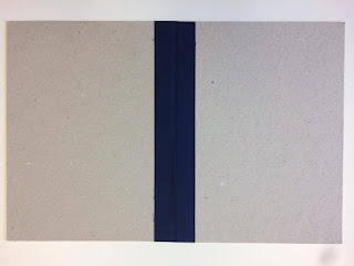
Instead of exposing my bind and pages on the spine, I aim to cover it using binding tape. This will add rigidity to my publication and also represent Bristol's 'edge'.
As I haven't finalised my content, I roughly guessed the thickness of the stock when my publication is closed so that I left enough room for the binding tape/spine. This is an important consideration during the production process in order for the book to function properly and look professional.
Inside:
Outside:
Next time I will wrap the binding tape around the full publication so that inside is also covered.
The navy blue binding tape contrasts well against the grey board, however I aim to test black binding tape because it will be even more contrasting and consistent with the black typeface, reflecting Bristol's edge.


No comments:
Post a Comment