First:
During the first test print I forgot to tick 'print blank pages' which meant the pagination was incorrect. I have highlighted areas that need to be changed and edited but also highlighted some double page spreads that were unexpectedly intriguing.
The quote doesn't relate to the image accompanying it on the double page spread as originally they both had there own double page spread. However traditional Times juxtaposed with the urban environment and graffiti illustrates my interpretation of Bristol through the publication:
I will consider these alternative layouts when finalising page composition because they are really engaging and reflect my concept well.
Second Print
Printed my second test correctly:
The limitations of printing in black and white means I can't judge the colour management and quality of the images. Seeing the images in print allowed me to gain an understanding of page composition, especially making sure the images are completely visible. I noted down specific images that were blurry in order to resize them in Photoshop.
Colour Print
My previous test prints have been a standard A3 double spread, however my publication is going to be an original size to give my publication more presence, therefor I printed my publication to the correct measurements and in colour:
Before I did this, I made sure all the images placed in the document were CMYK so that the colours are correct when printing. I noticed that some of my images were out of focus because they had been enlarged too much, to overcome this, I aim to resize the image using links with Photoshop in order to get the best possible print quality. The links panel is a really useful tool for checking images are to the best quality.
The image below was duotoned instead of black and white so the colours aren't completely monochrome. This was barely visible on screen which shows the importance of test prints.
High quality image is still crisp when applied to full bleed:
Need to make sure the images are aligned accurately on the page, particularly full bleed:
The black and white image needs to be smaller because it is slightly pixilated. Both images need to be separated because they don't compliment each other. The intention was to inform the audience on the environment as well contrasting the colours to connote emotion between the two subjects:
The grey board doesn't contrast with the white pages so I introduced coloured stock that protects the information and also creates contrast against the grey board, focusing the audiences attention on the content.
Green stock influenced by my research into Bristol's colours. Instead of having an introductory page, the green stock compliments the graffiti so it is appropriate to leave it blank. I could print the introduction onto the green stock, however it would be harder to read as there is less contrast between the stock and the text.
To overcome this, I can introduce a small page that wraps around the whole publication that can be used to introduce the publication. Presenting the introduction at against the coloured stock is aesthetically pleasing and also puts the audience into context without them seeing any of the content.
I aim to research into stocks that can contrast/compliment the green stock.
Jesse Draxler
Mix media collage:
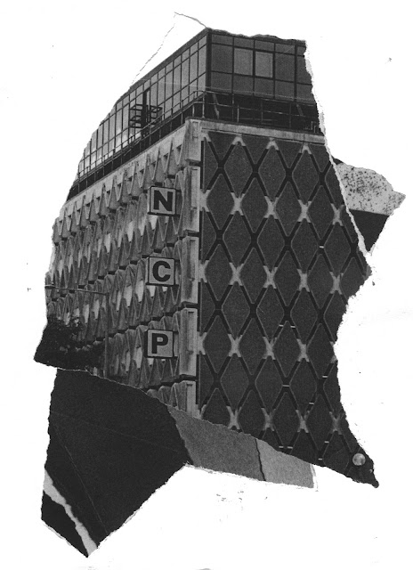
As I have printed out a lot of test pieces in black and white, instead of wasting them, I created some collages that juxtapose environments and typefaces to engage and appeal the target audience. I used influences from Draxler's monochrome compositions as it is a similar technique. Draxler has manipulated and combined photographic images to create contemporary compositions based on the human form.
Collage
Ripping the paper creates rough edges that highlight specific areas of the photographs. Juxtaposing the typography and monochromatic tones creates engaging textures. I aim to use these images inside the small publication leaflet.
Manipulating the paper by scrunching into a ball, folding and ripping creates a rough textures and natural lines that compliment the black and white colour palette.
There is opportunity to introduce the collage to the introductory page as the abstract content will intrigue the audience.


No comments:
Post a Comment