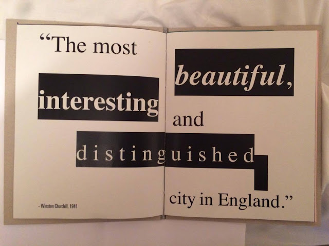
To make a considered design decision, I printed my publication using two stocks to analyse the print quality and feel of the stock.
Recycled, 120 gsm:
- Using this stock would mean my publication is made predominantly from recycled materials which supports Bristol's environmental consideration.
- Slightly off white and subtle freckles in the paper is similar to the texture of the greyboard.
- Identified this stock on a previous visit to digital print
- Light and malleable
- Very strong white
Both stocks are very similar and did not alter the colours and print of the images. Therefor the recycled stock would be most appropriate for my publication because it highlights Bristol's environmental consideration and the flake of the stock creates cohesion between the content and cover stock. The flakes in the paper and slightly off white colour take advantage of print media as the rougher texture of the stock stimulates the audiences senses.
Intro:
As my introduction is going to be on smaller stock, it provides opportunity to introduce a coloured stock as it will be visually engaging and separates the written content from the images, inspired by Flaxen Zine. The colours have been influenced by the ones used in the crest:
Recycled:
GF Smith:
Initially I was going to use red stock influenced by the colours from the crest, however I changed it to pink so that the type was legible.
Changed the green stock to navy blue as the pink contrasts well.
The justified to the left text is too close to the bind, however moving the text to the bottom right would lead the audiences eye to the middle of the page, focusing the audiences attention on the written information.
At the back of the book is an extra page created by the introduction. To utilise this, I credited Arcane Photography for their contribution. However, this should be inside the page:
References:
- Needs more work on layout
- Commercial considerations - The back page can be used to state copywright, stock choices and date it was published.
Zine
Recycled:
Pink:
Blue:
Green:
- Content is still visible on all stock choices.
Bound the zine in the middle of the publication. To separate this content from the rest of the publication, I included a double page spreads worth of coloured stock:
Creates contrast between the look and feel of the stock:
Printed the black and white zine on green stock to reflect Bristol's Green capital city award - Mixing urban with nature/greenery.
Centre page exposing bind:
- Grainy texture from the paper and scans make the zine tangible.
- Surprised by quality of print on the darker stock.
Need to include some content on the back page to avoid misleading the audience:
Printing onto coloured stock will be expensive because it is from GF Smith (industry standard). The stock came in A1 sheets so I had to cut them down myself to fit in the printer. I had to be extremely accurate so I cut it into 4 A3 pages - leaving room for the crop marks. This is an expensive alternative, however in the industry I would buy the coloured stock in bulk which won't be as expensive.
Binding
Bound the publication using chosen stocks to see how they deal with the large needle and thread and also the range of page sizes.
It was hard to secure all of the pages and booklets together so that they all lined up as the A3 paper and A4 leaflet/zine need to be positioned flush at the top and then centred inside the cover. To achieve this I used the binding clips, however the pages still moved around a lot. Needed to be accurate when piercing the 5 binding holes so that the stitch is straight - This is important as I can not hide the stitch
from being visible.
The thickness of the thread secures the publication so that it doesn't slip around the cover, making it consistent. Accurately piercing the pages with the binding tools avoided chewing up the stock, however it was hard to pull the thick needle and large thread through the thicker stocks. The only way I could achieve this was to continue using the pliers.
Type Problem
Even though I packaged the document, Univers 67 Bold Condensed wasn't available, so I was forced to use Ultra Condensed which effected my typesetting. I asked the print technician if I could over come this for my final print, however Typekit doesn't support my chosen typeface.
- 'Culture' is no longer justified to the same width as 'clash' because of the ultra condensed style.
- Not so much of an issue for the references as they are subtle additions to the page and don't effect the typesetting.
I bound the publication using the pamphlet stitch and twisted thread - Taking my time and using the correct tools allowed me to bind the publication accurately so text is still aligned accurately across the bind.
The printing cost was high due to my unique page size as I am charged on the amount of ink I used, not just the size of the stock. Overall the test print was a success as I have identified my stock choices for the final print. I can now tweak and adapt the images and layouts based on the test print. I still need to choose the coloured stocks so that they work harmoniously.


No comments:
Post a Comment