Experimented with a range of typefaces and point sizes:
Times Regular 30pt
A typeface that I considering to use throughout my publication so having it on the cover will make the book consistent and cohesive.
Time Bold 36pt
Clarendon Bold 30pt
Clarendon Bold 30pt - Upper Case
The prints transferred really well onto the grey board as the type is bold and clear, making the small typeface legible in relation to the size of the publication. Clarendon is a bold serif typeface which is a lot stronger than Times because of it's bold, dense structure.
In order to decipher which Clarendon would suit my publication best, I photographed them on my publication with the binding tape and asked for feedback.
The lower case is very subtle, however the rounded and bold uppercase copy is more prominent and legible, especially from far away. The majority of people thought the uppercase was more appropriate because it's more striking. This will make the title easier to read and impact the audience more.
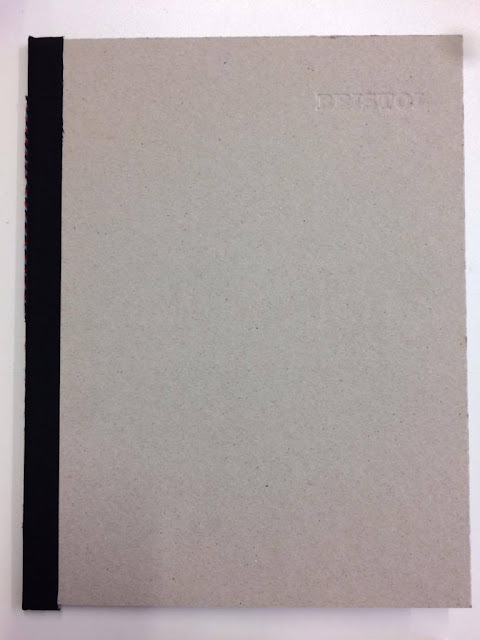
The front cover is minimal because I want to intrigue the audience into opening the publication and also highlight the unique stock choice. Putting emphasis on the stock will add to the tactility thus forcing the audience to explore/feel the book.
Debossing
There is potential to deboss the grey board using the lead type with/without ink to make the cover even more subtle and tactile. Due to the thickness of the grey board, embossing would be hard to achieve, however debossing will be a lot easier due to the composition of the stock.
As I am working with lead type, I need to be conscious that I don't press the type too hard as the type is likely to bend. Instead of using the letterpress, I used a traditional printing press that delivers an equal pressure from directly above which provides a consistent print. Blind de-bossing the cover makes the type very subtle, however more pressure would make it slightly more prominent. People often perceive traditional print as a limited process, however this demonstrates how the process can manipulate type.
Embossing the grey board adds to the aesthetic value of the publication making it more desirable.
Experimented with different tones:
As the subtly of the blind debossing wasn't prominent enough, I repeated the print without adding more ink.
Press 1 and 2:
Press 3 and 4:
Press 2 and 3 are mid-tones which make the title subtle yet easily legible.
In order to strengthen the blind debossing, I soaked the grey board in water for 30 seconds and then printed onto it:
The sogginess of the grey board allowed the metal type to create a deeper impression:
However due to the loose fibres of the stock, even when it was dry it had warped and stained the grey board. I am still pleased I tested this method as it is commonly used when embossing thinner stock.
When producing my final cover, I will experiment with mid-tones when debossing because it is still subtle and doesn't shout. This is relevant because I want the content to be vibrant and contrasting with the subtle cover.


No comments:
Post a Comment