Using publications instead of the internet as a research tool:
Vignelli Conon
I read up on Vignelli's publication because I need to consider my typesetting and page composition so that it is appropriate for my target audience and purpose.
'Bad layouts have no space left for breathing - every little space covered by a cacophony of type-sizes, images, and screaming titles.' - Vignelli
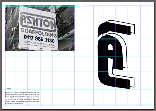
In order to convey my concept through page composition, I used a double page spread for each character. The centre fold line of a double page spread can separate the IN from the OUT, making it clear to the audience. I don't want the publication to feel cramped so I will take advantage of the landscape page orientation to make the information clear.
Vignelli believes that the white space is more important than the actual content because 'space qualifies context'. When designing my publication, I used the white space to 'better define the hierarchy of every component':
Placing the image at the top of the page immediately entices the audience so that they're intrigued and read on. I left a lot of white space between the image, copy and graphic image which allows the audience to focus on each component of the page. The size of the font is small so there is more emphasis on the images.
Vignelli states that a narrow margin increases tension which allows my landscape images to be larger. Having a smaller margin can also combat the binding allowance as more information can be nudged to the far side.
Standard 3mm bleed
Fit the margin to the 6x6 grid system. I chose 6x6 because it divides the page up evenly but is flexible enough to accompany text and image. Each of my pages are going to be different so this grid system is appropriate.
Tone of Voice
Tone of voice is dependent on many variables such as the purpose and target audience. The tone of voice throughout The-Art-Form is clear and concise, providing the audience with the most relevant information efficiently. This allows the audience to focus more on the subject of the publication.
I began by using third person to give the publication a professional tone of voice, focusing on the each individual letter. I don't want to ramble because the purpose of my publication is to inspire and change peoples perceptions of typography using high quality images and graphic art, to achieve this I will leave room for the audience to interpret their own opinion.
I haven't yet decided on a copy typeface so I am using Regular Minion Pro to get an idea of spacial awareness with text and image.
Baseline
During my time at ExtraStrong, I asked about typesetting because it was a weak area in my practice. He introduced me to setting type using the baseline tool. This makes the leading consistent between each line as the text automatically snaps to the baseline, the baseline can be edited depending on the size of the type. This is an industry standard technique that I aim to use in my practice to make my work more professional. It's helpful to edit the text once it is finalised otherwise the kerning/tracking and baseline will have to be constantly adjusted.
Two sizes of type help the reader to distinguish the subject from the body of text.
Vignelli's view on white space is refreshing as he believes pages shouldn't be filled to the brim with content, instead the white space should help the audience to separate each component of the page, from text to image. I created some pages based on my research using the copy from my summer project:
Some of my images weren't top quality, so to avoid blurry images I was forced to keep them small:
Experimenting with the layout of the text and image was good practice, however my publication isn't going to be an A-Z of type as I am exploring more than just the physical form of the letters in order to add depth to my concept.


No comments:
Post a Comment