People won't be accessing on mobile, however there is room for expansion.
Glad to be working with Ste as he has a valuable digital skill set and has experience in web design and development.
Thinking about the experience of using the site, our priority is to get people to the artists and music as quickly and easily as possible.
Why are people visiting the site?
- Listen to music
- Discover artists
- Get in contact
Three sections to the site:
- Homepage
Loading page animation
User scrolls down for more information into what Future Humans is.
Newsletter - In order to get more people involved and update them on future artists and releases we proposed a sign up form at the bottom of each page to encourage people to get involved.
User scrolls down for more information into what Future Humans is.
Newsletter - In order to get more people involved and update them on future artists and releases we proposed a sign up form at the bottom of each page to encourage people to get involved.
- Artists
Links to artists pages
- About & Contact
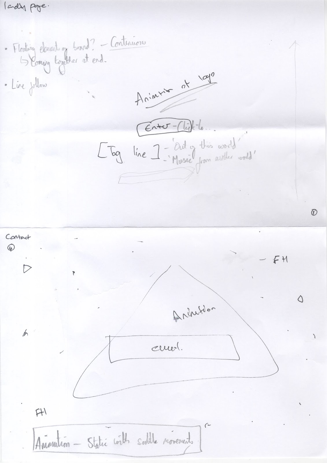
Loading Screen - Create an animated loading screen to engage and excite visitors whilst also reflecting the futuristic visual language took from our concept.
Concept:
- Split the Future Humans logo into separate shapes
- Have them floating around 'in space' and then come together to form the logo.

As the user scrolls down they will meet the about section of the homepage in order to immediately inform new visitors on what they site aims to achieve.
Artists Page:
- Have a constellation of stars over a nebular
- When the user interacts with each star with the mousse, it zooms in and expands on an artists profile.

- Simple grid of artists which have are gradient mapped/filtered to keep a consistent visual identity between all artists profiles.

Folding sheets of paper into 1 half and 2 quarters was useful for mapping out the headup page and what content is needed as the user scrolls down the site.

Web Concept - Artists' Page

Tone of voice:
To continue to theme of future and space, we began to implement this into the language used within the site. - 'Out of this world'
'About':
- Our existence
- Why this planet?
- What are we?
'Future Humans believe all artists, from emerging to established, should have affordable and equal access to all channels of music distribution.'
'Contact':
- Make contact
- Contact us
- Signal Received
- Mayday Mayday
'We are never too far away..'
Future Humans believe all artists, from emerging to established, should have affordable and equal access to all channels of music distribution.
Need to create a system for each artist image to keep consistent with brand. Eg- Gradient map, symbol, effect...
Inspiration:

Prometheus:


As Ste has specific knowledge and experience in web design, he created some web mockups to demonstrate to the client what the site will look like and the user experience. We developed the website together - Using the custom made space nebula for the background enabled it to transfer over the entire website.
Final Website:

Ste animated a video demonstrating the user experience of the site:
No comments:
Post a Comment