A visual reference of form and colour in architecture and the decorative arts.
General principles in the arrangement of form and colour in architecture and the decorative arts.
- All ornament should be based upon a geometrical construction.
- Stick to arranged proportions.
- Harmony of form consists of the proper balancing, and contrast of, the straight, the inclined and the curved.
- In surface decoration all lines should flow out of a parent stem. Every ornament, however distant, should be traced to its branch and root.
- Flowers or other natural objects should not be used as ornaments
- Colour is used to assist in the development of form, and to distinguish objects or parts of objects from one another.
- Colour is used to assist light and shade.
- Best attained by the use of the primary colours on small surfaces and in small quantities, balanced and supported by the secondary and tertiary colours of the larger masses.
- Primary colours should be used on the upper proportions of objects.
- In the use of primary colours, we should place blue, which retires, on the surface; yellow, which advances; and red, the intermediate colour, on the undersides; separating the colour by white.
- Ornaments of any colour may be separated from grounds of any other colour by edgings of white, gold or black.
Repose - a state of rest, sleep, or tranquillity.
'We believe that true beauty results from that 'repose which the mind feels when the eye, intellect, and the affections are satisfied, from the absence of any want.'
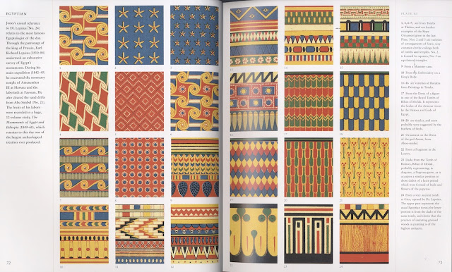
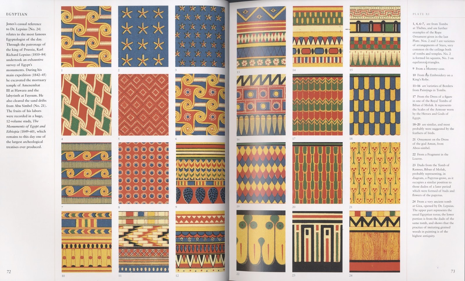
Egyptian:


Assyrian

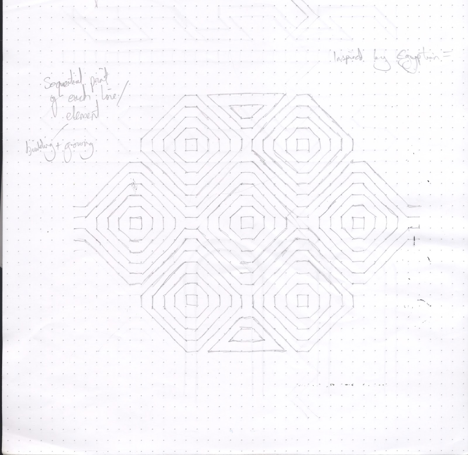
Really useful section of the book which provides simple skeletons and styles:
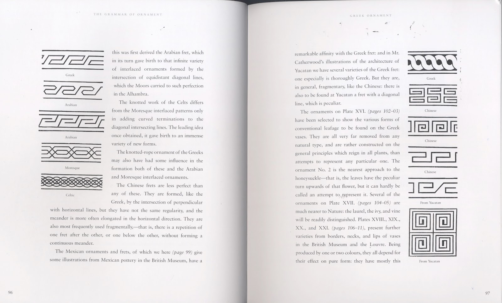
Greek:


Egyptian:


Assyrian

Really useful section of the book which provides simple skeletons and styles:
Greek:


No comments:
Post a Comment