Process:
Set the contrast to 3.5 and the aperture to f6
Focused the light referring to the edges of the rectangle.
Use the red filter to register the photographic paper - Shiny side up - within the light.
Place the letterforms on top of the paper in the desired composition.
In order to work out how long to expose the paper for, we created some test prints using a piece of card to block the light and moving it along each exposure.
Test Print
1: 2 second intervals
2: 0.5 second intervals

Adjusted the aperture to allow less light through - This provided us with more control over exposure times:
3: 1 second intervals
4: 0.5 second intervals

Optimum time is around 4-5 seconds
Immediate reaction - Clarity of type is HD
1: Test printing the type in order to get a taste of the aesthetic and quality of print.
2: Stood the type up to try create a shadow however it needs to be angled as the light hits the objects directly from the top.
3: Placed an 's' onto acetate, set the exposure time to 5 seconds, as the image is exposing we slid the type across the photographic paper. As a result we got a really subtle blur suggesting movement.

Experiments - Manipulating the dark room process to create effects
1: Movement - Exposed the composition for 1 second x 4 times. After each exposure I moved the type to create a motion blur.
2: Exposed the composition for 4 seconds. I used a piece of card to block the light and moved it whilst it was exposing. This creates a smooth gradual gradation.
3: Layering the standard weight with the oblique version. Placed the regular on the bottom and the oblique on top and exposed for 2 seconds. After the first exposure I removed the oblique and exposed for another 2 seconds. The type on the bottom layer is sharper as it has had more time to expose. The oblique type is faded as it was only exposed for 2 seconds and the shadow isn't as strong because it was raised from the surface.

We had no composition guides or grids therefore we have to compose the type by eye.
Testing our design skills
Important to have a steady hand when compositing the type - This is particularly important when creating layers and movement to make sure the type is in line.
Compositions
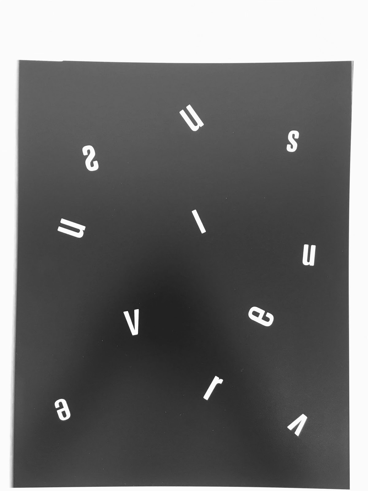
Working manually with the type allowed us to composite freely and expressively. Created some space like compositions using the small point type and variations of the condensed weights. Focused on ordered chaos

Typographic sculpture using the black extended variations:

Typographic structures:
Composited the type on the photographic paper.
By lifting up the edges of the paper on either side allowed the type to naturally fall into place. Lightly shaking the paper allowed the letterforms to slot together to create these 'towers' of type balancing on each other:


Process informing design
Would be very hard to replicate this digitally
Cropping and layering large format type
R:

Exposed the V for 2 seconds
Overlaid the U and exposed for a further 2 seconds:

N:
Gradation of tone from using the card through the exposure time - Almost looks like a light:

Combined the large format type.
Cropped the letterforms to abstract the letterforms.
Filled the negative space/counters with small point type.


Type cascading down into a funnel:

Repetition


Overlaying large letterforms:

Reflection:
Gained a huge amount of positive feedback from peers and tutors.
Really enjoyed the process - Definitely aim to continue this in the future as there are still loads of possibilities to explore.
Enjoyable way to design
Autonomous
Surprising results
No comments:
Post a Comment