Design Process
My research and experience within the farming industry has informed my design process. In order to reflect the manual labour and physical interactions between nature and industry I have decided to manually print and bind the publication. To further reflect the lack of control over certain areas within farming such as weather, disease and timing. To reflect the gamble, commitment and risk I aim to print directly into the publication, the results of which will be purely based on knowledge and skill of traditional print and design, similar to the life of farmers.
I aim to keep digital design tools to a minimum therefore the prints will not be edited or manipulated as well as the photography which will stay completely unedited to further communicate the lack of control and commitment.
Designing and creating the publication manually aims to increase my knowledge of editorial design to which I can feed into future projects.
Stock
Based on the sample book, I have chosen to take forward two stocks:
GF Smith:
Colour Plan Vellum White - 135gsm
Colour Plan Racing Green - 135gsm
Racing green creates an organic contrast between off white.
I don't want to complicate the printing and pagination process with too many stocks. I have experience working with a variety of stocks in the same publication, however I won't have the aid of InDesign to organise the pages for me.
Size
Decided the publication should be A3 as I can get 8 pages out of one sheet of A1 making it cost effective for myself to produce. I aim for the publication to be large, awkward and bulky to allow the user to experience the full potential of the book.
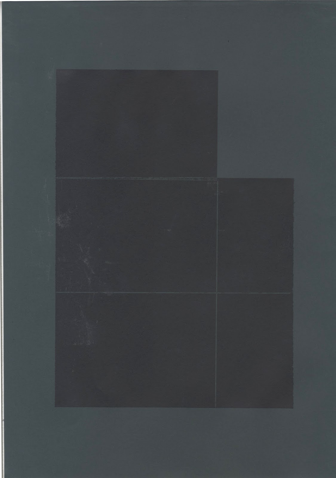
Created callograph plates from mountboard. I kept the ratio for the A size stock ranging from A3 to A6:

Using this ratio will allow me to map out elements of the composition in a gridded structure, similar to how farmers divide their sheds and fields.

Prints:
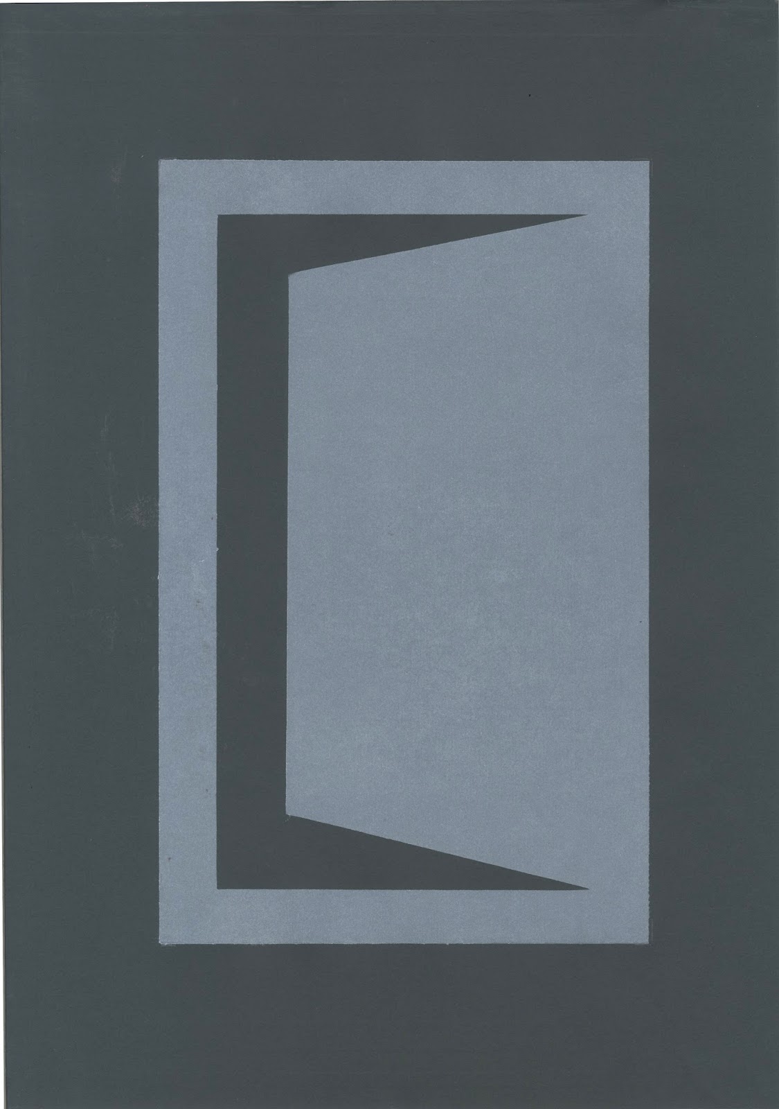
Aiming to create a visual narrative. Started with an ambiguous graphic image of an opening door. White printed on sporting green stock aims to communicate waking up early in dusk light.

Used my photography to inspire shapes and compositions:


Referring to my wallpaper reference book allowed me to accurately


Overprint of tramlines to communicate continuous use and sculpting of the landscape.

Overlaying textures:


Aim to include some photography from the numerous farm visits in order to bring further aesthetic documentation into the publication. To integrate the organic textures with the images, I test printed some onto acetate:
Acetate
Decided to test print on acetate as its transparency will allow the printed textures below to interact with the image once it is laid over the top.
Selected both 35mm and digital images and set them in a range of sizes and positions. To save money I printed two images per A2 sheet. I can experiment with layering the acetate over the callograph and integrating the textures using the sequential nature of the book. I haven't edited the photography but used InDesign to resize the images.


Process images:
Working manually allowed me to plan out compositions and freely move elements around in a more natural way. I referred to my photography to inspire graphic shapes and forms inspired by agriculture such as sheds, machinery, textures and fields. I took a lot of inspiration from Klein's stencil typeface as its structure is similar to the architecture within farming.
My main challenge is sorting pagination - Whilst software such as InDesign can sort pagination automatically, I am manually printing the book therefore I used scraps of paper to make notes and visually map out compositions and what stock is where.


Acetate -
The acetate holds the ink nicely.
Slightly blue texture - Unable to print double sides, however the image is still visible however it is slightly tinted by the subtle blue acetate.
When the acetate is laid flat on white stock it is completely transparent
Colours are surprisingly accurate when laid on white stock.
The user physically changes the composition through each turn of the page.
The acetate adds experiential value
Hard to photograph due to light reflection. This could be problematic once the publication is complete and setting up for my portfolio.
My main challenge is sorting pagination - Whilst software such as InDesign can sort pagination for you, I am manually printing the book therefore I used scraps of paper to make notes and visually map out compositions and what stock is where.
Feedback:
One of my peers observed how the wallpaper textures and card prints contrast subtle tones and forms from the photography with strong geometric prints.
Creating a narrative
Due to the broad industry I have struggled to identify a narrative to the publication. Through numerous discussions with tutors and peers I have identified a a few directions the book can take.
In order to communicate growth I aim to take advantage of the sequential nature of the book by keeping the pages minimal to start with and as the publication progresses the compositions get busier and more chaotic with more visuals and materials being laid over each other.
As the book draws to a close I have identified two directions:
1- Harvesting the produce - reap
2- Communicating the lack of financial support and low prices for farm produce - 'disappointment'
Pagination
As I have decided to manually print the short edged bound publication, I will have to sort each page composition before printing directly into the publication. This means meticulous planning and execution.
Alternating the pages from green to white to create contrast between the pages and prints.
The contrasting colours highlight different colours and textures on both sides of the acetate. When the user turns the page they are physically manipulating the image whilst revealing the print below.
To achieve this I created a mockup of the publication carrying notes and guidelines for where each element of the composition was going to go.
Print

Overlaying images printed on acetate over the textured prints:
*Please note these scans are slightly out of line*

Muted colour scheme but surprisingly clear
Combining two spreads


Evidence of pagination:


Really like how the photography interacts with the geometric prints. The organic inconsistent texture from the print contrasts with the sharp photography, creating new forms and shapes.


No comments:
Post a Comment