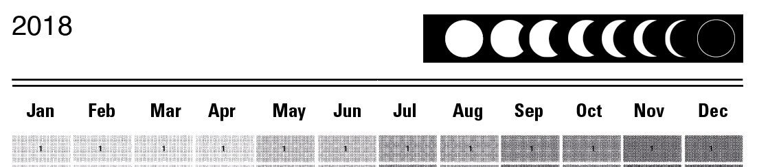
The lunar calendars that I have found use a simple illustration to show the shape/area that the moon is exposed. My research into letraset/tone provides me with a way that I can translate the percentage of moon exposure with the frequency of bitmapping. The bitmapping/half toning turns the gradient of colour into small dots which determine the brightness / darkness depending on how many dots per inch/cm. This will lend itself to the screen printing process which relies on bitmapped tones.

Created a tonal template ranging from 10% to 70%:

Anything higher than 70% may be too dark
Referring to the lunar calendars, I associated a specific percentage with the percentage of the moon that was revealed. Using swatches speeded up the process.


The composition can then be placed into Photoshop where the tones can be bitmapped according to the frequency:
Document must be greyscale
Referring to the letratone sheet, I input the values to see which would be optimum for screen print.I made sure that I stayed below 50lpi to ensure that all of the dots can be picked up when exposing the screen.
Bitmapping:

Tried the composition using 27.5lpi:

Under closer inspection

Test print:

Quality is good...
Feedback:
- Like the concept and overall look
- Writing onto dark sections may not show up - Acetate? Tracing paper?
- Titles need looking at - communicate space? Use a key to help the audience identify its purpose
- Took the test prints to the traditional print technician to check if I had bitmapped the tones effectively. Whilst he was confident all the dots would be picked up, he expressed concern over screen printing on such a large scale.
Title Section:
Clearly inform the audience on the concept:


Stages of the moon:
Test Print:
Again A1 and A2:


Listened to the feedback and placed a layer of tracing paper over the top.
Printing the numbers on the tracing paper makes them pop out more as the numbers aren't clear when printed over the bitmapped tones. However, tracing paper can become problematic due to the fact it is easily
Feedback:
- Move numbers to the top left corner of the box to leave more room for the user to annotate.
- Layering bitmapped halftone with typography destroys the quality. To overcome this I will add white fill around the numbers:

- Suggested that I do two variations: 2 colours - Print metallic ink on black stock and Black ink on off white stock.
No comments:
Post a Comment