Binding
Instead of simply stapling the publication together, I decided saddle stitch the bind using thread. Due to the thickness of the publication, a staple would struggle to go through. Manually stitching the publication together adds craft and exclusivity. I had intended on using string sourced from farm site visits:


However it is too thick, therefore I sourced some thread that is a similar colour but much thinner. This will make it easier to thread the publication together without tearing the pages. Due to the thickness of the publication and variety of stock materials, I was forced to manually pierce holes in each page separately. To achieve consistency, I used a masking sheet made to mark out where each hole needs to be for the saddle stitch.
Marked the halfway point.
+5cm either side
+ an extra 3cm either side

Even with the thinner thread, piercing the publication was difficult as I had to push double the thread through the pages. The tore the cover page:


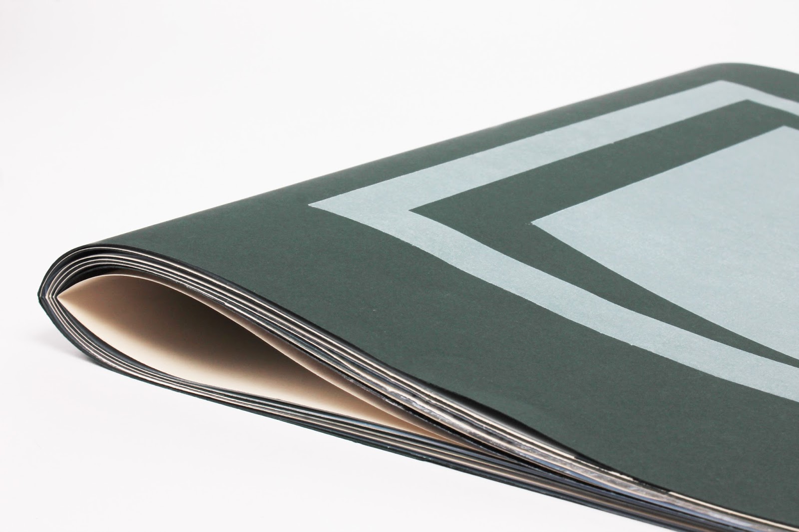
Used the electric guillotine to accurately trim the edges of the publication and make every page fit together. I had intended on leaving the pages as they were to create a rough aesthetic, however the clean edges add professionalism.

Middle page:

Exposed the bind in the centre of the publication to highlight process and materials.
Scanned in the publication and created a short animation flicking through each page:
Cover Page:

Keeping the publication ambiguous in order to intrigue the reader and invite them in. The card print of a door printed in white ink on racing green stock aims to communicate an open door at the early hours of the morning.
Introduction
Introducing the title of the publication and a brief overview of the project to provide the user with context. As the outcome so far is fairly ambiguous, I created an introductory page to provide the reader with some context into the subject and purpose of the publication. I intended to keep the tone of voice professional to suite a culturally engaged audience. Two layers of acetate forces the reader to interact with the publication and reveal the content below. Using clean sheets of acetate makes the reader question the order of the layers. The first layer is an image sourced from one of my numerous farm visits and shows the farm when the family first bought it in the 1930s:

When the user turns the first page the introductory statement is revealed clearly. The image of the farm is flipped and inverted by the racing green stock.

Manipulated the sequential nature of the book to force the user to add and remove content through layering pages on acetate. The final section from this page exposes the manually printed design.

Printed the interview onto acetate to add layers. The two columns of type layered over the organic textures aim to replicate the strips of ploughed fields. The user may become frustrated by having to read the small pt type through layers of images and textures, however this is to force the reader into having to work hard and manipulate the page/reading position.

The user deconstructs the page composition as they turn the pages

Final exposure of organic texture:

Interacting the organic textures with the industrial imagery:


Using the contrasting pages highlights different colours from the acetate, therefore I kept the white page blank in order to allow the yellow to stand out:

Reveals organic texture from wallpaper:

Studio Images:


To define the outcome we can refer to Clive Phillpot.
‘Book objects’ are sculptural and explore the physical form of the book through ‘unique, singular objects’ (Phillpot, 2013). These books belong in an exhibition context. Phillpot’s diagram puts the artists book between the two extremes of function and form suggesting that the artists’ book is a hybrid between the objective nature of literary texts and the aesthetics of book art.
No comments:
Post a Comment