Stephen has previous experience in branding for live projects and has extremely valuable knowledge on web design, development as well as a plethora of other skills.
We both identified a key interest in sport and are effected by injury, however we both feel discouraged to go to see specialists due to the uninviting corporate identities and formal tones. Whilst it is important to keep a serious tone of voice, in order to keep the brand trustworthy, we feel a more friendly and vibrant identity would encourage a younger audience to seek medical advice.
Oslo Agency
Working with Oslo gives us the opportunity to work on a live brief, gaining professional experience and feedback within the design industry.
The Brief - Ideal Physio
Problem
Summary
Ideal Physio are a organisation starting up in the heart of Leeds providing a physiotherapy service. They provide all the standard services that physiotherapies do, however, they specialise in musculoskeletal physiotherapy. Their brand values are quality, positivity and creative. The brand is evolving from an individual with 10 years of practice in the industry. The challenge is to brand the physiotherapy whilst being more creative and less corporate to appeal to a younger audience and considering the whole brand. Colour with this brand will be priority. Understanding how colour can communicate their industry and how it can be appealing to the audience.
Considerations
Throughout the project we will need to update the directors on our progress and check with them that the design direction is suitable. All design directions we decide to work on need to have a reason why. We must ensure it strongly communicates the brand and not purely for aesthetic reasons. We will be expected to work as a team on this brief.
Requirements
To present the ideas to Oslo Agency and then send them off to the brief once the concepts have been confirmed. To work as a collaborative team on at least one concept to move forward. To work on the brief for a total of 4-5 days from 10am whilst 6pm
Audience
Audience
The business will target clients working and commuting in the area of Leeds primarily. As they want to brand themselves more creatively, younger audiences with sports injuries will appeal to the organisation but shouldn’t neglect slightly elder audiences.
Deliverables
A Brand Story
A Brand Mission
Brand Values
Company Tone of Voice
Range of suitable taglines
Visual Identity Research
Visual Identity
Concepts & Development
Brand Assets & Marketing Material - Business Cards, Posters, Compliments Slips Website Asset Animation & Web Design.
Deadline
Interim Deadline: 3rd April
Deadline
Interim Deadline: 3rd April
Deadline: 20th April
CLIENT:
Got the client to fill in this form to provide us with a clear idea of the business, his aspirations, how/why/when the business was created. We can rely on this document to make sure the branding reflects the clients values.


Describing the product/service
Clients journey
He describes his company as quality, positive and creative.
This provides us with the freedom to be creative and avoid corporate identities.
This was a valuable document for writing up the brief.
What did I get from this?
=
What to avoid - Corporate
Target Audience - 18 -45
Stage 1 - Initial research
Looking at current and on-trend sport branding. This will inspire concepts based on the freedom of movement and fitness.
Competitors
Researched into current physiotherapy practices in Leeds in order to identify the client's competitors and avoid repeating the same visual style.

Physio Action:
Branding:

Website:

Physique Physio
Branding:

Website:

PEAK Physiotherapy
Branding:

Website:

Boring and uninviting.
What to avoid:
Corporate colour palette
Flat visuals
Created a Pinterest board so we could share ideas:

Nike:
Dominance of line
High impact typography - Capitalised
Studio Build


Adidas:

Between both campaigns their is a dominance of high impact images and bright colours.
Identified yellow, blue and red as colours to make the brand visually exciting.
Typography layered over images creates depth.
Created an initial concept board in order to get an idea of colour, shape and composition.
Key themes:
- Movement
- Fitness
- Sport
- Bright and Vibrant


Skins logo
Interconnecting type through line
Creates movement
However it isn't friendly enough for the brief
Offers inspiration into brand messages:


Oslo provided some useful help for creating a brand document:
Brand Story
Created a brand story to create a complete picture made up of facts, feelings and interpretation of the brand. I tried to include words associated with the occupation of physiotherapy such as 'stretch', 'balance' in order to encompass the entire brand.
Brand Mission
The brand mission is a short statement that aims to highlight the market and competitive advantages of the brand. Highlight the businesses goals and philosophies. It defines what an organisation is, why it exists and its reason for being.
Brand Values
Guiding principles placed at the core of the brand to dictate the brand message, look and personality.
Brand Message
A short phrase/sentence to influence that relates to the brand and target audience/buyer.

Brand Mission
To provide quality consultation and treat our clients to achieve their goals in a positive, creative and dynamic way.
Tone of Voice
Tone of Voice
Ideal Physio’s tone of voice should be inspirational and fun whilst having vocabulary of determination. This should be conveyed in an intelligent and positive way.
Brand Values
IDEAL
IDEAL
I = Innovative
D = Diagnosis
E = Envision
A = Ability
L = Lifestyle
D = Diagnosis
E = Envision
A = Ability
L = Lifestyle
Brand Story
Why We Exist
Born with over 10 years experience, Ideal Physio is a physiotherapists growing in the heart of Leeds. With insight into effective methods and systems, your health is in positive hands. Here at Ideal Physio, we strive for quality and a positive experience. Patients are our priority and we are passionate about providing new understandings and methods in physiotherapy, and we adore the feeling of a delighted customer.
What We Do
We provide an accurate diagnosis and our specialist services treat a vast range of injuries. Whether it’s a bad back from work or had a knock playing sports, our ambition is to provide innovative rehabilitation and private health care to aid your recovery. An initial assessment will ensure you set the goals right for you which will inspire the aims for our physiotherapist. You can be confident we will create a sustainable and effective plan.
How it impacts their life
Completed your plan and are happy with the progress made but concerned with what happens next? Ideal Physio offer a post plan experience that will ensure our patients receive further advice, management strategies or even home workout plans so we can guarantee you receive care you deserve. It’s essential to us that our patients feel confident and place their trust in us to deliver.
Brand Message:
The thorough preparation provided us with a solid foundation to move forward into the research and initial concept stage. In the past I have failed to identify the core values of a business, however this has been really beneficial and will provide a useful source when tackling brand and identity briefs in the future.
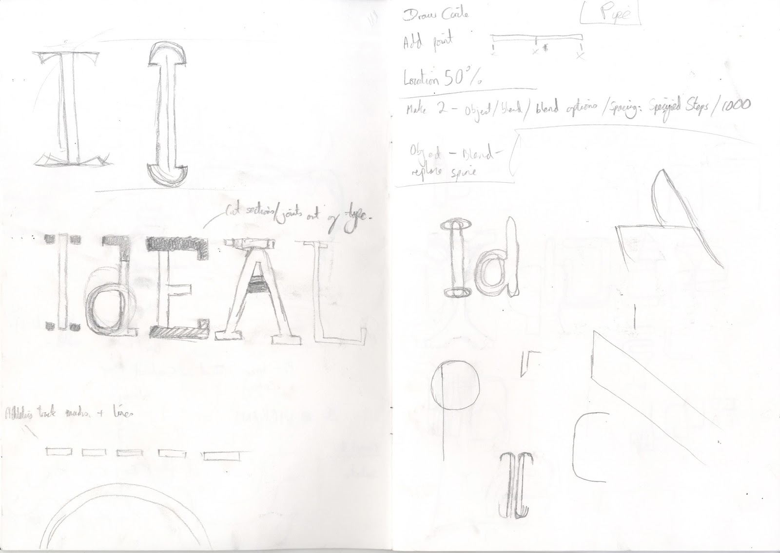
Initial concept sketches

Focused on the anatomy of typefaces - highlighting joints, stems, etc:


Sockets
Joints
Moved onto digital mockups:
Had a go at drawing my own typeface using simple geometric shapes:
Some sections have two lines inspired by the racetracks in athletics. I have highlighted joints and stems to highlight anatomy.

Focusing on joints again:


Crit/Feedback
Colour scheme is way too corporate - Think about bright, vibrant, neon colours in order to be friendly and approachable.
Colour Theory research:

I had to ensure I wasn't using the same colour as my co-worker
I made sure I kept in contact to make sure we avoided the same
Blue - The colour of trust
Reduces stress
Emotionally - Trust, responsibility, honesty
Used within healthcare
Pink - The colour of sensitivity
Encourages creativity
Compassionate

Concept 2:
Simplified the I and the P into three evenly spaced vertical columns:


Development:
Refined the bottom of the stem of the P so that is it curved. This makes it easier to define the i from the p and looks like the curve of a running track:
Added some more colour theory to better inform:
Red:
Energy
Attention
Used within sport
Strength and power
Yellow:
Stimulate
Positivity
Used in sport, travel and leisure

Potential colour scheme:
Green:
Balance
Harmony
Stability
Reliability
Purple :
Energy of red and the calm of blue combined
Encourages creativity
Encourages reflection and self awareness


Brand mark inspired by balls fitting into sockets:

Stage 2 - Further development
After the initial sketch and design stage, we decided to take 2 concepts each forward for development. I have been working on two concepts at the same time which has naturally caused them to blend into each other. This had a detrimental impact on getting diverse ideas.
Tried to create a brand mark out of the logo. This can be applied to a variety of print and web assets. Rotating the logo around the tittle ended up looking more like windmills. Scrapped this idea because it doesn't communicate movement and health.

Combined the i and the P in order to simplify the logo even more:

Began to think of ways to create movement:

Crit/Feedback
Preferred the double stem as it has more presence.
Stage 3 - Refinement
Mocking up designs onto posters, business cards and widgets to see how the brand can be transferred over numerous platforms.
Business Cards:
At this stage I needed to find a typeface to accompany the logo. I used Futura Book because of its vertical height and legibility through print and digital. The sans-serif typeface is contemporary and current.


Instead of rejecting the brand mark, I decided to crop it. I highlighted the tittle using a vibrant lime green in order to give a focal point.
Back and front of business card:

Created icons and widgets for social media:
I used a variety of colour pallets that the client can choose from. I made sure they were bright and vibrant for the client to choose from:
Red/Yellow:
Combining the energy, strength and power of red with the positivity of yellow.
Purple/Green:
Combining the balance and harmony of green with the energy and creativity of purple
Balance
Harmony
Stability
Reliability
Purple :
Energy of red and the calm of blue combined
Encourages creativity
Encourages reflection and self awareness
Blue/Pink:

Design and poster mockup incorporating the brand pattern and colour scheme:
 Immediately we felt that the socket brand pattern doesn't quite work with the logo.
Photography
Sport related photography - focus on stretching, exaggerated movements, flexibility:
Adidas:


Gradient Mapping:
This is a way that we can keep the colour scheme of the brand consistent through images:


Mocked up some posters using the images as a background. Experimented with the scale of the logo - Prefer the small icon size.


How it impacts their life
Completed your plan and are happy with the progress made but concerned with what happens next? Ideal Physio offer a post plan experience that will ensure our patients receive further advice, management strategies or even home workout plans so we can guarantee you receive care you deserve. It’s essential to us that our patients feel confident and place their trust in us to deliver.
Brand Message:
- Back on your feet
- Standing strong
- Cracking on
- Got your back
- Deeper than skin
- Push and pull
- Back in the game
We asked for feedback from Oslo....
The thorough preparation provided us with a solid foundation to move forward into the research and initial concept stage. In the past I have failed to identify the core values of a business, however this has been really beneficial and will provide a useful source when tackling brand and identity briefs in the future.
Initial concept sketches

Focused on the anatomy of typefaces - highlighting joints, stems, etc:


Sockets
Joints
Moved onto digital mockups:
Had a go at drawing my own typeface using simple geometric shapes:
Some sections have two lines inspired by the racetracks in athletics. I have highlighted joints and stems to highlight anatomy.

Focusing on joints again:

Highlighting the joints - Looks like half a face however their is a lack of clarity:

Concept 1:
Predominantly inspired by the Skins logo, I have simplified the i and the p into lines.
The logo can be stacked - Used two weights of Gotham to create contrast between the two words.
Lined the tittle with the start of the P in order to keep the logo cohesive.
Changed the colour of the tittle in order to highlight the head of the figure and provide a focal point.

Crit/Feedback
Colour scheme is way too corporate - Think about bright, vibrant, neon colours in order to be friendly and approachable.
Colour Theory research:

I had to ensure I wasn't using the same colour as my co-worker
I made sure I kept in contact to make sure we avoided the same
Blue - The colour of trust
Reduces stress
Emotionally - Trust, responsibility, honesty
Used within healthcare
Pink - The colour of sensitivity
Encourages creativity
Compassionate

Concept 2:
Simplified the I and the P into three evenly spaced vertical columns:


Development:
Refined the bottom of the stem of the P so that is it curved. This makes it easier to define the i from the p and looks like the curve of a running track:
Added some more colour theory to better inform:
Red:
Energy
Attention
Used within sport
Strength and power
Yellow:
Stimulate
Positivity
Used in sport, travel and leisure

Potential colour scheme:
Green:
Balance
Harmony
Stability
Reliability
Purple :
Energy of red and the calm of blue combined
Encourages creativity
Encourages reflection and self awareness


Brand mark inspired by balls fitting into sockets:

Stage 2 - Further development
After the initial sketch and design stage, we decided to take 2 concepts each forward for development. I have been working on two concepts at the same time which has naturally caused them to blend into each other. This had a detrimental impact on getting diverse ideas.
Tried to create a brand mark out of the logo. This can be applied to a variety of print and web assets. Rotating the logo around the tittle ended up looking more like windmills. Scrapped this idea because it doesn't communicate movement and health.

Combined the i and the P in order to simplify the logo even more:

Began to think of ways to create movement:

Preferred the double stem as it has more presence.
Stage 3 - Refinement
Mocking up designs onto posters, business cards and widgets to see how the brand can be transferred over numerous platforms.
Business Cards:
At this stage I needed to find a typeface to accompany the logo. I used Futura Book because of its vertical height and legibility through print and digital. The sans-serif typeface is contemporary and current.


Instead of rejecting the brand mark, I decided to crop it. I highlighted the tittle using a vibrant lime green in order to give a focal point.
Back and front of business card:

Created icons and widgets for social media:
I used a variety of colour pallets that the client can choose from. I made sure they were bright and vibrant for the client to choose from:
Red/Yellow:
Combining the energy, strength and power of red with the positivity of yellow.
Purple/Green:
Combining the balance and harmony of green with the energy and creativity of purple
Balance
Harmony
Stability
Reliability
Purple :
Energy of red and the calm of blue combined
Encourages creativity
Encourages reflection and self awareness
Blue/Pink:

Design and poster mockup incorporating the brand pattern and colour scheme:

Photography
Sport related photography - focus on stretching, exaggerated movements, flexibility:
Adidas:


Gradient Mapping:
This is a way that we can keep the colour scheme of the brand consistent through images:


Mocked up some posters using the images as a background. Experimented with the scale of the logo - Prefer the small icon size.


No comments:
Post a Comment