Sunday, 30 October 2016

OUGD504 - Design for Print - David Carson

Carson's rebellious use of typography has highlighted him as a profound and controversial typographer. A lot of his work is published in surf magazines which suits Carson's natural, chaotic style of work:


Overlapping and creating contrast with different font sizes makes the text harder to read, forcing the audience to change their typical reading method. This wouldn't be appropriate for a formal publication, however it can create emotive outcomes suitable for contemporary design. Pushing design, especially with type, can be controversial as the design decisions aren't immediately justifiable from the audiences point of view.

My publication consists of limited type, however the famous quotations throughout the publication need to be engaging to continue the theme of diversity. Using influences from Carson and my research into traditional typesetting from Tschichold and Vignelli, I experimented with a range of concepts to present the quotes in an engaging way.

Standard Times Regular enlarged so the audience can clearly see the anatomy of the type. I need to be aware that text doesn't transfer  well on a double page spread because the binding fold distorts/hides the content:


To overcome this, I rotated it to give the type more room to breath on the rag. I left 'and' on its own in the centre of the page because it isn't the most important word in the sentence. This also creates a contemporary, modern edge as the 'and' will be slightly hidden inside the fold of the publication. This is appropriate because it doesn't hinder the audiences reading. 'Winston Churchill' in Univers creates contrast so the audience can differentiate the type from the reference. Noticed the tittles become more prominent:


Changing the font style creates more contrast and engages the audience and also puts emphasis on the adjectives:


Looks crowded and dysfunctional. 


Used the underline tool and off set it to highlight the adjectives. The different character and font styles manipulate the audiences traditional reading methods in order make the written content engaging and break the traditional rules of design. This was heavily influenced by Carson and also Anna Ahnborg's 'Fade into you / Can you read me'.

Saturday, 29 October 2016

OUGD504 - Design for Print - Zine/Sticker Research

In order to promote my publication and draw in my target audience, I researched into zines as they are a compact source of visual culture. This will allow me to demonstrate Bristol's creative culture through the use of expressive craft techniques such as collage. This will ultimately add an element of desire and also provides opportunity for a free publication. This would be appropriate for Bristol as magazines such as CRACK and B24/7.

Zine

Most commonly a small-circulation of self-published work, consisting of original texts and images usually reproduced via photocopier which makes them cheap to produce. Topics covered are broad, including fan-fiction, politics, poetry, art and design and personal journals. The content is often too far outside of the mainstream to be included in traditional media such as magazines and books but offer a USP alongside magazines such as WRAP. 

Gloria Glitzer


Gloria Glitzer is an art based book/zine producer based in Berlin, operated by artists Franziska Brandt and Moritz Grünke.


  • Consistent A5 page size
  • Predominantly visual - very limited type
  • Limited colour palette to make printing cheap - Zines are commonly printed using risography so a limited colour palette will only require one or two ink plates for two spot colours, instead of four CMYK plates. 
  • Expressive

Behind the Zines: Self-Publishing Culture, 2011


Behind the Zines introduces a cutting-edge selection of international zines and examines their role as a catalyst in the evolution of media and graphic design today. The book presents the broad range of existing zines that combine thought-provoking content with compelling design.

'Oozing love, thought, time - and often enough - spirited improvisation, self published zines are starting to seep into mainstream culture - and on a shelf or in a specialist bookshop near you.'

Flaxen Zine
Studio Subsist - Michael Kosmicki

Page 


Visually and conceptually split into two parts, creating a platform for collaboration and the exchange of ideas and interests. Designers, illustrators, photographers and writers respond to the double themes of each issue. The change in scale and stock colour would relate back to my early IN/OUT concept as I already have a lot of visual content that I can use to create an expressive craft style in my publication. 

Village Bookstore, Leeds

Managed to get my hands on some zines to get more of an idea of size and analyse the type of content, stock and print method.
  • A5 pages were common - Standard A4 paper is cheap
  • Cheap
  • Illustrative 
  • Narrative
  • Limited type
  • Abstract typesetting
  • Cheap, thin stock - However some use bespoke paper to make them more desirable and tactile.
  • Printed on coloured stock
  • Monochrome - Cheap to print
Zines provide opportunity to be expressive and subjective without having to justify every traditional design decision, hence why they are so abstract and visually engaging. Creating a zine for my publication would increase awareness and promote my publication. 

Stickers

Noticed that vinyl's and magazines have stickers on the front of them, stating the unique content inside and intriguing the audience. 

The Wytches:


  • Illustrative, freehand
  • Simplistic
  • Expressive
  • Rough
  • Appropriate for the style of music
  • No regard for rules 
When I was in Village, I was trying to visualise my publication on the shelves alongside the other publications/magazines. Perhaps adding a sticker informing the target audience of the free zine and environmentally friendly production. 
  • Zine
  • Recycled materials 
Used the map to inform the shape of the sticker:


Traced the Cabot, Clifton and Clifton East area of the map because that's the area where the majority of the images were taken:


Contour line is very detailed so may be too abstract for the audience to recognise. Therefor I aim to use a simplified, basic shape so that the information is clear. I want the sticker to stand out like a store promotion or vinyl sticker over the neutral grey board.

Johan Idema, How to Visit an Art Museum

On the front of the publication isn't actually a sticker, but printed 'carelessly' onto the front as if it has been stuck on.

Adds contrast to the well considered typesetting so that it stands out.


OUGD504 - Design for Print - Mock Up #2

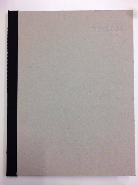
Created a mock up using black binding tape and stitch so that I could make a firm decision on the page size in comparison to the cover.


In order to conserve binding tape, I cut it down to 4cm, leaving 1cm to accommodate the bind. However, over time the edges of the tape began to un-peal because the fold is so close to the tape. Therefor I will use 5mm tape for my final publication.

Binding

Estimated the amount of pages so that I could tailor the spine to accommodate all the stock and get an accurate mockup so that the final production is well considered. As I am using black binding tape to join the covers together I researched into different types of thread to contrast with the matt black tape. Visiting Fred Aldous offered me an array of colours and style.

The red, blue and navy twist are colours taken from Bristol's crest, exposing a hint of colour and adding to the bespoke aesthetics and a hint charm to the minimal, grey cover.

The thread that I have identified is very thick which means that I will have to use a thick needle to stitch the publication together. This was problematic as I struggled to pull the needle and thread through the small binding holes. To overcome this, I used a pair of pliers to grip the needle and pull it through. Although this is an unconventional method, it was appropriate for a mock up.


Annotated the pages so that I could visualise the pagination:


Took influence from my research into Printed Pages and introduced a small pamphlet in the centre of the publication:


The change in scale puts the audience into a new context where I can potentially add some expressive and engaging compositions based on my early concepts. To take the audience out of context, I aim to use a coloured stock across the double page spread.

Visible stitch is appropriate for the bespoke feel that I aim my publication to have and also reflects Bristol's 'rough and ready' approach.


As I was asking for feedback, it became apparent that the narrow A4 pages may bend the cover because the stock finishes an inch away from the cover, therefore I aim to increase the page width.

I noticed that the thick thread and needle can chew up the thin stock - This is something I will consider when choosing my stock as I want the publication to have a quality and professional finish.

Tuesday, 25 October 2016

OUGD504 - Design for Print - Typeface/Content

Typeface

Publications such as Printed Pages use more than one typeface which creates contrast. This aids heirachy between the title and block of text. It's important to make sure the two typefaces work together.

AW15 Printed Pages:


Modernist approach to graphic design - Breaking the rules of design to set a tone.

Considered 5 typefaces for my publication:


Contrasting serif and sans-serif typefaces evoke the diverse culture of Bristol as two styles are clashing harmoniously. 

This publication aims to explore Bristol’s artistic and commercial typography, reflecting the creative heritage that built the city and its reputation through its production and abstract content. In order to inform the audience on the context of Bristol and engage with Bristolians, I aim to create a contents page for where each letter was taken. This adds to commercial value as it is a professional consideration which demonstrates my understanding of the creative industry.

Contents Page

Univers 67 Bold Condensed and
Times Regular 


The 6x6 grid system and narrow margin creates tension on the page and also allows the images to be more prominent. Using Univers Bold and Times is an example of hierarchy as the audience can clearly read the most important information. In this case, the character and context can be seen first whereas Times Regular gives the audience the ability to differentiate each section due to the contrast in type weights and sizes.

Using a full bleed, high quality image of Bristol's graffiti to accompany the introduction is there to intrigue the audience so that they want to keep reading on. Reflecting on this concept, it isn't relevant for my publication because it the images and characters will be juxtaposed around the publication, further reflecting Bristol's diversity.

I aim to reflect Bristol's diverse culture through the production and page composition which makes it appropriate for me to break the traditional rules because Bristol isn't uniform and consistent. 

Introduction

Instead, like many look books/coffee table books, an introductory paragraph about the context of the publication will inform the audience about the publications tone of voice/themes.


Copy:

'Bristol’s thriving current and historical arts scene has evolved the city into a bohemian, multi-ethnic culture. This scene is characterised by a strong relationship between music and art, especially graffiti art. The Bristol underground scene is associated with drum and bass and graffiti art that has existed in Bristol from the early 1990s to the present.

Architecturally, the city is home to 51 Grade I and 500 Grade II buildings in a variety of architectural styles, from medieval to modern. 70s tower blocks cast a shadow over the historic architecture, yet Bristol’s environmental awareness keeps the city green and fresh. As a result, Bristol won the EU’s European Green Capital Award in 2015. Bristol’s consideration to the environment and the arts demonstrates forward thinking which British cities should follow. 

Home to famous artists such as Banksy, Massive Attack and Damien Hirst, Bristol’s creative scene is recognised around the world. This publication aims to explore Bristol’s  diverse culture through the art of typography. Celebrating the vibrant city’s urban and rural locations in search of the impact Bristol’s culture has made on typography.'

Sources:
B24/7
Visit Bristol

Setting the type on the left hand side creates tension but also gives the full bleed image room for the audience to read the introductory text without being distracted. This highlights the importance of white space. Highlighting Bristol's characteristics early in the publication will give the audience personal context, particularly for Bristolians. This will ultimately create a bond between the publication and Bristolians.

Illustrated this through typography:


Univers Condensed's bold characteristics contrast with Modern21's serif's which makes the text engaging to read. By warping the serif typeface creates even more contrast between the two type faces and also illustrates the meaning of the lexis. The white text with a black highlight purposefully creates more contrast, enhancing the impact. This is relevant because my publication aims to explore Bristol's diverse culture.

Quotes

https://www.amazon.co.uk/Bristol-Beautiful-Interesting-Distinguished-England/dp/0952700913

I aim to include quotes about Bristol throughout the publication, from locals to celebrities as this will engage Bristolian's.

Winston Churchill:

“The most beautiful, interesting and distinguished city in England”


Keeping the typefaces consistent and editing the typesetting by breaking up the adjectives changes the audiences typical reading pattern, ultimately puts emphasis on the positive adjectives of Bristol. The type stands alone on a double page spread, forcing the audience to read it and applying a positive tone of voice at the beginning of the publication. Setting the reference at the bottom of the page provides a lot of white space, further influencing the audience. Showing the dates of each quote will engage the audience as they can see how people's points of view of Bristol changes throughout time.


Edited the original image to make it look older and represent the 1660s era and also so that the type layered over the top is legible. The strikethrough of 'inconveniences' is typical Bristol rebellious style which engages the target audience:


The typesetting is cramped, even though it's spread over a double page, because of Univers' bold line so to overcome this I used a different style of Univers:

Univers 67 Bold Condesned:


Adaption of Univers but isnt recognisable and consistent with the rest of the publication therefor I am going to explore further.

Simplified and traditional:

I will ask for feedback on which typeface(s) to use and typesetting requirements because I am unsure on what page composition makes the most impact. 

Colour Palette

In order to make an informed decision on my colour scheme, I researched into the colours often used and found in Bristol:

University of Bristol

The University of Bristol's primary colours are white, red and black. However after researching into a colour palette for my publication I came across the colour swatches that the university use for their website.


The University has developed a new visual identity, based on a standard supporting palette of 16 colours. All the sites aim to adhere to this colour scheme. Any sites that are not schools, faculties, departments or research groups will use the core palette of red, white and black.

Brights:


Darks:


Coat of Arms

BRISTOL CITY COUNCIL (UA) (GLOUCS):


  • 'VIRTUTE EN INDUSTRIA' translates into 'By virtue and industry.'
  • Recorded and confirmed 24th August 1569 - Badge granted 16th February 1983.

The triadic colour scheme harmonises the composition using muted and traditional tones that reflect how long ago it was created.

This is translated onto the crest of Bristol City Football Club. Same consistent use of colour palette modernised and simplified:


I aim to continue using these Bristol colours to create unity between the city and my publication. 

Thursday, 20 October 2016

OUGD504 - Design for Print - Letterpress/Embossing/Debossing

I won't be able to use a standard printer because the stock is too rigid. Traditional typesetting and letterpress will help me to overcome this as I can print the type directly onto the grey board.


Experimented with a range of typefaces and point sizes:

Times Regular 30pt

A typeface that I considering to use throughout my publication so having it on the cover will make the book consistent and cohesive.


Time Bold 36pt


Clarendon Bold 30pt


Clarendon Bold 30pt - Upper Case


The prints transferred really well onto the grey board as the type is bold and clear, making the small typeface legible in relation to the size of the publication. Clarendon is a bold serif typeface which is a lot stronger than Times because of it's bold, dense structure.

In order to decipher which Clarendon would suit my publication best, I photographed them on my publication with the binding tape and asked for feedback.


The lower case is very subtle, however the rounded and bold uppercase copy is more prominent and legible, especially from far away. The majority of people thought the uppercase was more appropriate because it's more striking. This will make the title easier to read and impact the audience more.

The front cover is minimal because I want to intrigue the audience into opening the publication and also highlight the unique stock choice. Putting emphasis on the stock will add to the tactility thus forcing the audience to explore/feel the book.

Debossing

There is potential to deboss the grey board using the lead type with/without ink to make the cover even more subtle and tactile. Due to the thickness of the grey board, embossing would be hard to achieve, however debossing will be a lot easier due to the composition of the stock.

As I am working with lead type, I need to be conscious that I don't press the type too hard as the type is likely to bend. Instead of using the letterpress, I used a traditional printing press that delivers an equal pressure from directly above which provides a consistent print. Blind de-bossing the cover makes the type very subtle, however more pressure would make it slightly more prominent. People often perceive traditional print as a limited process, however this demonstrates how the process can manipulate type.


Embossing the grey board adds to the aesthetic value of the publication making it more desirable.


Experimented with different tones:


As the subtly of the blind debossing wasn't prominent enough, I repeated the print without adding more ink.

Press 1 and 2:


Press 3 and 4:


Press 2 and 3 are mid-tones which make the title subtle yet easily legible.

In order to strengthen the blind debossing, I soaked the grey board in water for 30 seconds and then printed onto it:


The sogginess of the grey board allowed the metal type to create a deeper impression:


However due to the loose fibres of the stock, even when it was dry it had warped and stained the grey board. I am still pleased I tested this method as it is commonly used when embossing thinner stock.

When producing my final cover, I will experiment with mid-tones when debossing because it is still subtle and doesn't shout. This is relevant because I want the content to be vibrant and contrasting with the subtle cover.