Monday, 14 May 2018

OUGD603 - Univers - Alan Kitching

As one of the main elements to our concept is to communicate the range of techniques and processes (and contexts) that Ruder used throughout his career I have researched into letterpress. This will challenge Univers'

We have already laser cut our type from

A Life in Letterpress

Use of Univers


Printing processes and techniques

Experimental print using the type forme upside down to show the 'feet' of the type:


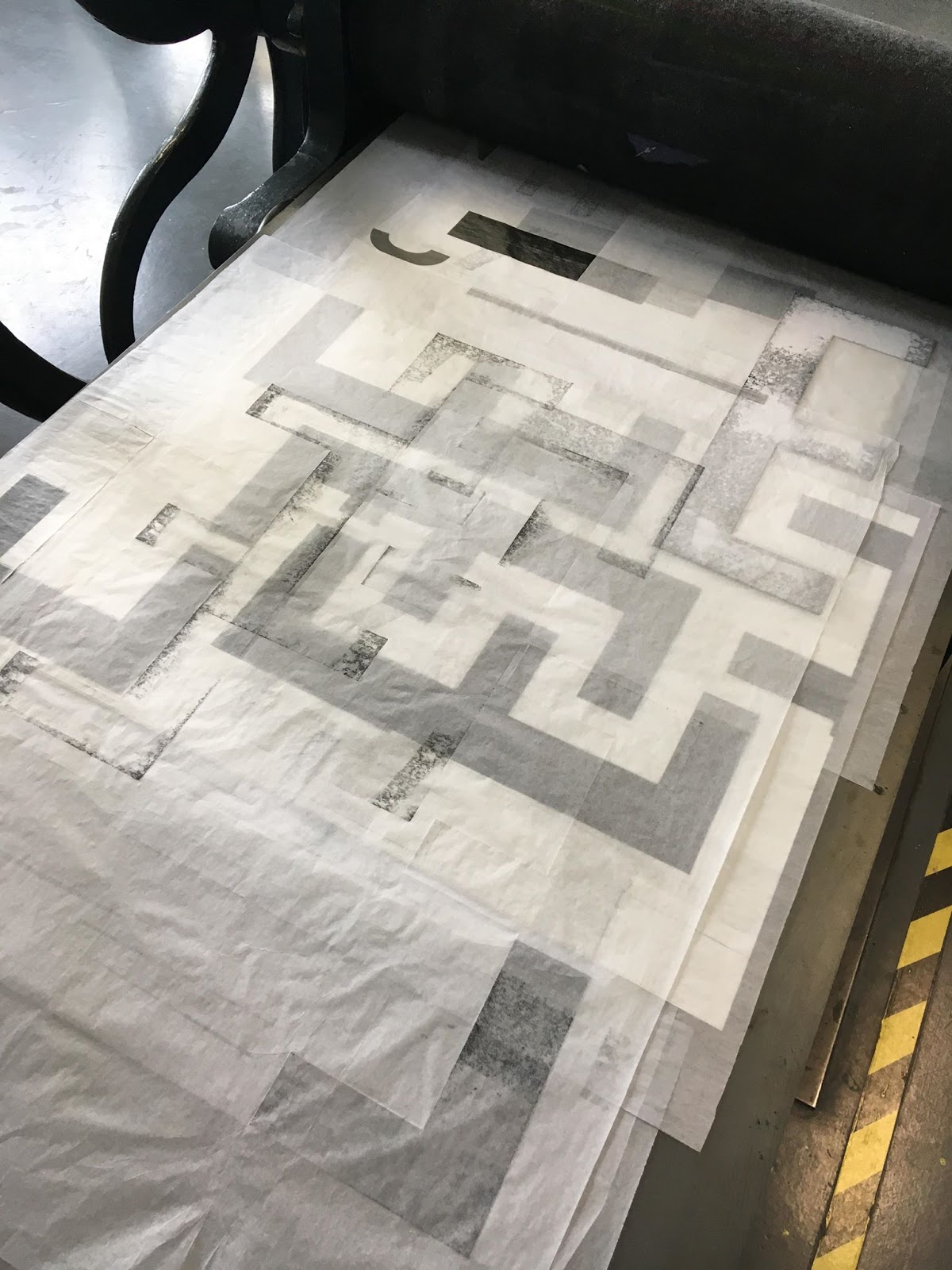
Experimental prints using metal furniture, normally used for spacing, which was cut to type height and then printed and then overprinted in a series of black and greys.


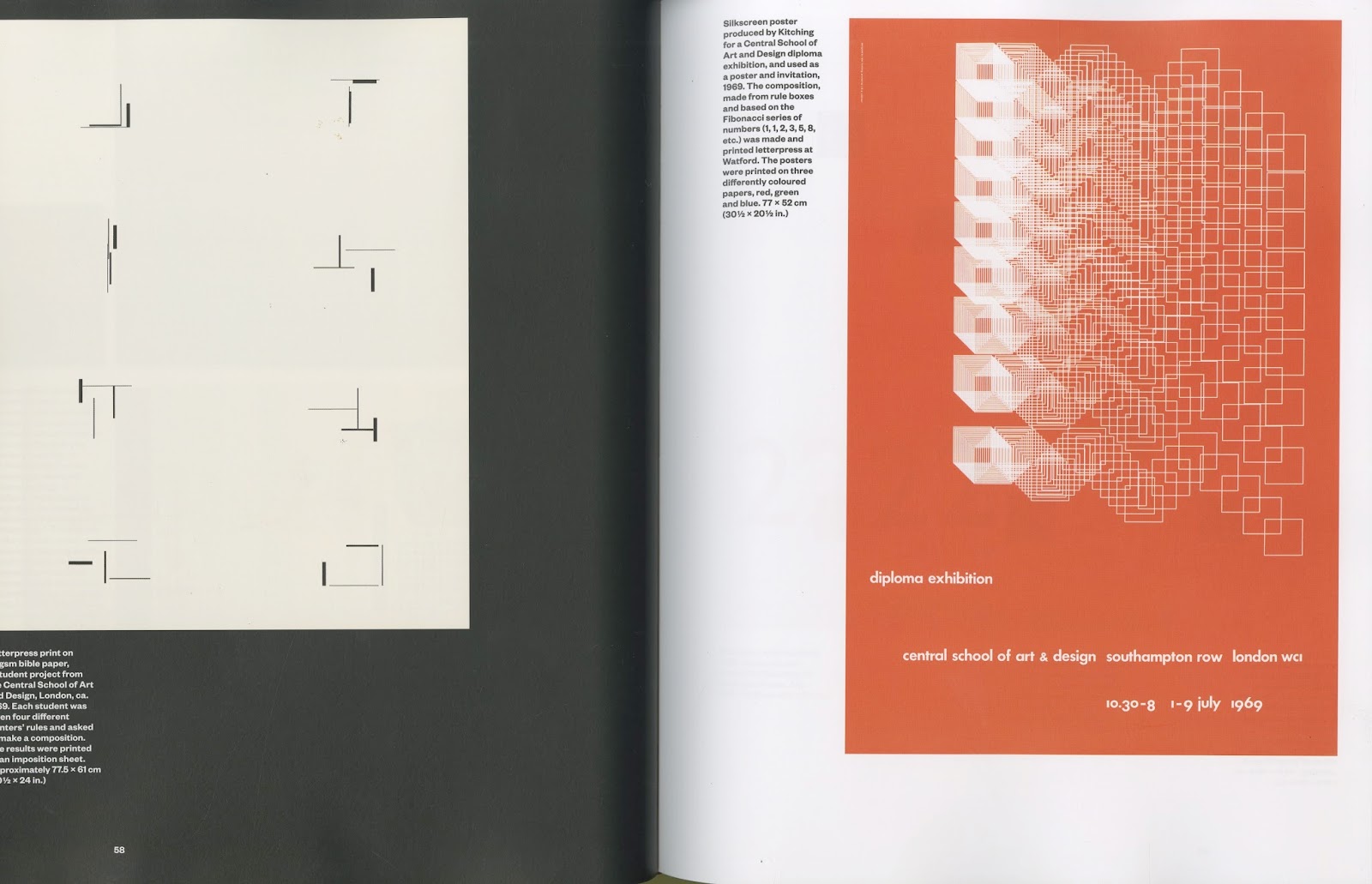
Composition to the right of the page was a student project. Each student was given four different printers' rules and asked to make a composition:


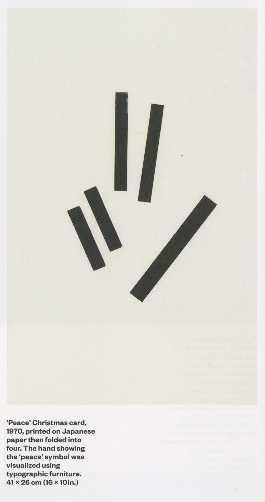
Peace - The hand showing the 'peace' symbol was visualised using typographic furniture.


Big magazine number 7. Big's art director Vince Frost commissioned Kitching to produce woodletter artwork.

Promotional poster:


Layering:


OUGD603 - Univers - Laser Cut

As we have decided to emphasise process throughout the concept, we are required to letterpress therefore I went to investigate into what sizes and weights are available from the University's library of metal type.

The uni has a small selection of metal type in Univers:


This will be ideal for small point type however we were hoping of printing with larger letterforms in order to highlight Univers' weights and balance.

Laser Cut

To overcome the lack of metal type, we took advantage of the laser cutter. We cut a variety of weights and sizes:

4 sizes


Large format cutting

Chose a 6mm plywood however the laser struggled the cut all the way through it. To overcome this we sought the advice of the technician who suggested repeating the cut. After 8 cuts the laser still wasn't penetrating the plywood so we resorted to mount board.


To make the most of our time we decided to resort to mount board as we were confident the laser was able to cut through it. I have experience printing with mount board, its a very flexible printing material that can be cut using a scalpel however it is durable enough to hold its form after repeated runs through the press.

In the past I have created textures on mountboard by removing layers of the ply. This allows you to achieve dark to light tones to create a 3D effect and movement. We can do this to the type in order to create more engaging compositions.

OUGD603 - Univers - Letterpress

Working from the mockups from 'U N I V E R S' blog post. Both Ed and I created compositions from the allocated letters to translate into letterpress.

Cutting 6mm plywood didn't work out as the laser struggled to cut through the wood so we used mount board (please see laser cut post for more). The advantages of using mount board is the fact it can be put through Rochat double geared etching press:


This will allow us to comfortably print A2 sized prints. The mount board can also be torn and manipulated unlike wood. Started by using the letters as a stencil to map out the composition and use as a template to register the type in place:


We used two sizes of rollers to allow even coverage over the variety of weights.
We used Paynes Grey ink
Added a pigment to allow the ink to dry quicker


Ink absorbed into the mountboard nicely. After inking up the type and letting it dry after one print we we found the quality to be more consistent.


Used sheets of tissue paper to mask off certain areas and keep the printing plate and rug as clean as possible. This will avoid unwanted overprints and ink stains.


Working manually encouraged us to take risks and experiment with new ideas. This shows how we allowed the process to inform our decisions. For compositions with more than one letter we had to repeat the printing process. This was particularly difficult when printing the 'E' composition as it needed adjusting and running through the press 11 times. In the future we could cut multiple letterforms in order to speed up the process. 

We decided to save the masking sheets of tissue paper because they cropped certain sections of the type. Layering these over each other further emphasises process and we will consider using them within the final publication.


Compositions:


Deconstruction

Tearing off layers of the mount board in created natural organic textures:


OUGD603 - Univers - 'U N I V E R S'

One of our concepts was to create a series of posters/pages, one for each character in the word Univers.

Our artistic aim is to be expressive and experimental, therefore we decided not to burden ourselves with rules of design but rather exploring the process and our subjective interpretation of the medium and typeface.

Mocked up some digital designs and allocated each other with three words each to create compositions from.

My characters were U, N and E.

Took inspiration from SPIN's SPIN:360 which explores typography from a abstract perspective to deform the type and challenge it.


U:

Univers 59 Ultra Condensed provides a narrow, balanced structure.
Linked the forms


N:

Repeating the character in oblique creates numerous letterforms - w, m, n, v

Rotating the N creates an 


E:


Created new shapes from the letterforms by rotating the characters and linking the through their stems and cross bars. This really highlights Univers' balanced structure.

Negative space is just as important as the characters.

This experimentation informed the size and weight of type for each character to which we will send through the laser cutter and we can manually create the compositions and allow the process of letterpress to inform concepts.

Working digitally to plan out compositions and sort type and weights allows us to work efficiently and sustainably.